
CSS3 Flexbox Layout module Vous connaissez certainement le modèle de boîte classique en CSS et ses dispositions de type “block” ou “inline”, sachez que Flexbox CSS3 a été conçu pour étendre ce périmètre en introduisant un nouveau modèle de boîte distinct, que l’on appellera “le Modèle de boîte flexible”. En février 2016 est sorti mon livre entièrement dédié à Flexbox. Il se nomme "CSS3 Flexbox : plongez dans les CSS modernes" et je vous recommande bien évidemment sa lecture afin de comprendre tous les rouages de ce positionnement révolutionnaire, et d'en maîtriser tous les aspects. Au sein de ce schéma, on ne raisonne plus en “block” ou “inline”, ni même en float ou autres types de boîtes “classiques” CSS, mais en “Modèle de boîte flexible”, dont les quatre possibilités principales sont : Note : ce tutoriel a été initialement rédigé en octobre 2010. En action ! Flexbox (le modèle de boîte flexible) se fonde schématiquement sur une architecture de ce type : Démonstration display: flex Compatibilité Standardisation
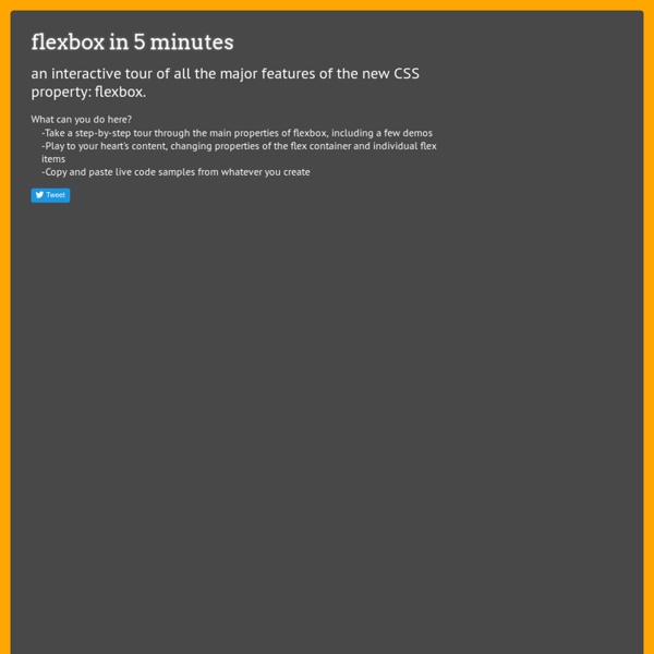
Desarrollando un Proyecto desde cero con Node.js & Angular.js (Parte 1) Solved by Flexbox — Cleaner, hack-free CSS All of the code samples on this site show how to solve a particular design problem with Flexbox. They show just the code that's needed to make the demos work in a spec-compliant browser. Some browsers do not fully comply with the latest version of the spec, so sadly, a few workarounds were necessary. Workarounds for non-compliant browsers are not shown in the code samples, but if you're curious about those implementation details, you can check out the source files. Each demo links to its source, and all browser-specific workarounds are well-documented, so don't be afraid to take a look. The vendor prefixing and translating of current flex properties to their legacy equivalents is all handled by autoprefixer. The class naming convention used in the code samples and source files is taken from SUIT CSS, which is based on BEM methodologies. If you find a mistake or would like to suggest an additional example, feel free to open an issue or submit a pull request on Github.
CSS3: declarando variables Sin duda es algo que muchos programadores estaban pidiendo. Por fin la tercera versión de CSS soportará variables. Hay un poco de controversia con este cambio, dado que CSS se comienza a parecer a un lenguaje de programación. En síntesis, ahora podremos declarar variables en CSS3. Cada uno decidirá para qué las usa y verá si su código pasa a tardar el triple en cargar, si le va perfecto o si se queda con lo que venía usando y se apoya en Javascript. Declarando variables en CSS3 Básicamente, debes usar esta sintaxis: Y puedes invocar esta variable en cualquier momento que la necesites (dentro de tu código CSS) de esta forma: Presumiblemente puedas declarar toda tu paleta de colores con un puñado de variables al principio de tu CSS: Me parece que va a ser una mejora importante en CSS, el que quiera puede aprovecharlas, el que no, no
Flexy Boxes — CSS flexbox playground and code generation tool Flexbox browser support Three versions of the flexbox spec – each with different syntax – have been implemented in browsers. The two 2012 specs are roughly equivilant in terms of features, differing mainly in syntax. The earlier 2009 spec is less comprehensive though covers a lot of the same ground. Flexbox 2012 — W3C Candidate Recommendation, September 2012 Opera 12.1+, Firefox 22+. More browser support info available on caniuse.com. Known issues Flexbox early 2012 Flexbox early 2012 (Internet Explorer 10) align-content (equiv. flex-line-pack) doesn't work if the cross axis dimension is set with min-width or min-height Flexbox 2009 Box wrapping is not supported. box-lines is the property in this spec to achieve wrapping, though unfortunately no browser implemented it. Flexbox 2009 (Firefox) Firefox has a number of non-trivial issues with its 2009 implementation: The setting display: box is treated as display: inline-box if there is no width set. Further reading Code and design by @pete_b.
Working with flexbox Flexible layouts. Equal height columns. Presentation independence from your HTML source order. These things haven't been so easy to achieve with CSS—until now. In this article I'll walk you through the latest flexbox specification and use a simple demo to show you how to create a layout that's flexible, and has equal height columns and elements that you can arrange in any order, regardless of their order in the HTML source. There is some bad news with regard to flexbox and browser support. Opera (12.1) - Supports the latest specification without the need for vendor prefixes.Chrome (23.0) - Supports the latest specification, but requires the -webkit vendor prefix.Safari (5.1) - Supports an older version of the specification with the -webkit vendor prefix.Internet Explorer (10) - Supports an older version of the specification with the -ms vendor prefix. The following explains which mobile devices support the most recent flexbox specification: For more information, go to W3C website.
Advanced Cross-Browser Flexbox Introduction The CSS Flexible box module level 3 — or Flexbox for short — brings with it a lot of power and some very exciting possibilities for web development, allowing us to put together complex site layouts easily and rapidly, and dispensing with some of the illogical hacks and kludges that we’ve traditionally used. I dealt with the basics of Flexbox in my article Flexbox: fast track to layout nirvana? In this article I will go a bit further, looking at a more advanced example, and using Modernizr to serve different styles to browsers with differing levels of Flexbox support, providing the best level of cross browser support currently available. Introducing the example The example I have built for this article looks like Figure 1: This has multiple levels of Flexboxes contained within it. The overall layout The basic layout of the site is like this: The <section> is set to display as a flexible box like so: Child flexboxes Next comes the magic moment. Intelligent fallbacks for Flexbox
GitHub - 10up/flexibility: Use flexbox while supporting older Internet Explorers GitHub - philipwalton/flexbugs: A community-curated list of flexbox issues and cross-browser workarounds for them. GitHub - vadimyer/Ecligrid: Flexible Mobile First Grid System Based on Flexbox. CSS3 . Info - All you ever needed to know about CSS3 GitHub - cjcenizal/flexbox-patterns at webdesignernews.com Jack in the flexbox Cousin germain de l'objet Media, qui fait les beaux jours de OOCSS, l'objet “Autogrid” a les particularités suivantes : s'adapte automatiquement au nombre d'éléments enfantschaque enfant est fluide, de même largeur et même hauteur par défautaffichage sur une seule ligne (pas de saut de ligne prévu)des gouttières précises sont possibles Cette configuration est présente dans un nombre impressionnants de gabarits et de designs. Et elle ne nécessite que quelques déclarations en Flexbox ! Le lien CodePen : EDIT : une journée après avoir créé mon CodePen, un article sur CSS-tricks traite de ce même sujet ;) grid autogrid pattern oocss
Solved by Flexbox — Cleaner, hack-free CSS All of the code samples on this site show how to solve a particular design problem with Flexbox. They show just the code that's needed to make the demos work in a spec-compliant browser. Some browsers do not fully comply with the latest version of the spec, so sadly, a few workarounds were necessary. Workarounds for non-compliant browsers are not shown in the code samples, but if you're curious about those implementation details, you can check out the source files. Each demo links to its source, and all browser-specific workarounds are well-documented, so don't be afraid to take a look. The vendor prefixing and translating of current flex properties to their legacy equivalents is all handled by autoprefixer. The class naming convention used in the code samples and source files is taken from SUIT CSS, which is based on BEM methodologies. If you find a mistake or would like to suggest an additional example, feel free to open an issue or submit a pull request on Github.