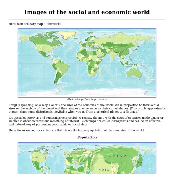
Wind Map
An invisible, ancient source of energy surrounds us—energy that powered the first explorations of the world, and that may be a key to the future. This map shows you the delicate tracery of wind flowing over the US. The wind map is a personal art project, not associated with any company. If the map is missing or seems slow, we recommend the latest Chrome browser. Surface wind data comes from the National Digital Forecast Database. If you're looking for a weather map, or just want more detail on the weather today, see these more traditional maps of temperature and wind.
Welcome to GEOG 486 - Cartography and Visualization | GEOG 486: Cartography and Visualization
Printer-friendly version New to GEOG 486? Registered students - if this is your first visit to this course website, please take some time to become familiar with the assignments and course environment by going to the Orientation, located in the "Start Here" menu (see left). This website provides the primary instructional materials for the course. Not registered? Quick Facts about GEOG 486 Instructor: Adrienne GruverCourse Structure: Online, 10-12 hours a week for 10 weeksOverview: GEOG 486 is one of several courses students may choose as their final course in the Certificate Program in Geographic Information Systems.
Animated Historical Maps
The first Christian communities (1st century) This map is part of a series of 17 animated maps showing History of Christianity. 4 are currently available online Independence for India and Pakistan Clement Attlee, the Labour Prime Minister who replaced Winston Churchill in July 1945, soon realised that independence for India was inevitable, but disagreements among the Indian politicians made the negotiations very difficult. This map is part of a series of 14 animated maps showing Decolonization after 1945 The circumference of the Earth and the Route towards the West In the 3rd century BCE, Eratosthenes calculated the circumference of the Earth with remarkable precision. In later centuries, other Greek geographers, including the most famous of them all Ptolemy, suggested a much lower figure for the circumference for our planet. This under-estimation was adopted by 15th century map-makers. This map is part of a series of 16 animated maps showing The Age of Discovery (Part I) Europe Plunges into War
Slippy Map
Slippy map Slippy Map is, in general, a term referring to modern web maps which let you zoom and pan around (the map slips around when you drag the mouse). Here we often talk about "The Slippy Map" to mean the map display on the openstreetmap.org front page. This is a web interface for browsing rendered OpenStreetMap data. By default the slippy map shows tiles rendered in our "standard" OpenStreetMap style, but you we offer several other featured tiles as layers to select and to link to. See the Browsing page for more basic help information on how to use the slippy map and link to it. Technical details Tile rendering The process of rendering, going from vector to raster map data, baking style choices into bitmap images, is a fairly resource-intensive process. OpenStreetMap "Standard" tile server Mapnik is the rendering software used for generating the "standard" OpenStreetMap style. The standard tiles are generated on tile.openstreetmap.org. See also
Historical Maps
home page Down to: 6th to 15th Centuries | 16th and 19th Centuries | 1901 to World War Two | 1946 to 21st Century The Ancient World ... index of places Aegean Region, to 300 BCE Aegean Region, 185 BCE Africa, 2500 to 1500 BCE Africa to 500 CE African Language Families Alexander in the East (334 to 323 BCE) Ashoka, Empire of (269 to 232 BCE) Athenian Empire (431 BCE) China, Korea and Japan (1st to 5th century CE) China's Warring States (245 to 235 BCE) Cyrus II, Empire of (559 to 530 BCE) Delian League, 431 BCE Egyptian and Hittite Empires, 1279 BCE Europe Fertile Crescent, 9000-4500 BCE Germania (120 CE) Greece (600s to 400s BCE) Gupta Empire (320 to 550 CE) Han China, circa 100 BCE Hellespont (Battle of Granicus River, 334 BCE) India to 500 BCE Israel and Judah to 733 BCE Italy and Sicily (400 to 200 BCE) Judea, Galilee, Idumea (1st Century BCE) Mesopotamia to 2500 BCE Mesoamerica and the Maya (250 to 500 CE) Oceania Power divisions across Eurasia, 301 BCE Roman Empire, CE 12 Roman Empire, CE 150 Roman Empire, CE 500
Making Maps: A Visual Guide to Map Design for Geographic Information Systems
Constantine's Roman Empire
j.b.krygier: research and teaching
go to Classes | Research | Making Maps Book & Blog Ohio Wesleyan University Department of Geology and Geography61 South Sandusky StreetDelaware OH 43015 Office: 206 SCSC | GIS Lab: 207 SCSC (...don't call me on the) Phone: 740-368-3622 | Fax: 740-368-3999 (...instead send an) E-mail: jbkrygier@owu.edu the SoundCloud | the BandCamp Tweets by @poponthebeezer