
15 Fresh Free Fonts for Your Next Design. 100 Free Fonts You Should Have in Your Library. Fonts have already been among the essential materials used by designers.

Whether it is a web design project or a logo design – font is the element, capable of attracting people’s attention, rendering the key idea, and communicating the necessary message. That is why, thousands of free fonts reside today in multiple online font repositories. Below we are introducing a collection of 100 free fonts, which represent vividly only some of the most significant trends in typography, however all of these fonts feature really unique and fresh designs.
Clean fonts contain the samples of free fonts of the sans serif family with classic proportions, distinct lines, and clean backgrounds. Fancy fonts introduce multiple decorative elements, used in typography – from curly fonts to eroded and distorted ones. 1. Delicious-Roman DiavloBook-Regular HattoriHanzo-LightItalic LT Oksana Bold Champagne & Limousines Vegur-Regular Caviar Dreams Bold Ageone Aldo SemiBold Zrnic Zero Threes Yanone Kaffeesatz Regular Mabella 2.
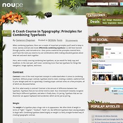
25 Free Fonts for Your Creative Projects. A Crash Course in Typography: Principles for Combining Typefaces. Apr 11 2011 When combining typefaces, there are a couple of important principles you’ll need to keep in mind, namely contrast and mood.

Effectively combining typefaces is a skill best learned through practice, and trial-and-error. Once you’ve mastered the principles covered here, you’ll have the tools you need to try out combinations while making educated guesses about what will and won’t work together. Here, we’re mostly covering combining two typefaces, as you would for body copy and headlines. In the next part, we’ll cover combining more than two typefaces for things like navigation, image captions, and more. Contrast Contrast is one of the most important concepts to understand when it comes to combining typefaces.
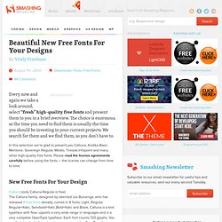
But first, what exactly is contrast? Weight The weight of a typeface plays a huge role in its appearance. You’ll want to look for typefaces that have noticeable difference in weight, without being too extreme. Style and Decoration Scale and Hierarchy Classificiation Structure Mood. Beautiful New Free Fonts For Your Designs - Smashing Magazine. Advertisement Every now and again we take a look around, select “fresh” high-quality free fonts and present them to you in a brief overview.

The choice is enormous, so the time you need to find them is usually the time you should be investing in your current projects. We search for them and we find them, so you don’t have to. In this selection we’re glad to present you Calluna, Andika Basic, Mentone, Sovereign Regular, Medio, Tiresias Infopoint and many other high-quality free fonts. Please read the license agreements carefully before using the fonts — the license can change from time to time. New Free Fonts For Your Design Calluna1 (only Calluna Regular is free) The Calluna family, designed by talented Jos Buivenga, who has released 9 free fonts2 already, comes in 8 fonts: Light, Regular, Regular+Italic, Semibold+Italic,Bold+Italic and Black. Tiresias Infopoint6 Tiresias Infofont has been designed for use on information labels to help improve legibility. Credits: Hamish Macpherson39. 40 Beautiful Free Fonts For Creating Attractive Typography Headlines.
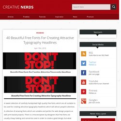
A sweet collection of carefully handpicked high quality free fonts, which are all suitable to be used for creating attractive typography headlines which will attract people’s attention.

A collection of amazing fonts which are suitable and perfect for web design projects as well print based projects. There is a misconception by designers that free fonts are usually cheap looking and cannot be used in order to create a good design, but what designers don’t realise is that there is the odd good free font it just takes time in order to find the perfects ones. This is the exact purpose of this article to be bookmarked by designers and to referred to in the future when working on a design projects where money may be tight and the client can’t afford to splash out on big expensive fonts.
This post will be a handy resource for designers searching high quality good free fonts. 1. 2. 3. 4. 5. 6. Mastering Font Combinations. Remember the days of the Commodore computer?

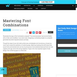
Your word processor had one font family, with an italic and a boldface, if you were lucky. Designing a contrasting header to a computer-generated document required scissors and tape. Though the output of your dot matrix printer was unmistakable and monotonous, at least you never had to sweat the aesthetics of combining type. Matching heading fonts with body fonts, accent fonts and footnote fonts can be a touchy pursuit. Even perfectly balanced fonts can look ungainly and ugly next to the wrong neighbors. Unfortunately, it’s also a hard skill to master intuitively. Learn to Combine Fonts – the Essential Basics When you need a type combination and you need it immediately, check out Douglas Bonneville’s 19 Top Fonts in 19 Combinations.
For a more in-depth version, try this arrayed infographic codifying 22 possible type combinations. Get Help on Helvetica Combinations Learn to Create Well-Balanced Contrast Pairings Further Reading: