
50 Totally Free Lessons in Graphic Design Theory. 1,200+ courses and ebooks Design, code, video editing, business, and much more. Adobe Photoshop, Illustrator and InDesignGraphic, Logo and Print DesignSketch, Adobe XD & FigmaWordPressJavascript, PHP & PythonAdobe After Effects & Premiere ProMuch More Millions of creative assets Design templates, stock videos, photos & audio, and much more.
Graphic TemplatesStock PhotosMusic TracksVideo TemplatesWeb TemplatesDesign AssetsWordpress Themes & PluginsMuch More 1,200+ courses and ebooks Design, code, video editing, business, and much more. Adobe Photoshop, Illustrator and InDesignGraphic, Logo and Print DesignSketch, Adobe XD & FigmaWordPressJavascript, PHP & PythonAdobe After Effects & Premiere ProMuch More Millions of creative assets Design templates, stock videos, photos & audio, and much more. Graphic TemplatesStock PhotosMusic TracksVideo TemplatesWeb TemplatesDesign AssetsWordpress Themes & PluginsMuch More. The Secret Law of Page Harmony. “A method to produce the perfect book.”

The perfect book. This is how designer-genius Jan Tschichold described this system. Not the ok book, nor the pretty good book, but the perfect book. This method existed long before the computer, the printing press and even a defined measuring unit. No picas or points, no inches or millimeters. And you can still use it. The Secret Canon & Page Harmony Books were once a luxury only the richest could afford and would take months of work to be brought to fruition. And they were harmoniously beautiful. The bookmakers knew the secret to the perfect book. So elegant is this method of producing harmony that a few designers saw to rediscover it.
They found the way to design a harmonious page. There’s a dance to all this Let’s look at this dance, shall we? And here it is with them (using the Van de Graaf Canon and Tschichold’s recommended 2:3 page-size ratio, which we’ll get into next). This is where the harmony is found. How is this dance beautiful? The J. Fonts, typefaces and all things typographical — I love Typography (ILT)
Learn to love typography « VCC Graphics Technology. Perhaps you’ve been neglecting a love affair with one of the most powerful elements in design: typography.

That’s right – it’s time you fell in love with an element of design which will undoubtedly improve your design skills. Learning how to successfully use type doesn’t just miraculously occur as you design. As Kristy noted in her comment in the “10 Tragic Typefaces” article, “too many people new to design and typography think that figuring out how to apply the basics of design and typography is just going to dawn on them one day while they’re clicking and dragging…” Typography is often one of the biggest weaknesses of most students nearing graduation. Understanding elements that make typographic design successful is key to becoming a better designer. New media designer, Cameron Moll notes, “Typeface selection is one of the most transparent ways of detecting good — and bad — design.”
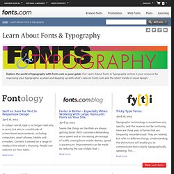
So it’s time you found a place in your heart for typography. For a good read (online articles) Enjoy! U&lc Issue: 42.1.2. Browse the most recent contributions to Fontology, the Fonts.com Blog and fy(t)i.

Serif vs. Sans for Text in Responsive Design April 16, 2014 In today’s world, type is no longer read only in print, but also in a multitude of screen-based environments, including computers, smart phones, tablets and e-readers. Content is viewed on a range of media of the viewer’s choosing. Faster Is Better – Especially When Working With Large, Non-Latin Fonts on Your Site. April 15, 2014 Seems like things on the Web are always getting faster. Burlingame – Finesse in Font Development April 07, 2014 Carl Crossgrove’s new Burlingame® family is a classic example of the subtlety type designers bring to typeface design. Top 100 Fonts.com Web Fonts for March 2014 April 01, 2014 Serif vs. March 26, 2014 One of the first determinations to be made when selecting a typeface for text is serif or sans? The Fonts.com Big Script Sale is Here! MartinSilvertant (Martin Silvertant) on deviantART.