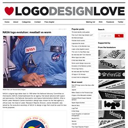

Building a Corporate design. Branding Techniques by Branding Agency. NASA logo evolution. NASA/Time Life Pictures/Getty Images NASA’s original logo dates back to 1959 when the National Advisory Committee on Aeronautics (NACA) metamorphosed into an agency that would advance both space and aeronautics: the National Aeronautics and Space Administration (NASA).

After a NASA Lewis Research Center illustrator’s design was chosen for the new agency’s official seal, the head of Lewis’ Research Reports Division, James Modarelli, was asked by the executive secretary of NACA to design a logo that could be used for less formal purposes. The illustrator’s design before simplification Mr Modarelli simplified the seal, leaving only the white stars and orbital path on a round field of blue with a red airfoil. Then he added white N-A-S-A lettering. NASA’s meatball Known officially as the insignia, NASA’s round logo was not called the “meatball” until 1975. Danne remembers NASA’s administrator, Dr James Fletcher, and deputy administrator, Dr George Low, having the following exchange:
Identity Designed. Papeterie Haute-Ville - Logos on Creattica: Your source for design inspiration. Peopledesign. New Logo Trends in 2010. [ad#468x60-top-header] Today When i was surfing internet this article “New Logo Trends” by Bill Gardner inspires me so i decided to publish on my blog.

Text is ever more important in identity design. Driven by the delinquent dollar, clients and designers are working hard to make identity messages more succinct and/or direct, and incorporating actual words into logos makes the message all the more immediate. Some logos are simply stuffed with information. Use of color is even more unrestrained now—which is somewhat counterintuitive given the flu-ish economy. A highly encouraging trend is the emergence of innovative, fresh design emerging from Eastern Bloc countries. Scandinavian design has also seen a shift of late, to a lighter,fresher approach in design.
What else is especially noticeable this year? There is plenty of optimism shining through in many designs—or at least clients are trying to bravely declare through their identities that they aren’t the slightest bit afraid. Cubist 1. 1. Web Design blog - Website Design, Web Design from Budapest. To start a project I need the following things: Project briefingIf you do not have it please download the Client WorksheetProject wireframes (mockups)Project files (photos, logo style guide) Client Worksheet If you have a project please Download it!

I read all e-mails and do my best to reply to all of them as soon as possible. Yet, I will also have to consider priorities, especially if business is concerned. Do you have more questions? 436 understanding e-branding — The Branding Source. The Style Network is an American cable network dedicated to fashion and design.

Originally launched in 1999 as an off-shoot from the E! Network, today it is now part of NBCUniversal and is distributed to many parts of the world. Yesterday, June 20, Style unveiled a new visual identity that will replace the circle it is using at the moment. The new logo is described as a "strong, classic midnight blue typeface word Style accented by a splash of light blue".
It shows some typographic curiosity, as the period after the name is repeated at the beginning as part of the S. The Corporate Identity Style Guide - Brand Standards and Guidelines Manuals. Branding, logo creating, coining of slogans took time and effort.

Those sessions paid handsome dividends, because today the company has an expression all its own - so unique that people will make the "connect. " The physical hallmarks of your brand and company mirror excellence, commitment and service.You register and copyright the brand, logo and all the accompanying trademarks and symbols. But it doesn't end there.You need to protect them, and the only way to do that is to create a brand manual. There are many ways of branding a product or service. Sometimes they're used the wrong way. The Brand Manual: Is it Really Necessary? This question is like asking if it's possible to engage in e-commerce without a web site.
Top reasons why you need a brand manual: 1. Companies hire third parties to help convey a message. What happens? Product branding goes beyond the product. Amateurish branding has no place. Because you DON'T have a brand manual, are you prepared to deal with: 1. 1. Good Technology Brand Identity Guide. 20 top tips for designing effective brand guidelines « Saatchi & Saatchi Design.