
Ideo's David Kelley on "Design Thinking" The smell of ramen noodles wafts over the Stanford d.school classroom as David Kelley settles into an oversize red leather armchair for a fireside chat with new students.
It's 80 degrees and sunny outside in Palo Alto, and as the flames flicker merrily on the big computer screen behind him, Kelley, founder of both the d.school and the global design consultancy Ideo, introduces his grad students to what "design thinking" — the methodology he made famous and the motivating idea behind the school — is all about. Today's task: Design a better ramen experience. Some students seem a little mystified, as they twirl noodles around their chop sticks. What does a "ramen experience" have to do with design? Dominikus Baur Interfacery - Data Visualization - How to make fast animated HTML5 visualizations. Update: Jeremy Stucki from Interactive Things quickly hacked together an impressive demo of >500 animated, flower-like shapes in SVG - showing that complex animations can also be done using vector graphics.
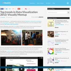
Still, it lacks some of the details (gradients! Text labels!) And while working great on a reasonably fast laptop, it's similar in speed to our Canvas-BLI on an iPad 3/iPhone 4S. So, yes, SVG lets you do a lot, but I would still argue that the low-level Canvas is a tad faster. One thing that people tend to forget in today's HTML5-ed world is how extremely fast Flash actually was and still is. I had to learn the restrictions of HTML5 with the revamp of the OECD's Better Life Index. The OECD Better Life Index (BLI) is an appealing, web-based visualization of various quality-of-life indicators for a set of 36 countries. Flower animations in the (Flash) Better Life Index (click to see the animation).
Infosthetics : An #infovis dream/nightmare... Top trends in Data Visualization 2013: Visually Meetup. With 2012 behind us — and having discussed our favorite infographics, interactive visualizations and motion graphics of the year — it was only natural that the topic of our first meetup for 2013 would be Top Trends in Data Visualization.
Nearly 100 people came to the Trulia offices in SOMA, San Francisco (many thanks for being our host!) And we kicked off the evening with beer, pizza (and even some ping pong). Of course, we weren’t there just to have fun, but also hear two very smart and talented people talk about what they think are the top trends in interactive visualizations and motion graphics. Scott Murray, a code artist, and Assistant Professor of Design at University of San Francisco, gave a presentation on the top trends in interactive visualization. A self-professed “process junkie,” Murray believes process will be a big conversation in the field this year. You can watch his talk (and presentation) here: The State of Information Visualization, 2013. Well, the world hasn’t ended, so here’s a look back at what happened in visualization in 2012, and a look ahead in case the world is still around a year from now. 2012: What Was Last year was an exciting one, at least for me.
First I started my sabbatical year at Tableau, then I decided to stay there. I went to SxSW and Malofiej. I met a lot of smart people. 2012 was the year visualization in the news took off. And you know who called it a year ago? If you don’t believe that data journalism will be big in 2012, I have one word for you: U.S. The New York Times, which used to hide its interactive pieces online, has posted a collection of the amazing work they did in 2012, including such pieces as 512 Paths to the White House. This marks a sea change not only in terms of interactivity on the web, but in how newspapers are starting to approach the issue of browser support. 2013: What Will Be My predictions have at times been self-serving. Beyond 2013 There is plenty of opportunity, too. Infographic: The 550,000 Miles Of Undersea Cabling That Powers The Internet.
They seem so brittle.
Cables that are a little more than two inches thick line our ocean floors, culminating in over half a million miles in length, transmitting terabytes of data across the globe every second. What about satellites? As of 2006, they represented just 1% of telecommunications traffic. Most of our information flows through these underwater pipes, laid by ships off gigantic spools. Click to enlarge. The Submarine Cable Map, by telecom research firm TeleGeography, is a vintage rendition of the worldwide network that drives our communications infrastructure today. "The beautiful hand-drawn details found on old maps have always fascinated me and are sorely missing from contemporary cartography,” designer Markus Krisetya explains.
The result is gorgeous, like some combination of classic cartography and a modern tube map, or maybe a circuit board diagram. Interestingly enough, the map hides some other big pieces of data near the bottom of the print. Buy one here. Information Is Beautiful. 2012: The Year in Graphics - Graphic.