
Features. Essential visualisation resources: Tools for mapping. Originally published by Andy Kirk on Visualising Data, 1 May 2011.
This article is republished with permission. This is the fourth part of a multi-part series designed to share with readers an inspiring collection of the most important, effective, useful and practical data visualisation resources. The series will cover visualisation tools, resources for sourcing and handling data, online learning tutorials, visualisation blogs, visualisation books and academic papers. Your feedback is most welcome to help capture any additions or revisions so that this collection can live up to its claim as the essential list of resources. This fourth part presents a broad range of visualisation resources that can be used for representing data via maps. Please note, I may not have personally used all the tools presented here but have seen sufficient evidence of their value from other sources. Google Maps & Google Earth Find out more information | Cost: Free | Tags: Google, KML, 3D.
Chrome Experiments - Experiments. Visualization: Map - Google Charts. The Google Map Chart displays a map using the Google Maps API.
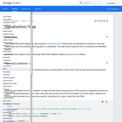
Data values are displayed as markers on the map. Data values can be coordinates (lat-long pairs) or addresses. The map will be scaled so that it includes all the identified points. If you want your maps to be line drawings rather than satellite imagery, use a geochart instead. You can identify the places to put markers by name, as shown below in this map of the top ten countries by population.
When the user selects one of the markers, a tooltip with the name and population of the country is displayed, because we used the showInfoWindow option. You can also specify locations by latitude and longitude, which loads faster than named locations: The above chart identifies four locations by latitude and longitude. You can use marker shapes located elsewhere on the web. If you select pins in the above chart, they slant.
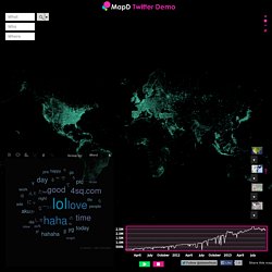
In addition to creating a default set of markers, you can also create multiple sets of markers. MapD Twitter Demo. Vai ficar defendendo a amiguinha vaaai@Kiara_GIRLCRAZY jajaja ya pues no hay nada más que hacerQuando sai o teaser do Minho???
Toma no cunobody wants to sit next to me in any of my classes.... @entaojonas @AnaCarolinaN27 vcs tem whats?? Anfoloverima zelim da sanjaju krvave oci Maje Nikolic.Mikirin apa sih sampe nggk bisa tidurr? "@l_april60: @mizihurahura tidak bisa tidur ___''@chaarmxo thank you lovely! XI love my lifeCumaya gidiolar♥♡♥♡@siigh_ ممثللي مدري وش ابي :(#السعودية لماذالايكتفى بصورة البطاقه الوطنيه لفئة المراهقين بسب قهرالمراهقه بتضيع الأصل والرجوع رقمياً للخزن الإلكترونى لتأكدمن هوية حاملها؟Mawlaya (Arabic Version - Bonus Track) by Maher Zain — if you didn't tweet about the lil peanut, people would think you didnt care.
Big Data Paris 2015 : 3 questions à Damien LESAGE, Business Intelligence (BI) Analyst pour CRITEO. Big Data Paris 2015 : 3 questions à Damien LESAGE, Business Intelligence (BI) Analyst pour CRITEO Damien LESAGE, Business Intelligence (BI) Analyst pour CRITEO animera une conférence sur le thème « Le pouvoir des données et de la technologie », le mardi 10 mars de 17h50 à 18h10 (Amphithéâtre GOETHE), l’occasion de présenter le projet Tableau Software pour Criteo. 1.

En quoi consiste le projet développé par TABLEAU SOFTWARE et CRITEO ? L’objectif du projet était de proposer aux équipes BI un outil d’analyse qui soit simple d’utilisation et qui leur permette de gagner en autonomie et en rapidité sur le partage d’informations clés pour la croissance de Criteo. Cet outil devait également permettre d’accéder aux sources de données déjà existantes au sein de Criteo.
En quelques chiffres-clés, Tableau chez Criteo représente : 60+ analystes possédant Tableau Desktop qui peuvent publier des tableaux de bord 1000+ tableaux de bord en ligne après moins d’un an d’existence 2. Ce fut immédiat. 3. Magic Quadrant for Business Intelligence and Analytics Platforms. Analyst(s): Rita L.
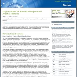
Sallam, Bill Hostmann, Kurt Schlegel, Joao Tapadinhas, Josh Parenteau, Thomas W. Oestreich Figure 1. Magic Quadrant for Business Intelligence and Analytics Platforms Source: Gartner (February 2015) Overview of Magic Quadrant Positioning The vendors' positions in this Magic Quadrant reflect the current market transition. The year 2014 has been another year of challenging execution for the market share leaders in the BI and analytics market, juxtaposed against strong execution by the data discovery vendors that are satisfying customers, meeting their buying requirements and delivering greater business value. The current BI and analytics market situation looks similar to the mainframe/workstation market in the late 1980s, which had a complete shift in requirements and buyers. While data discovery platforms predominantly complement IT-centric systems-of-record deployments, they are being used for much of the new analytics project investments.