
CSS outline property - outline: none and outline: 0. Gaussian Blur and CSS3/SVG - CSS-Plus. Edited: 07 January 2014 – Updated article to reflect current browser support.
Gaussian blur is something I use a lot when it comes to Photoshop. It would be very handy to have that kind of ‘filter’ power within a browser environment. Before we get started, I think it’s just important to understand that both the SVG and CSS filter properties affect an element and all of it’s children. A child element cannot be ‘un-blurred’, only blurred more. There are a few methods of recreating this Gaussian blur effect, some work cross-browser, others don’t but will be supported in future.
In the example jsfiddles you may notice HTML IE conditional statements: Usually those conditional statements are applied to the <html> element and I’ve added them to a div to mimic that functionality. CSS3 text-shadow I’m sure you’re either aware of, or easily understand how this trick works. Problems Opera doesn’t currently support the transition to the text-shadow property. Fallback. CSS3 Filters: Altering HTML and Images with just CSS. CSS3 Filters are a quite interesting offshoot from SVG, allowing you to modify HTML elements and images with blurs, brightness and a lot more.
In this quick tutorial we’ll go over exactly how they’re going to work. Using just CSS we can accomplish some pretty complicated effects. These should be applicable to both images and HTML elements, but obviously browsers will vary for the foreseeable future. The property used to control all of this stuff is filter. filter: filter(value); As you might expect though, browser prefixes will be required. StackBlur - A fast, almost Gaussian blur for Canvas by Mario Klingemann, Quasimondo. Blur.js. Cross-browser Image Blur with CSS. In this article I’ll show how to blur photographs using CSS and SVG in modern browsers, with the usual caveats: the techniques I’ll demonstrate will work on all browsers, but only recent versions. blur is similar to the Gaussian Blur filter in PhotoShop; its inclusion in CSS3 and SVG means we can now achieve the same effects natively in the browser (for this example, using an image by Khalil Shah).
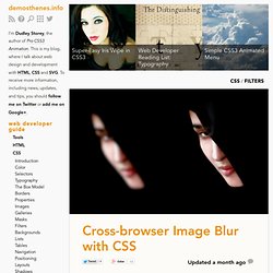
One design caution: if used incorrectly or too frequently, blur may make your users feel that they are visiting your site after a week-long bacchanal, quickly producing a headache. Blur is often combined with a mouse rollover detection that undoes the effect, which I’ll also demonstrate in this article. As before, we’ll apply the easiest version first: the new CSS3 filter. Before that, our HTML5 content: Then the blur effect, applied via a class: The SVG blur filter. Cross-browser filters with CSS and SVG. For some time now, since Safari 6 and Chrome 18 were released, we’ve been able to use the –webkit-filter CSS property to apply graphical filters to HTML content.
But it seems that many people aren’t aware that you can also do this in Firefox and — within a very limited set of parameters — IE9 and above. The reason for this is that all of these browsers support SVG filter effects, and CSS filter effects are basically shorthand functions that apply predefined configurations of SVG filters. Blur.js. Blur.js Take II - A post from jakiestfu. To view Demos and to download, view the post here.
Some time has passed since I wrote my hack plugin blur.js, and i thought I'd play around with the concept again, but in a different way. jQuery is required, and so is a modern browser. This is nothing more than a wrapper for CSS making it easy to work with, the CSS itself will be at the bottom of this post. customClass: uses this class for some of the inner workings of the script.radius: The blur radius you want to use (int)persist: Boolean, removes previously blurred elements. The option persist is used to fix the following scenario.
Box Shadow CSS Generator. Box Shadow Generator. Use this CSS3 box shadow generator to quickly generate box shadow CSS for your project.
Your browser does not support the CSS3 box-shadow property. You can still use this tool to generate the CSS3 rule, but you won't be able to see the results. Hover.css - A collection of CSS3 powered hover effects. All Hover.css effects make use of a single element (with the help of some pseudo-elements where necessary), are self contained so you can easily copy and paste them, and come in CSS, Sass, and LESS flavours.
Many effects use CSS3 features such as transitions, transforms and animations. Old browsers that don't support these features may need some extra attention to be certain a fallback hover effect is still in place. Licenses. Soothing CSS3 Dropdown Animation. Pure CSS Folded Corner Effect With Animations. Folded Corners Effect with CSS3 Animations made by Charlotte Dann and inspired by this tutorial.
I have improved the markup and CSS code a bit to make it more usable. We could use the ::before or ::after pseudo elements instead of the extra span elements but unfortunately transitions on pseudo elements arn't widely supported. For example I tried pseudo elements in this item but the animation failed to work in Chrome 17, while worked fine in Firefox 11. The folded corner is very simple to make. You could use an extra span element as used in this item or a pseudo element as mentioned above. Movies In Color. PURE CSS ANIMATED TOGGLES. Hop Over Notification Badge. CSS3 PIE: CSS3 decorations for IE. Hover.css - A collection of CSS3 powered hover effects. CSS Shadow Experiments.
Original Hover Effects with CSS3. HTML5 Showcase - Transitions. CSS Tricks – Floating Labels - ► Shai Raiten. The web is full with amazing designs and people are really taking HTML to the edge, some require JavaScript code, some require CSS 3 features such as Transition and KeyFrames but some only require basic CSS.
In this post I’ll show how to create Floating Labels for input fields, I made some examples but you can take those and modify them further based on your needs. The entire Floating Labels trick relays on two principles, the first is placing the input and label html elements inside div element. (This is not new – most of the times you’ll place both in div element because you need to place them in block level) Now we need to set relative positioning. This will allow absolute positioning within it, which means we can position the label and input on top of each other. And the second principle is using :focus and :valid states combining with adjacent sibling combinator (+) Bottom Label Style Right Label Style Top Label Style iPhone Label Style. Demo: Pure CSS speech bubbles. The basic bubble variants This only needs one HTML element.

For example, <p>[text]</p>. But it could be any element you want. The entire appearance is created only with CSS. Simple examples Design is directed toward human beings. Ivan Chermayeff It’s not what you look at that matters, it’s what you see. Henry David Thoreau. Demo: CSS drop-shadows without images.