
Fluid grids. Early last year, I worked on the redesign of a rather content-heavy website.
Design requirements were fairly light: the client asked us to keep the organization’s existing logo and to improve the dense typography and increase legibility. So, early on in the design process, we spent a sizable amount of time planning a well-defined grid for a library of content modules. Article Continues Below Over the past few years, this sort of thinking has become more common. Thanks to the advocacy of Mark Boulton, Khoi Vinh, and others, we’ve seen a resurgence of interest in the typographic grid, and how to use it on the web. However, our client had one last, heart-stopping requirement: the design had to be fluid and resize with the browser window. Minimum screen resolution: a little white lie#section1 Instead of exploring the benefits of flexible web design, we rely on a little white lie: “minimum screen resolution.”
As it turns out, it’s simply a matter of context. With ems, it’s easily done. Learn CSS Positioning in Ten Steps: position static relative abs. 1. position:static The default positioning for all elements is position:static, which means the element is not positioned and occurs where it normally would in the document.
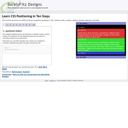
Normally you wouldn't specify this unless you needed to override a positioning that had been previously set. 2. position:relative If you specify position:relative, then you can use top or bottom, and left or right to move the element relative to where it would normally occur in the document. Let's move div-1 down 20 pixels, and to the left 40 pixels: Notice the space where div-1 normally would have been if we had not moved it: now it is an empty space. It appears that position:relative is not very useful, but it will perform an important task later in this tutorial. 3. position:absolute When you specify position:absolute, the element is removed from the document and placed exactly where you tell it to go.
Let's move div-1a to the top right of the page: What I really want is to position div-1a relative to div-1. Footnotes. Ingrid, the jQuery Datagrid. How to Use Part 1 - Setup Ingrid uses the sugary sweetness only found in your latest version of JQuery.
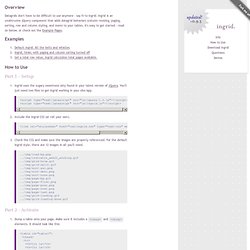
You'll just need two files to get Ingrid working in your site/app. <script type="text/javascript" src="js/jquery-1.2.js"></script><script type="text/javascript" src="js/ingrid.js"></script> Include the Ingrid CSS (or roll your own). <link rel="stylesheet" href="css/ingrid.css" type="text/css" media="screen" /> Check the CSS and make sure the images are properly referenced. .. Part 2 - Activate Part 3 - Server Side Download Currently on Github Ingrid is on Github. Legacy Prior to moving to Github in 01/2014, changes were tracked at Google Code. v.9.4 (Thanks Patrice!) Questions What are all the moving parts? Ingrid's got 3 main parts: a header, a body, and a paging control.
How does the server-side script work? Ingrid passes a couple different params to the server, depending on how it's configured. I think I saw Ingrid on Del.icio.us. You most certainly did! Contact Donate.