Strikethrough Header. Animated Buttons with CSS3. Still hyped by the possibilities of CSS3, I want to share some CSS3 button experiments with you.
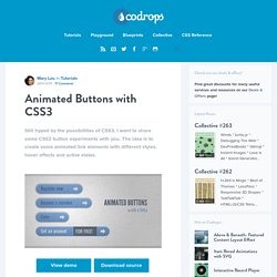
The idea is to create some animated link elements with different styles, hover effects and active states. View demo Download source The icons used in some of the examples are by webiconset.com and the symbol font is by Just Be Nice We’ll go through every example and see how the HTML structure looks and what the styles for the normal, the hover and the active states are. Please note that the animations/transitions will only work in browsers that support those CSS3 properties. In order not to bloat the tutorial, I will not be using any CSS vendor prefixes. Example 1 In this example we will create a big button with several details in it. Markup The structure is pretty straightforward: the icon will be an image and the other elements will be spans: In the style we will make sure that the right transitions are set on the element that we want to animate on hover.
Example 2 Example 3 Example 4 Example 5. CSS3 Graph Animation. Hi guys, today I present a small experiment, using once again the CSS3 animations and properties.

This time we will build to create a chart, for me this is just an experiment to test the CSS3, I do not think you can use in your projects but you can enhance your knowledge. I remember this animations are only visible in Firefox, Safari and Chrome. Let’s start! The Markup In this experiment we will encounter several properties that return useful in future projects. Inside this div will put a tooltip that will allow us to mouse over to display a value, a number, a phrase or what one wants.
Well after creating our markup is the time to fill our CSS to give life to our experiment. As you will need to set the angle of the line and in this case we use the rotate property and also use the transform-orign property that will help move the line, i have helped with Firebug to find the right point of attachment. CSS – Control Layer for the Delay CSS – Tooltip CSS – Coordinate Points CSS – Animations.
Creating Stylish Responsive Form With CSS3 and HTML5. #buttons #submitbtn { display: block; float: left; height: 3em; padding: 0 1em; border: 1px solid; outline: 0; font-weight: bold; font-size: 1.3em; color: #fff; text-shadow: 0px 1px 0px #222; white-space: nowrap; word-wrap: normal; vertical-align: middle; cursor: pointer; -moz-border-radius: 2px; -webkit-border-radius: 2px; border-radius: 2px; border-color: #5e890a #5e890a #000; -moz-box-shadow: inset 0 1px 0 rgba(256,256,256, .35); -ms-box-shadow: inset 0 1px 0 rgba(256,256,256, .35); -webkit-box-shadow: inset 0 1px 0 rgba(256,256,256, .35); box-shadow: inset 0 1px 0 rgba(256,256,256, .35); background-color: rgb(226,238,175); background-image: -moz-linear-gradient(top, rgb(226,238,175) 3%, rgb(188,216,77) 3%, rgb(144,176,38) 100%); background-image: -webkit-gradient(linear, left top, left bottom, color-stop(3%,rgb(226,238,175)), color-stop(3%,rgb(188,216,77)), color-stop(100%,rgb(144,176,38)));