
Fixed Positioning in Mobile Browsers. Fixed positioned elements (typically headers or footers) are extremely common conventions for native mobile platforms, so naturally fixed elements found their way into mobile browsers.
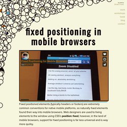
Web designers are used to fixing elements to the window using CSS’s position: fixed, however, in the land of mobile browsers, support for fixed positioning is far less universal and is way more quirky. I set up a demo to test fixed positioning support across mobile browsers. You can view the demo here. I was particularly curious to see how fixed positioning worked without disabling the user’s ability to scale the page. CSS Transforms and Floaty Bars.
On April 7th, Google launched a new version of Gmail for mobile for iPhone and Android-powered devices.
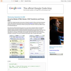
We shared the behind-the-scenes story through this blog and decided to share more of what we've learned in a brief series of follow-up blog posts. This week, I'll talk about different ways to animate the floaty bar. Even from the earliest brainstorming days for our new version of Gmail for iPhone and Android-powered devices, we knew we wanted to try something novel with menu actions: a context-sensitive, always-accessible UI element that follows conveniently as a user scrolls.
Thus, the "floaty bar" was born! It took us a surprisingly long time, experimenting with different techniques and interactions, to converge on the design you see today. Preparing Your Web Content for iPad: Technical Note TN2262: Preparing Your Web Content for iPad.