
45+ Best Responsive WordPress Themes – Spoil Your Mobile Visitors. A responsive WordPress theme is a theme build to adapt with the purpose of giving tablet and smartphone users a great experience.

This without maintaining multiple websites and multiple sets of content! For some time dedicated WordPress mobile themes was the best option, but recently responsive WordPress themes have been all over the place. There is no doubt that responsive web design is the new hot trend and so it is to use responsive CSS frameworks to implement the responsive layouts. With the rapid growth in number of smartphones and Internet enabled gadgets being sold world wide, it is time to take mobile web design serioust and ensure that your blog or business website is ready.
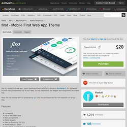
WordPress themes with responsive layouts makes this possible and at a reasonable cost. Having a responsive web design allows your website content to be displayed correctly to all users by adjusting the layout to accommodate screens of different sizes and orientation. Advertisement Index DeepFocus – MORE INFO. First - Mobile First Web App Theme. First is a mobile first web app / admin dashboard theme with flat ui based on Bootstrap 3, it’s lightweight but with many components suit to your need. it’s fully responsive, the widgets and components are mobile first.

Note: the live preview demo is protected by gzit, only the purchased file have the separate css and js files. Features: Lightweight Flat ui with clean style Many components Mobile widgets Base on Bootstrap 3 (v.2.0) Html5 Markup & CSS3 Easy colors change base on Color Scheme Slide and Fade carousel Panel and List group mobile widgets Enhanced lightweight Chart components Shift js let you move the Dom when screen change Change log v.3.3.1 – 15 April 14 - update to Bootstrap 3.1.1 - include open sans font v.3.3.0 – 24 January 14 - update to FontAwesome 4.0.3 - update to Bootstrap 3.0.3 v.3.2.3 – 19 October 13 - add flot chart v.3.2.2 – 25 September 13 - add Chrome app sample code - add invoice page - add portlet - add gallery - add Google map. Foundation: The Most Advanced Responsive Front-end Framework from ZURB. Reverie: Versatile HTML5 WordPress Framework.
Bones - The HTML5 Wordpress Starter Theme. Responsive Youtube Embed - Tutorials - Avex Designs. Responsive YouTube Embed Update: I was asked to write an article for .Net Magazine on this topic.

The article is more depth, suggesting some alternatives for embedding responsive videos in your web designs. Check it out in issue # 247, available October 8th 2013. I came across a small problem when adding a video from YouTube to one of my blog posts about the Childish Gambino website. Since this website is fully “responsive”, I needed the YouTube video to re-size depending on the browser size or device width. The fix was actually quite simple, and here is how. You will need to wrap the responsive youtube embed code with a <div> and specify a 50% to 60% padding bottom. First you will need to add the following to your style sheet. Next, edit add some HTML around your embed code. If the responsive YouTube embed worked, your videos should be responsive, and ready to view on Tablets and Mobile devices. Responsive YouTube Example I found this article on Web Designer Wall.
Cheers — John.