
10 Awesome Free Tools To Make Infographics. Advertisement Who can resist a colourful, thoughtful venn diagram anyway?

In terms of blogging success, infographics are far more likely to be shared than your average blog post. This means more eyeballs on your important information, more people rallying for your cause, more backlinks and more visits to your blog. In short, a quality infographic done well could be what your blog needs right now. Designing An Infographic Some great tips for designing infographics: Keep it simple! Ideas for infographic formats include: Timelines;Flow charts;Annotated maps;Graphs;Venn diagrams;Size comparisons;Showing familiar objects or similar size or value. Here are some great tutorials on infographic creation: Creating Your Infographic Plan and research.If required, use free software to create simple graphs and visualisations of data.Use vector graphic software to bring these visualisations into the one graphic.
Free Online Tools For Creating Infographics Stat Planet Hohli Creately New York Times Many Eyes. 50 Popular iPad Apps For Struggling Readers & Writers. Whether you’re the parent of a child with a reading disability or an educator that works with learning disabled students on a daily basis, you’re undoubtedly always looking for new tools to help these bright young kids meet their potential and work through their disability.
While there are numerous technologies out there that can help, perhaps one of the richest is the iPad, which offers dozens of applications designed to meet the needs of learning disabled kids and beginning readers alike. Here, we highlight just a few of the amazing apps out there that can help students with a reading disability improve their skills not only in reading, writing, and spelling, but also get a boost in confidence and learn to see school as a fun, engaging activity, not a struggle. Note: See also 15 Of The Best Educational Apps For Improved Reading Comprehension & 20 iPad Apps To Teach Elementary Reading Helpful Tools.
Action mapping: Design lively elearning and training. Freebie Friday – Portfolio Infographic Design Kit. For todays Freebie Friday we created an simple and easy to tweak portfolio Infographics design kit.
It is for those who are looking into updating their portfolio / CV and to make it stand out. The elements come in PDS and Ai files. The beauty of data visualization - David McCandless. To create his infographic about nutritional supplements, it took McCandless a month to review about 1,000 medical studies and design the visual.
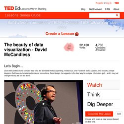
Is that level of effort surprising, and do you think it’s worth it? Try out the interactive version that’s available on McCandless’s website. What engaged or surprised you? What, if anything, would you change to improve the user experience? Online Diagram Software and Flowchart Software - Gliffy. The Anatomy Of An Infographic: 5 Steps To Create A Powerful Visual. Information is very powerful but for the most bit it is bland and unimaginative.

Infographics channel information in a visually pleasing, instantly understandable manner, making it not only powerful, but extremely beautiful. Once used predominantly to make maps more approachable, scientific charts less daunting and as key learning tools for children, inforgraphics have now permeated all aspects of the modern world. I designed a couple of infographics back in college, the need arising especially around the time Soccer World Cup fever spiked. It was a fun process representing the different groups, predicting winners in each group at each stage and creating a mock pairing of teams that would clash all the way leading upto the finals. I was a devout Argentinian supporter at the time. Infographics can appear daunting to some with the sheer amount of data they present, but designed in the right manner and step by step, they can actually be one of the most fun things you will ever create. 1. 2.
Make Your Own Infographic. Infographics are to data what storytelling is to an annual report: a more engaging way to help bring attention and understanding to your nonprofit’s cause.
Yesterday we looked at an interesting infographic that suggested a new way to view your volunteers. Today, let’s look at infographics in general – and resources to help your nonprofit get started on making your own. As Wikipedia explains, “Information graphics are visual devices intended to communicate complex information quickly and clearly”: Information graphics or infographics are visual representations of information, data or knowledge. These graphics are used where complex information needs to be explained quickly and clearly, such as in signs, maps, journalism, technical writing, and education. ...
For example, compare the Portrait of a Volunteer infographic we talked about yesterday with Pew Internet’s more conventional Portrait of a Twitter User, where a similar type of data is presented in a simple table. How To Create Outstanding Modern Infographics. In this tutorial you will learn that data doesn't have to be boring, it can be beautiful!

Learn how to use various graph tools, illustration techniques and typography to make an accurate and inspiring infographic in Adobe Illustrator. Start by using the Rectangle Tool (M) to draw a shape. Give it a subtle radial gradient too. The entire design is based on a grid of four columns. To make the columns first select the rectangle and drag a guide onto the centre of the shape. Condense the shape so it fits within the left-most guide and centre guide.