
Tagging. Timeline.swf (application/x-shockwave-flash Object) Thisissand.com. Data Visualization Tools. From navigating the Web in entirely new ways to seeing where in the world twitters are coming from, data visualization tools are changing the way we view content.

We found the following 16 apps both visually stunning and delightfully useful. Visualize Your Network with Fidg’tFidg’t is a desktop application that aims to let you visualize your network and its predisposition for different types of things like music and photos. Currently, the service has integrated with Flickr and last.fm, so for example, Fidg’t might show you if your network is attracted or repelled by Coldplay, or if it has a predisposition to taking photos of their weekend partying. As the service expands to support other networks (they suggest integrations with Facebook, digg, del.icio.us, and several others are in the works), this one could become very interesting.
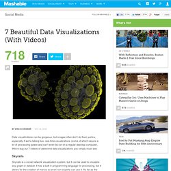
7 Beautiful Data Visualizations (With Videos) Data visualizations can be gorgeous, but images often don't do them justice, especially if we're talking live, real-time visualizations (some of which require a lot of processing power and can't even be run on a regular desktop computer).
We've dug out 7 videos of awesome data visualizations you simply must see. Skyrails Skyrails is a social network visualization system, but it can be used to visualize any graph or dataset. It has a built in programming language for processing, but it allows for the creation of menus so even non-experts can use it. As far as the actual visualizations go, they redefine awesomeness. Vuvox.