
A grid system for fixed and fluid layouts. Don't Overthink It Grids. The vast majority of websites out there use a grid.
They may not explicitly have a grid system in place, but if they have a "main content area" floated to the left a "sidebar" floated to the right, it's a simple grid. If a more complex layout presents itself, people often reach for a grid framework. They assume grids are these super difficult things best left to super CSS nerds. That idea is perpetuated by the fact that a lot of the grid systems they reach for are very complicated. Here's how I build grids. Context A block level element is as wide as the parent it's inside (width: auto;). Columns Let's start with a practical and common need: a main content area being 2/3 the width and a sidebar being 1/3 the width. How well do you know CSS display? The display property is one of the most important CSS properties we use for layout.
Most of us would have used block, inline and none. table and inline-block are also quite common. The new darling is definitely flex, because it’s a display property that was created specifically for layout. The upcoming grid (currently still being actively worked on) is another layout-specific property that we’ll soon have in our arsenal as well. This post grew much longer than I initially expected so feel free to skip to a subsection if you wish. Though I would really appreciate it if you took the time to read the whole post 😁.
Useful resources and inspiration for creative minds. Interactive 3D Mall Map. 25,600 Free Icons - The Largest Icon Pack Ever. Fontastic. Stackicons - Icon Fonts for Web Designers. Inverse trigonometric functions with Sass. You might think that math doesn't have a lot to do with writing stylesheets, but you can actually do some amazing things with a little math in CSS.
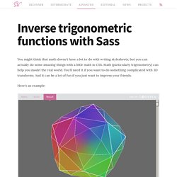
Math (particularly trigonometry) can help you model the real world. You'll need it if you want to do something complicated with 3D transforms. And it can be a lot of fun if you just want to impress your friends. Here's an example: This rotating icosidodecahedron is an advanced example of what you can do with trigonometry in CSS. I'm a bit of a trigonometry nerd. Manually compute the values I needed with a calculator (boring!) Naturally, I chose the second option! Fortunately for me, I stumbled across an article about writing sine and cosine functions in Sass using Taylor expansions. Disclaimer: This is about to get super Math heavy. Trigonometry 101 Before we get too far let's go back and review some basic high school math. This diagram should look somewhat familiar. Putting It All Together. The following code incorporates all of the methods that have been explained in the previous pages: <!
DOCTYPE html><html><head><title>My first web page</title></head><body><h1>My first web page</h1><h2>What this is</h2><p>A simple page put together using HTML. Kendo UI Gantt. The Kendo UI Gantt widget displays a set of tasks and dependencies, which are used to visualize project planning data.
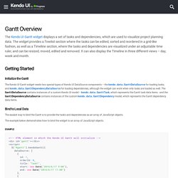
The widget provides a Treelist section where the tasks can be edited, sorted and reordered in a grid-like fashion, as well as a Timeline section, where the tasks and dependencies are visualized under an adjustable time ruler, and can be resized, moved, edited and removed. It can also display the Timeline in three different views – day, week and month. Getting Started Initialize the Gantt The Kendo UI Gantt widget needs two special types of Kendo UI DataSource components – the kendo.data.GanttDataSource for loading tasks, and kendo.data.GanttDependencyDataSource for loading dependencies, although the widget can work when only tasks are loaded as well.
Bind to Local Data The easiest way to bind the Gantt is to provide the tasks and dependencies as an array of JavaScript objects. The example below demonstrates how to bind the widget to an array of JavaScript objects. The Kendo UI Book. Recharts. Susy. All Susy3 API functions draw on the same shorthand syntax, which consists of two parts, seperated by the word of.

The first part describes a grid-spanwidth, location (if needed), and spread (in any order): // <width> at <location><spread> $span: span(2);$span-spread: span(3 wide); // location is only needed with asymmetrical grids $span-location-spread: span(3 at 2 narrow); The second half describes the grid-contextcolumns, container-spread, and gutters in any order: // of <columns><container-spread> set-gutters <gutters> $of-columns: of 6;$of-columns-spread: of 12 wide;$of-columns-gutters: of 12 set-gutters 2em; There are two primary functions, span and gutter, which can be used anywhere you need to calculate grid math. span accepts the full shorthand syntaxgutter only uses the second half (with or without of)