
CSS3 Tricks: Animated Buttons. We are starting a new column called CSS3 Tricks.
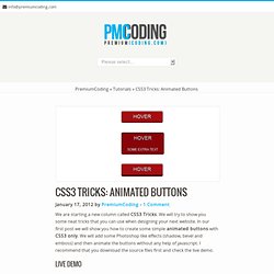
We will try to show you some neat tricks that you can use when designing your next website. In our first post we will show you how to create some simple animated buttons with CSS3 only. We will add some Photoshop like effects (shadow, bevel and emboss) and then animate the buttons without any help of javascript. I recommend that you download the source files first and check the live demo. CSS3 Tricks: Animated Hover Effects (3D Flip) In previous article of our CSS3 Tricks column I showed you how to create rounded buttons and then animate them with CSS3 only.
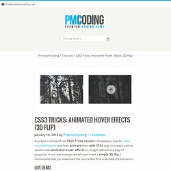
In today’s tutorial we will make animated hover effects on images without any help of javascript. In our last example we will even make a simple 3D flip. I recommend that you download the source files first and check the live demo. Download Animated Hover Effects (3D Flip) (1193) CSS3 Tricks: Jumping Featured Boxes. In today’s tutorial we will create a set of featured boxes that will create a nice text flying effect when you move your mouse over them.
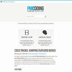
We will take advantage of the CSS3 custom animations and create a set of our own animations. I recommend that you download the source files first and check the live demo. Simply move your mose over the featured boxes to see the effect. Download CSS3 Tricks: Jumping Featured Boxes (1371) We will define four boxes that will use the same structure. <div class="one_fourth"><div class = "boxImage"><img src = "images/321.png"></div><h2>MOVIE CLIP</h2><div class = "boxDescription">Lorem ipsum dolor sit amet, consectetuer adipiscing elit, sed diam nonummy nibh euismod tincidunt ut laoreet</div></div> ... three other boxes... The syntax for other three boxes is the same and all you need to do is copy the code three more times.
We will first define CSS for the whole container: In next we need to design our containers. It is now time to apply the animation. Annotation Overlay Effect with CSS3. A tutorial about how to create an overlay effect to show some more details of an item or image.
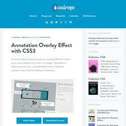
The effect is CSS-only and uses a combination of the :checked pseudo-class with the sibling combinator. Seminar Registration Form with jQuery. Dynamic Order Form. jQuery Circulate. Prereqs Requires the jQuery Library as well as the Easing plugin.
Usage / Options / Defaults. CSS3 Generator. Fontello - easy iconic fonts composer. HTML for Icon Font Usage. Where are we at right now in terms of the best markup for using icon fonts?
Let's cover some options I think are currently the best. You want the icon to enhance a wordYou want the icon to stand alone but still be functional or informational And our major goals here are: As good of semantics as we can getAs little awkwardness for screen readers as possible This ground has been treaded before, but I think the following techniques are a small step forward. Graphical CSS Rollover Menu - Webvamp. We looked previously at the Apple menu and how they use a single image sprite to run their menu system.
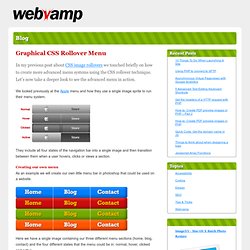
They include all four states of the navigation bar into a single image and then transition between them when a user hovers, clicks or views a section. Creating our own menu As an example we will create our own little menu bar in photoshop that could be used on a website. Here we have a single image containing our three different menu sections (home, blog, contact) and the four different states that the menu could be in: normal, hover, clicked and active.
Creating the code The following case may look long and complex, but it is really very simple and can be broken up into four sections which have been commented in the CSS. CSS Buttons with Pseudo-elements. In this tutorial, I'll show you how to create buttons with a twist, using just one anchor tag per button and the great power of CSS.
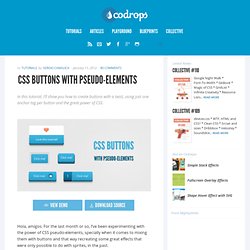
View demo Download source Hola, amigos. For the last month or so, I’ve been experimenting with the power of CSS pseudo-elements, specially when it comes to mixing them with buttons and that way recreating some great effects that were only possible to do with sprites, in the past. In this tutorial, I’ll show you how to create buttons with a twist, using just one anchor tag per button and the great power of CSS. The font used is ‘Open Sans’ by Steve Matteson. CSS Buttons with Pseudo-elements. Rotating Words with CSS Animations. Blur Menu with CSS3 Transitions. There are so many great things we can do with the additional properties and possibilities that CSS3 brings along.
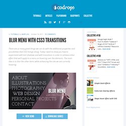
Today I want to show you how to experiment with text shadows and with transitions in order to achieve a blur effect that we'll apply to a menu on hovering over the elements. The main idea is to blur the other items while enhancing the one we are currently hovering. Page Transitions with CSS3. In the last few years, we've seen a lot of single page websites lying around the internet, most of them using JavaScript for some transitions effect.
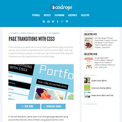
Well, now I'm gonna teach you how you can have your own, but instead I'll be using CSS Transitions and the :target property to do all the magic. View demo Download source In the last few years, we’ve seen a lot of single page websites lying around the internet, most of them using JavaScript for some transitions effect. Scrolls Etsy.com - The fastest way to find the best handmade products on Etsy.com! Text Blur effect with CSS and JQuery. Blur Menu with CSS3 Transitions. Arctext.js - Curving text with CSS3 and jQuery. Rotating Words with CSS Animations. Using CSS Animations we will change or rotate some parts of a sentence.
View demo Download source In today’s tutorial we’ll create another typography effect. The idea is to have some kind of sentence and to rotate a part of it. We’ll be “exchanging” certain words of that sentence using CSS animations. Please note: the result of this tutorial will only work as intended in browsers that support CSS animations. So let’s start! In the following, we’ll be going through demo 2. The Markup. Rotating Words with CSS Animations. Cross-Browser CSS Reflections, Glows and Blurs. Reflections can add an interesting dimension to objects, lending a touch of realism and giving them context within their surroundings. Let's take a look at achieving reflections with CSS and we'll examine glowing and cross-browser blurring for good measure too. Assumptions Following this tutorial works on a number of assumptions: You know your HTML.You are familiar with CSS and CSS2 selectors.If you want to recreate the example exactly, you should know how box-shadow works.
It isn't the key to this tutorial, so you'll need to figure it out yourself. Box-reflect vs. Box-reflect is a CSS property which is meant for precisely this purpose: making reflections. At the time of writing both properties are only supported by webkit (Chrome and Safari).The implementation is buggy to say the least. When Microsoft introduced their filter effects (think of the IE 4 era, nested tables for layout and images for reflections), the filthy filters didn't apply to the whole of any given element. Choices… Edit this Fiddle. Blur Effect with CSS and Jquery [unsaved] Blurry Menu. Fun With Blurred Text. Making text blurry is pretty easy. Just make the color transparent and set a text-shadow. That's dangerous though, because there are browsers that support color but not text shadow, so the end result would be totally invisible text. Of course, the solution is to feature detect and only apply this effect if you are in a browser that supports it: The color of the shadow is the only thing visible, so make sure it has enough contrast enough to be seen.
Thems the basics. By The Letter Using Lettering.js, we can inject spans into a word. Blur Effect with CSS and Jquery. How to Create an Awesome Blurry Menu Using CSS. Today we will get a perfect and simple blurry menu effect via CSS. In addition to it, we will get a useful multiple borders effect. To achieve this effect you will need to have a basic understanding of HTML and CSS. We will work with IE filters and text-shadow, but there is no reason to worry if you have never used it, they’re all well and simply explained. And the best part is that anything done here works almost anywhere, from IE6 to real browsers. So, let’s work! You can check the demo here. Step 1 – Basic HTML Let’s start defining our basic structure. <ul> & <li> – As a menu is an unordered list of elements, it must be inside a ul. At the end of this step, your HTML should be something like this: