
Create a Sticky Note Effect in 5 Easy Steps with CSS3 and HTML5. Create a Sticky Note Effect in 5 Easy Steps with CSS3 and HTML5 In this tutorial, you’ll learn how to transform an HTML list into a wall of “sticky notes” that look and work like the following… The effect is built up gradually and works on the latest Webkit browsers (Safari, Chrome), Firefox and Opera.
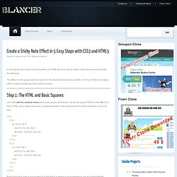
Other browsers simply get some yellow squares. Step 1: The HTML and Basic Squares Let’s start with the simplest version that works across all browsers. Nicer Navigation with CSS Transitions - GetHiFi. Update: March 21, 2014 - We have an updated post after years of practice with these techniques.
Newer versions of Apple's Safari web browser (and Google Chrome, which is also based on Webkit) support a vendor-specific implementation of the CSS3 Transition property. CSS Transitions are a very powerful effect that can eliminate the use of JavaScript for many common effects. Quick Overview. CSS Animation. We have another cool new CSS feature to talk about: animation specified in CSS.
There is a lot of ground to cover here, so we’ll start with the basics first. The simplest kind of animation that we’ve added support for is called a transition. Normally when the value of a CSS property changes, the rendered result is instantly updated, with the element in question changing immediately from the old property value to the new property value. Transitions describe how to instead execute an animation from the old state to the new state over time. Transitions are specified using the following properties: transition-property – What property should animate, e.g., opacity.transition-duration – How long the transition should last.transition-timing-function – The timing function for the transition (e.g., linear vs. ease-in vs. a custom cubic bezier function).transition – A shorthand for all three properties. Webkit transition.
Pure CSS folded-corner effect. Create a simple CSS folded-corner effect without images or extra markup.
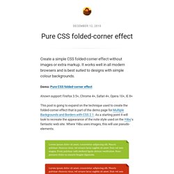
It works well in all modern browsers and is best suited to designs with simple colour backgrounds. Demo: Pure CSS folded-corner effect Known support: Firefox 3.5+, Chrome 4+, Safari 4+, Opera 10+, IE 8+ This post is going to expand on the technique used to create the folded-corner effect that is part of the demo page for Multiple Backgrounds and Borders with CSS 2.1. As a starting point it will look to recreate the appearance of the note style used on the Yiibu‘s fantastic web site.
Nothing complicated. Adding position:relative makes it possible to absolutely position the pseudo-element. A Comprehensive Guide to CSS Resets. This guide examines the infinite-like variety of CSS resets created by web developers and designers across the world.
While almost all of these CSS resets are generally provided free for public use (many through Creative Commons licensing), it is incumbent upon you to check the terms of use before putting them to use in your projects. This guide follows Part 1, where the history of CSS resets was discussed; you’re advised to read that before this one to get the most out of this guide. Menu Transitions.
Since I started helping out over at Widgetopia, I’ve been paying much closer attention to Web menus and how they work.
The aspect of menus that’s been on my mind the most is the menu transition often used in Flash UIs, such as the “choose a model” menu on the current Volkswagon homepage. What intrigues me about menu transitions is not their effects, but their experience. As an experiment of sorts, I thought a Nielsenesque miniguide to menu transitions would be fun to write. What are Menu Transitions? Menu transitions are visual (and sometimes audio) effects that connect two separate menu states. 100 Exceedingly Useful CSS Tips and Tricks. You can never have too much of a good thing–and two good things we rely on in our work are tips and tricks.
Nuggets of information, presented clearly and succinctly, help us build solutions and learn best practices. In a previous article, we shared a jam-packed list of 250 quick web design tips. It seems only right to continue the trend by showcasing 100 fresh–and hopefully useful–CSS tips and tricks. General Not everything in this list was easy to categorize. Conditional comments have been a godsend for resolving Internet Explorer inconsistencies. Animation Using CSS Transforms < CSS.
Tweet363 Shares Share0 Tweets37 Comments The examples on this page will work now in Firefox, Safari, Chrome, Opera and Internet Explorer 10.

In older browsers you will see either no effects, or the transforms taking place without any animation. The animations presented below involve setting up a transformation to take place in response to a mouseover or other event. Then, rather than applying the effect instantly, we assign a transition timing function which causes the transformation to take place incrementally over a set time period.
There are also other kinds of animation available, including @keyframes for perpetual motion, and requestAnimationFrame which gives complete control over the timing and path. CSS Transitions 101. Despite people’s expectation of change and movement on the screen, CSS and HTML have few controls that allow you to design interactivity, and those that exist are binary.
A link is either one color or another. A text field is either one size or another. A photo is either transparent or opaque. No in-betweens from one state to the next. No transitions. This has led to most web pages feeling abrupt, with elements shifting and changing ungracefully. Yes, we can use DHTML and leverage the jQuery library for transitions, but this requires a lot of code for something that should be very simple. Vertical Centering in CSS. Yuhu's Definitive Solution with Unknown Height Though there is a CSS property vertical-align, it doesn't work like attribute valign in HTML tables.
CSS property vertical-align doesn't seem to be able to solely solve this problem: Definition of the problem there is an area (e.g. <div>) with known height in the page an internal object (typically long text in <div>) is inside the area and I don't know its height (e.g. because its content is dynamically generated from a database) I want to center the object vertically within the area without using HTML tables.
No general solution was known until September 2004. Display an example of the vertical centering in your browser. The idea The keystone of the solution for Internet Explorer 6, 7 or quirk mode is this: the internal object is absolutely positioned in half of the area height. Solution for standard browsers like Mozilla, Opera, Safari etc. Understanding border-image. The new CSS3 property border-image is a little tricky, but it can allow you to create flexible boxes with custom borders (or drop shadows, if that's your thing) with a single div and a single image. In this article I explain how the border-image shorthand property works in today's browsers. The basic idea. Semantic CSS3 Lightboxes.
The rise of jQuery, MooTools, and JavaScript frameworks has given many web designers a new lease on life, adding more unique functionality into their sites. Most notably among the various cool and interesting features you can find being injected into a design is the humble lightbox (modal window). If you’ve ever come across a link or image which — upon clicking — increases in size and where the rest of the screen gets "shaded" to focus on the content, you’ll know what I’m talking about. This tutorial aims to showcase a method of displaying content based on the lightbox, which is web accessible and (excluding Internet Explorer) will require no scripting at all. Sound like fun? Well, let’s explore the subject further! How to Create Inset Typography with CSS3. In this tutorial, we’ll create inset type, a popular text treatment, using CSS.
If you follow Six Revisions closely, you’re probably thinking: "Jacob already wrote a Photoshop tutorial on how to do that. " That is correct, but this time we are going to do it using only CSS. I set out to recreate the How to Create Inset Typography in Photoshop tutorial, and after experimenting with some fresh and new CSS3 properties, I was able to make a similar type treatment. We’ll do all of this in less than ten lines of CSS. Step 1: The HTML markup Let’s first set up the HTML, which is super simple. Snazzy Hover Effects Using CSS. Using the CSS @import Rule. Even the most complex style sheet starts out with a single rule.
But when you’re working on a particularly massive and complex website, over time your style sheet will inevitably start to reflect the site’s size and complexity. And even if you employ every trick for organizing your CSS in the book, you might find that the sheer size of the file is simply overwhelming. At that point, you might want to consider splitting your style sheet up into several smaller CSS files. That’s when the @import rule can come in quite handy. The @import rule is another way of loading a CSS file. Css gradients in Firefox 3.6. Firefox 3.6 includes many CSS improvements. CSS transitions - MDC Doc Center. This is an experimental technologyBecause this technology's specification has not stabilized, check the compatibility table for usage in various browsers. Also note that the syntax and behavior of an experimental technology is subject to change in future versions of browsers as the specification changes. Make dropdown menu expand left rather than right if screen edge.
Jani - CSS positioning tricks. Rounded Corners in Internet Explorer. The ability to create rounded corners with CSS opens the possibility of subtle design improvements without the need to include images. CSS rounded corners thus save us time in creating images and requests to the server. Today, rounded corners with CSS are supported by all of the major browsers: Safari, Chrome, Internet Explorer, Opera, and Firefox.
Let's look at border-radius syntax, caveats, and Internet Explorer support. Syntax and Standards. CSS3 Box Shadow in Internet Explorer [Blur-Shadow] For a recent project I was given the task of creating a lightbox style help dialog. The dialog was intended to highlight content of an odd or unknown size in addition to the more controlled information box. CSS Shorthand. CSS Shorthand is a very useful thing to know as it will keep your style sheets more organized and also keep the file sizes down. One of the nicest features supported in CSS2 is the ability to use shorthand as well as longhand. Wanted: Layout System. CSS Techniques Roundup - 20 CSS Tips and Tricks. Top 10 CSS Sites. 0Google + Top 10 CSS Table Designs - Smashing Magazine. Classes Vs Ids. Create Your Own @font-face Kits. I Shot the Serif - Free Fonts. Learn CSS Positioning in Ten Steps: position static relative absolute float.
Osez HTML5 et CSS3 ! - Alsacréations. CSS3 Border Image Experiments : Nora Brown Design. CSS gradients for all web browsers, without using images. Css Zen Garden: The Beauty in CSS Design. CSS3 Gradient Buttons. How to Build a Kick-Butt CSS3 Mega Drop-Down Menu.
Fixed Header & Footer Layout: A Beginner’s Guide. Advanced CSS Layouts: Step by Step. How to design a sexy header for your site using CSS. My Top Ten CSS Tricks. DIV Based Layout with CSS. Ten CSS tricks you may not know. Reset Reloaded. Different hover states for links on same page. Advanced usage. CSS Backgrounds and Borders Module Level 3. Using Percent.