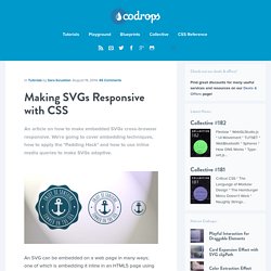

Making SVGs Responsive with CSS. An article on how to make embedded SVGs cross-browser responsive.

We're going to cover embedding techniques, how to apply the "Padding Hack" and how to use inline media queries to make SVGs adaptive. An SVG can be embedded on a web page in many ways; one of which is embedding it inline in an HTML5 page using the <svg> tag. The other commonly used techniques include embedding it as an image using the <img> tag, embedding it using the <object> tag, using an iframe, and as a CSS background image. Conceptually, making an SVG scale as its container scales should be as simple as removing any fixed height and/or width, and specifying a viewBox attribute value. However, due to different browser implementations and inconsistencies, the web isn’t all ponies and rainbows, and making SVGs fluid isn’t quite that straightforward, because the way browsers determine the dimensions of an SVG when embedded in different ways isn’t consistent across all of them. Responsive Images: If you're just changing resolutions, use srcset.
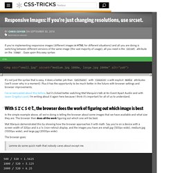
By Chris Coyier On September 30, 2014 responsive images If you're implementing responsive images (different images in HTML for different situations) and all you are doing is switching between different versions of the same image (the vast majority of usage), all you need is the srcset attribute on the <img>.

Gaze upon this easy syntax: It's not just the syntax that is easy, it does a better job than <picture> with <source>s with explicit media attributes (we'll cover why in a moment). Plus it has the opportunity to be much better in the future with browser settings and browser improvements. I've screencasted about this before, but it clicked better watching Mat Marquis's talk at An Event Apart Austin and with Jason Grigsby's post. #With srcset, the browser does the work of figuring out which image is best In the simple example above, all we're doing is telling the browser about some images that we have available and what size they are. The browser goes: Now another browser visits the site. Making SVGs Responsive with CSS. Webflow CSS Playground. Showcase of Beautiful Responsive WordPress Themes - Designhash. In today’s time, more and more people are using their mobile and tablet when browsing the internet.

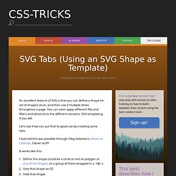
To get more out of this steady increase of mobile and tablet users. You need to go with the flow and it is a necessity to get more audience, means more income and more traffic to your site. In order for you to achieve this, you will need a template that can render in different resolution devices. Here are beautifully made responsive WordPress Themes to gain unfair advantage against competitors and attract more traffic to your site. Check it out every template and see for yourself. Modernize – Flexibility of WordPress Modernize is a new era of wordpress theme. Bigbang – Responsive WordPress Template All pages are W3C Valid. Raiden — A Minimal WordPress Theme with Style Raiden is an elegant personal blogging WordPress theme with refined typography and aesthetics. Central – Versatile, Multi-Purpose WordPress Theme CENTRAL is a highly versatile multi-purpose WordPress theme. SVG Tabs (Using an SVG Shape as Template) An excellent feature of SVG is that you can define a shape (or set of shapes) once, and then use it multiple times throughout a page.

You can even apply different fills and filters and whatnot to the different versions. SVG templating, if you will. Let's see if we can put that to good use by creating some tabs. I learned this was possible through Oleg Solomka's article on Codrops. Clever stuff! It works like this: Define the shape (could be a circle or rect or polygon or any of the shapes, or a group of them wrapped in a <g>).Give that shape an ID.Hide that shape.Use the shape where needed with <use>. That looks like this in HTML: You can then reference those different uses of the template individually and do whatever you like to them. Demo: Button Maker. Cycle2. Overview Cycle2 is a versatile slideshow plugin for jQuery built around ease-of-use.

It supports a declarative initialization style that allows full customization without any scripting. Simply include the plugin, declare your markup, and Cycle2 does the rest. Highlights: Supports all browsers Declarative: no scripting needed! How it Works It's very simple really, even your grandmother could use it. Include jQuery and the Cycle2 plugin on your page.
Web Fonts. Give ’n’ Go. Web Development. RWD. Wordpress Development. UI Development. Apps & Plugins.