The Village of Arts and Humanities. National Guild - Engaging Adolescents – National Guild for Community Arts Education. Meaningful engagement in arts education can have a life-changing impact on teens while benefiting your organization and your community.

Engaging Adolescents: Building Youth Participation in the Arts describes a holistic approach that integrates arts learning with principles of youth development. If you are developing new programs and services for teens or rethinking and strengthen existing programs, you'll learn from the principles and strategies explored in this publication.
Engaging Adolescents defines engagement and explains its benefits for both teens and arts organizations. It describes adolescents’ key developmental needs, reviews points to consider when building relationships with them, and outlines nine fundamental strategies for developing successful programs. Profiles of eight outstanding programs illustrate the strategies in action and contain practical advice culled from practitioners’ experience. --- H. ConnectedPRC. What Love Looks Like. Religionsmap.png (1616×1049) Visualización de datos: nuevas tendencias y herramientas. La plataforma Datavisualization.ch ha crecido y se ha convertido en uno de los sitios web más importantes y populares de Europa dedicado al desarrollo de visualizaciones de datos.
Siguiendo las tendencias y revisando tecnologías, es una fuente de información útil tanto para los interesados en entrar en el campo del periodismo de datos como para los periodistas de datos que quieren estar actualizados sobre los desarrollos en este campo. DataDrivenJournalism.net entrevistó a Benjamin Wiederkehr, socio fundador de datavisualization.ch y del estudio de diseño Interactive Things, para descubrir qué es lo que un periodista de datos debe saber sobre herramientas, tendencias y pros y contras de la visualización de datos. ¿Cuáles son las últimas tendencias en la visualización de datos? Visualization chapter from Fundamentals of Computer Graphics, Third Edition. From book Fundamentals of Computer Graphics, Third Edition Tamara Munzner Chapter 27, p 675-707, of Fundamentals of Graphics, Third Edition. by Peter Shirley and Steve Marschner, with additional contributions by Michael Ashikhmin, Michael Gleicher, Naty Hoffman, Garrett Johnson, Tamara Munzner, Erik Reinhard, Kelvin Sung, William B.
Thompson, Peter Willemsen, Brian Wyvill. Journalism in the Age of Data: A Video Report on Data Visualization by Geoff McGhee. MapsFusionTables. Emotional Data Visualization: Periscopic's "U.S. Gun Deaths" and the Challenge of Uncertainty. Alberto Cairo discusses Periscopic's "U.S.
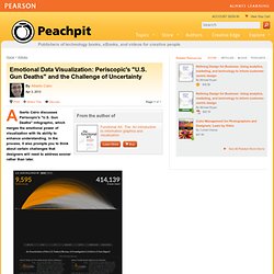
Gun Deaths" infographic, which merges the emotional power of visualization with its ability to enhance understanding. In the process, it also prompts you to think about certain challenges that designers will need to address sooner rather than later. The words "emotion" and "data" aren't paired very often. That's unfortunate, albeit understandable. Data visualisation, maps and timelines on a shoestring. 4 formas de mentir con gráficos de datos en una presentación. HomeVisualización4 formas de mentir con gráficos de datos en una presentación 4 formas de mentir con gráficos de datos en una presentación nov 24 2011.
Dipity - Find, Create, and Embed Interactive Timelines. Estadão Dados: "Basômetro" - Meça a base do governo no Congresso. The Functional Art: An Introduction to Information Graphics and Visualization. Spatial Information Design Lab. Cómo hacer un mapa interactivo con Google maps y publicarlo en Word... Crear Gráficos en Pastel. ChronoZoom. Cosmos Earth Life Prehistory Humanity 12 Ga.
SIMILE Widgets. Statistics on Turks and Caicos Islands. facts and figures, stats and information on Turks and Caicos Islands economy, crime, people, government, health and education. 1 maps and 1 flags. Data Desk - Los Angeles Times. EU Arms Exports. Preguntas Frecuentes.

Chart Types Categorized Posts The Excel Charts Blog. If you want to make a choropleth/thematic map in Excel without programming perhaps conditional formatting is all you need. Here is how to do it: Select a few hundred columns and rows; Set width and height to 3 (more or less, depending on the resolutions you want); Read more → It’s very simple, really: you do not compare proportions in a pie chart. Because a pie chart is not a comparison chart, it’s a part-to-whole chart. When you do this: what you really want to do is to compare each slice to the whole, like this: because, Selección de herramientas "Hágalo Ud. mismo" para hacer sus propias visualizaciones de datos. - Manual de Periodismo de Datos.
Community Driven Disaster Relief. Building good infographics part 1: Just because you can say it doesn’t mean you can show it. Every few months, I receive a call or an e-mail asking me the same thing: I want to set up an inhouse infographics team/process that spits out all the cool data we have sitting around on the cutting room floor. My response is usually the same: grab a cup of coffee, sit back, and be prepared to walk away with more questions than answers. Inevitably, at the end of an hour-long conversation, I hang up the phone and walk away thinking–”oh, I wish I’d said that.” So, this post is prompted by all the things I wish I had said, and all the things I wish I had known as I was starting out. BBC Four - The Joy of Stats. Hans Rosling's 200 Countries, 200 Years, 4 Minutes - The Joy of Stats - BBC Four. Espinoza: “Con unidad se pueden lograr cosas grandes”
Visualization Across Disciplines. In recent years, visualization has become an all-purpose technique for communicating and exploring data within the humanities.
There are a wide availability of tools offering different points of entry from IBM’s Many Eyes to Gephi to Tapor 2.0. Projects like the Visual Thesaurus, Mapping the Republic of Letters, and Hypercities, among countless others, all engage with visualization as an integral part of their scholarship. Designing Narratives. The New Mediators creates communications that are easy to understand not only through the use of a simple design language, but the application of narrative to complicated subjects as well.
This application of a narrative to an often non-narrative subject is key to the New Mediators’ approach. Such an approach requires bringing the lens of narrative analysis to the research phase of a project. The New Mediators uses style of narrative analysis related to that of Vladimir Propp. The New Mediators (subtitulado en Español) Andytow. John Snow's data journalism: the cholera map that changed the world. How often does a map change the world?
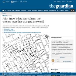
In 1854, one produced by Doctor John Snow, altered it forever. In the world of the 1850s, cholera was believed to be spread by miasma in the air, germs were not yet understood and the sudden and serious outbreak of cholera in London's Soho was a mystery. So Snow did something data journalists often do now: he mapped the cases. The map essentially represented each death as a bar, and you can see them in the smaller image above. It became apparent that the cases were clustered around the pump in Broad (now Broadwick) street.
Data Points Data Visualization Gurus. Crowd Chart. Computational and Data Journalism. The Noun Project, Investigative Journalism Icons now Available. Superpacks. Drones. Gerrymandering. Dark Money. About Charles Apple. A couple of charting debacles popped up this week of which you might want to take note. First, Reuters moved this fever chart showing the number of gun deaths in Florida going up after the state enacted its “stand your ground” law in 2005. Just one little problem: The artist — for some unknown reason — elected to build the chart upside down from the usual way a fever chart is drawn. Meaning the chart appears to show the number of gun deaths going down… if you focus on the white territory and consider the red to be the background of the chart.
ConnectedPRC. *33 sitios sobre Visualizaciones: herramientas, blogs, recursos y proyectos. Si te interesa el tema y su aplicación, qué mejor que explorar por ti mismo, a continuación una lista con links directos para guiarte sobre algunos sitios especializados y con distintas funcionalidades y enfoques. *Teoria de la visualización: algunos consejos de Edward Tufte. Josef Koudelka, “The urge to see” MIchael Florent van Langren, “La verdadera longitud por mar y tierra” Color Theory and Mapping. Originally published by Miranda Mulligan, executive director of Northwestern University Knight Lab, and formerly design director for digital at the Boston Globe, on Source under a Creative Commons Attribution 3.0 licence.
Of all the forms of non-verbal communication, the most instantaneous method of conveying messages and meaning through visual cues is color. In our design work, we use white space, typography and color theory to create and support the information architecture of a composition or a story. Information layering—organizing large amounts of data into short, digestible chunks—is a method for providing multiple points of entry into a story package, presentation, or layout. Gephi, an open source graph visualization and manipulation software. Visualising Data. International Networks Archive \\ Remapping Our World. Information Is Beautiful. [nytlabs] Datavisualization.ch. Chart Wars: The Steering Power of Data Visualization. How to Become a Data Visualization Freelancer.
We Feel Fine / by Jonathan Harris and Sep Kamvar. A toolbox for revolution. Explore Beautiful Trouble. Out of Sight, Out of Mind: A visualization of drone strikes in Pakistan since 2004. Which Country Uses the Most Oil? History - Timelines - British Timeline. A Periodic Table of Visualization Methods. Big Data Week 2013. Introducing Data Stories. You Are Your Words - AHD. Create beautiful dynamic data driven maps. Data Visualizations, Challenges, Community. How to Find the Right Chart Type to Represent your Numeric Data. 22 Feb 2016 Charts help you visualize numeric data in a graphical format but the problem is there are just too many types of charts to choose from.
This diagram will help you pick the right chart for your data type. couch mode print story. Data Visualization, Infographics, and Statistics. Tagxedo - Word Cloud with Styles. Visualizing Data at the Oxford Internet Institute. Many Eyes. Introduction to Data Visualization with R and ggplot2. Blog About Infographics and Data Visualization - Cool Infographics. Simply Statistics. Stories Through Data. Site of Lucas Zanotto. Chart Porn. La iguana ilustrada. Chart Selection, Art and Science. Choosing the right chart for data presentation isn’t easy -- even if you do it for a living.
Art. Big ideas worth pursuing. Spatial Analysis. Gallery · mbostock/d3 Wiki. Wiki ▸ Gallery Welcome to the D3 gallery! Courses. In Maps We Trust. Conceptual Map — Varieties of Democracy. Medialab-prado. A visual exploration on mapping complex networks. Sign Design Society. The Functional Art: An Introduction to Information Graphics and Visualization. Visualización de la información: la base del conocimiento enlazando ideas de forma gráfica « Inteligencia en el Negocio. Descifrando el 3.0…
Mapping Complex Information. Theory and Practice. Sheila Pontis. Sheilapontis.files.wordpress.com/2010/02/spanish.pdf. New ET Writings, Artworks & News.