
Collapse Of The Wintel Monopoly. A full-text visualization of the Iraq War Logs. Update (Apr 2012): the exploratory work described in this post has since blossomed into the Overview Project, an open-source large document set visualization tool for investigative journalists and other curious people, and we’ve now completed several stories with this technique.

If you’d like to apply this type of visualization to your own documents, give Overview a try! Last month, my colleague Julian Burgess and I took a shot a peering into the Iraq War Logs by visualizing them in bulk, as opposed to using keyword searches in an attempt to figure out which of the 391,832 SIGACT reports we should be reading. Other people have created visualizations of this unique document set, such as plots of the incident locations on a map of Iraq, and graphs of monthly casualties.
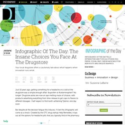
We wanted to go a step further, by designing a visualization based on the the richest part of each report: the free text summary, where a real human describes what happened, in jargon-inflected English. And it works. Infographic Of The Day: The Insane Choices You Face At The Drugstore. Just 10 years ago, getting something for a headache or a cold at the drugstore was a simple enough affair: Ibuprofen or Acetaminophen?

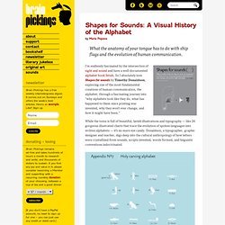
No longer: Drugstore aisles are now an eye-melting maze of choices, with products advertising everything from time-release to gel-caps to flavors to different dosages. I half-expect to find tooth-whitening Tylenol, one day soon. Shapes for Sounds: A Visual History of the Alphabet. By Maria Popova What the anatomy of your tongue has to do with ship flags and the evolution of human communication.

I’m endlessly fascinated by the intersection of sight and sound and have a well-documented alphabet book fetish. So I absolutely love Shapes for sounds by Timothy Donaldson, exploring one of the most fundamental creations of human communication, the alphabet, through a fascinating journey into “why alphabets look like they do, what has happened to them since printing was invented, why they won’t ever change, and how it might have been.” While the tome is full of beautiful, lavish illustrations and typography — like 26 gorgeous illustrated charts that trace the evolution of spoken languages into written alphabets — it’s no mere eye candy. Donaldson, a typographer, graphic designer and teacher, digs deep into the cultural anthropology of how letters were crystallized from sounds, scripts invented, words formed, and linguistic conventions indoctrinated.
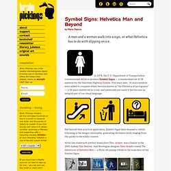
Donating = Loving. Symbol Signs: Helvetica Man and Beyond. By Maria Popova A man and a woman walk into a sign, or what Helvetica has to do with slipping on ice.

In 1974, the U.S. Department of Transportation commissioned AIGA to produce Symbol Signs — a standardized set of 34 symbols for the Interstate Highway System. Five years later, 16 more symbols were added to complete what’s become known as “the Helvetica of pictograms” — a 50-piece symbol set so iconic and universally pervasive it has become an integral part of our visual language. But beyond their practical application, Symbol Signs have amassed a cultish following in the design community, generating derivative work ranging from the quirky to the wildly creative.
Digging Into the Relationships in Sunlight’s Twitter Lobbyist List. Enquête 2014 sur l'utilisation de 529cbe2d9536f1ce41009dcf - Mardi, 08 Avril 2014 Question : 1 sur 4 Comment évalueriez-vous 529cbe2d9536f1ce41009dcf sur une échelle de 1 à 5 (1 étant la meilleure note) ?

Question : 2 sur 4 À partir d'où utilisez-vous 529cbe2d9536f1ce41009dcf ? Question : 3 sur 4 Combien de fois utilisez-vous 529cbe2d9536f1ce41009dcf ? Question : 4 sur 4 Naviguez-vous sur 529cbe2d9536f1ce41009dcf sur votre téléphone mobile ? Envoi de réponses ... ©2014 All Rights Reserved. Your privacy is important to us. Stefanie Posavec on Her Obsessive Analog Data Visualization. Visualize This: How to Tell Stories with Data. By Maria Popova How to turn numbers into stories, or what pattern-recognition has to do with the evolution of journalism.

Data visualization is a frequent fixation around here and, just recently, we looked at 7 essential books that explore the discipline’s capacity for creative storytelling. Today, a highly anticipated new book joins their ranks — Visualize This: The FlowingData Guide to Design, Visualization, and Statistics, penned by Nathan Yau of the fantastic FlowingData blog. (Which also makes this a fine addition to our running list of blog-turned-book success stories.) Yu offers a practical guide to creating data graphics that mean something, that captivate and illuminate and tell stories of what matters — a pinnacle of the discipline’s sensemaking potential in a world of ever-increasing information overload.
For a historical perspective on infographics, be sure to see the story of Otto Neurath’s Isotype. Donating = Loving Brain Pickings has a free weekly newsletter. Share on Tumblr. OpenBible.info.