
Who Made That Escape Key? So You Need a Typeface. Typography in 7 Minutes: A PBS Micro-Documentary. By Maria Popova Visibility, invisibility, and what the spirit of letters has to do with the meaning of text.

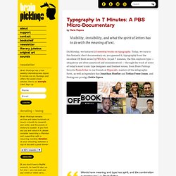
On Monday, we featured 10 essential books on typography. Today, we turn to this fantastic short documentary on, you guessed it, typography from the excellent Off Book series by PBS Arts. In just 7 minutes, the film explores type — ubiquitous yet often unnoticed and misunderstood — through the work of some of today’s most iconic type designers and freshest voices, from Brain Pickings favorite Paula Scher to our friends at Hyperakt, masters of the infographic form, as well as legendary duo Jonathan Hoefler and Tobias Frere-Jones, and Pentagram prodigy Eddie Opara. Words have meaning and type has spirit, and the combination is spectacular.” ~ Paula Scher The most challenging part of working on an infographic is taking all the available data and deciding what is the most important bit of information that we need to communicate. Share on Tumblr. Ira Glass on the Secret of Success in Creative Work, Animated in Kinetic Typography.
Cultural Connectives: Understanding Arab Culture Through Typography. By Maria Popova What typography has to do with cross-cultural understanding and linguistic minimalism.

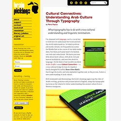
I’m obsessed with language, such a crucial key to both how we understand the world and how the world understands us. In today’s political and media climate, we frequently encounter the Middle East in the course of our daily media diets, but these portrayals tend to be limited, one-note and reductionist. We know precious little about Arab culture, with all its rich and layered multiplicity, and even less about its language. On the heels of last month’s excellent Arabic Graffiti comes Cultural Connectives — a cross-cultural bridge by way of a typeface family designed by author Rana Abou Rjeily that brings the Arabic and Latin alphabets together and, in the process, fosters a new understanding of Arab culture. The book jacket unfolds into a beautiful poster of a timeless quote by Gibran Khalil Gibran, rendered in Arabic: Brain Pickings has a free weekly newsletter and people say it’s cool.
Arkitypo, a 3D alphabet of alphabets. 10 Essential Books on Typography. By Maria Popova What Arab culture has to do with industrial ideals, midcentury design and Victorian hand-lettering.

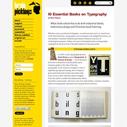
Whether you’re a professional designer, recreational type-nerd, or casual lover of the fine letterform, typography is one of design’s most delightful frontiers, an odd medley of timeless traditions and timely evolution in the face of technological progress. Today, we turn to 10 essential books on typography, ranging from the practical to the philosophical to the plain pretty. In 1967, iconic typography pioneer Emil Ruder penned Typographie: A Manual of Design — a bold deviation from the conventions of his discipline and a visionary guide to the rules of his new typography. From texture to weight to color to legibility spacing and leading, the 19 chapters gloriously illustrated in black-and-white with some in red, yellow and blue explore insights from the author’s studies and experiments. Images via Display. Web Fonts. Kern Type, the kerning game. What if famous brands had regular fonts? RegulaBrands - Pixelonomics.
Jan62012 EmailEmail What if famous brands had regular fonts?
- RegulaBrands Last week, I was having a skype call with a friend in Italy, who also happens to be a communication designer. And like every other time, we took a detour to one of our favorite topics of discussion – ‘clients’. Call it coincidence, fate or a mutual observation, we both have been asked the same question time and again, by our clients. The common ones are “all my office computers have Arial. “I thought logos are always Times New Roman” Stunning Subjectivity: Paula Scher's Obsessive Hand-Painted Maps. By Maria Popova An irreverent, artful antidote to GPS appification, or what the NYC subway has to do with tsunamis.

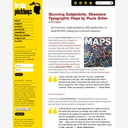
Iconic designer Paula Scher is one of my big creative heroes, her thoughts on combinatorial creativity a perfect articulation of my own beliefs about how we create. Since the early 1990s, Scher has been creating remarkable, obsessive, giant hand-painted typographic maps of the world as she sees it, covering everything from specific countries and continents to cultural phenomena. This month, Princeton Architectural Press is releasing Paula Scher: MAPS — a lavish, formidable large-format volume collecting 39 of her swirling, colorful cartographic points of view, a beeline addition to my favorite books on maps. I began painting maps to invent my own complicated narrative about the way I see and feel about the world.
(Cue in cartograms.) Cherry on top: The cover jacket folds out into her legendary colorful map of the world. How Cloud Computing Made Web Typography Better For Everyone. What’s makes sites like A Working Library and Pictory stand out from the pack in terms of readability?

Clear, humane typography, of course. But what makes that possible? Web fonts: legally-licensed real typefaces dynamically served via "the cloud" using Javascript and CSS. Sound like Greek to you? Me too. Before Typekit, what options did a web designer have for incorporating imaginative typography into her site designs? 20 Top Serif Fonts.