
The condescending UI. I have a kneejerk reaction to most modern computer user interfaces (also, all microwave user interfaces).
I've used plenty of excuses over the years: my "eye for design," my love of minimalism, a sense of utility. Today, I finally put my finger on it, and it's not just a desire for the-computer-as-pure-machine, or a spartan aesthetic. It's quite simple, really: I don't like the condescending tone. Growing up I was always very small for my age. I didn't mind the size ("the bigger they are, the harder they fall! " My problem with many modern UIs is that they never get past the telling phase. An example of this is the dramatic, quasi-utilitarian animated transition. But it's not just functionality, there's something deeper that bugs me, about the decorations themselves. And of course, there is the transgression of the century: Apple's downward spiral into overt 1:1 metaphors. For reference, here's where we started: Oh, how "far" we've come! Designing for iPad: Reality Check.
By Oliver Reichenstein Over the last two months we have been working on several iPad projects: two news applications, a social network, and a word processor.
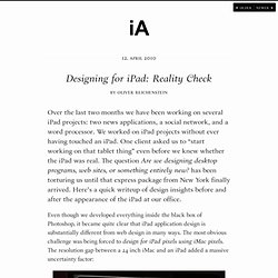
We worked on iPad projects without ever having touched an iPad. One client asked us to “start working on that tablet thing” even before we knew whether the iPad was real. The question Are we designing desktop programs, web sites, or something entirely new? Has been torturing us until that express package from New York finally arrived. Even though we developed everything inside the black box of Photoshop, it became quite clear that iPad application design is substantially different from web design in many ways. 1. The obvious issue with the resolution gap is typography. Is the font big enough?
…we had no choice but to print out 1:1 scale mockups. Reality check: Wow, this thing is sharp! After two months of printing, we did get the typography pretty much right, but there was another surprise waiting for us: The sharpness. 2. 3. Mac OS X Human Interface Guidelines: About the Guidelines for Creating Great Mac OS X Apps. Mac OS X Human Interface Guidelines describes the characteristics of the OS X platform and the guidelines and principles that help you design an outstanding user interface and user experience for your Mac app.
Mac OS X Human Interface Guidelines does not describe how to implement your designs in code. When you’re ready to code, start by reading Mac App Programming Guide. At a Glance Aqua is the overall appearance and behavior of OS X. Adopting the Aqua look and feel helps you provide the best possible user experience for your customers. Interface Builder (a graphical UI editor in Xcode) is the best way to begin building an Aqua-compliant user interface. Great Apps Begin with an Understanding of the Fundamentals Before you begin designing your app, you need to get a feel for the OS X environment. Most people are not acquainted with the principles of human interface design, but they can tell when apps follow the guidelines and when they don’t. Attention to Detail Pays Off in a Superlative UI. KM Playground. Cocoia Blog. Webstock '11: John Gruber - The Gap Theory of UI Design.