
The R Project for Statistical Computing. Network Visualization. Immersion by the MIT Media Lab is a view into your inbox that shows who you interact with via email over the years.
Immersion is an invitation to dive into the history of your email life in a platform that offers you the safety of knowing that you can always delete your data.Just like a cubist painting, Immersion presents users with a number of different perspectives of their email data. It provides a tool for self-reflection at a time where the zeitgeist is one of self-promotion.
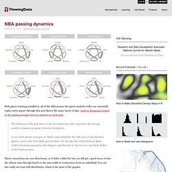
It provides an artistic representation that exists only in the presence of the visitor. It helps explore privacy by showing users data that they have already shared with others. Finally, it presents users wanting to be more strategic with their professional interactions, with a map to plan more effectively who they connect with. The base view is a network diagram where each node represents someone you've exchanged email with. Visualizing online social networks. The New York Times - Breaking News, World News & Multimedia. Gapminder: Unveiling the beauty of statistics for a fact based world view. - Gapminder.org. Many Eyes. Diagram Software to draw Flowcharts, UML diagrams & more Online. Gephi, an open source graph visualization and manipulation software.
Gephi:Wiki. Inkscape. Draw Freely. Interactive maps and visualizations. Free Data Visualization Software. SIMILE Widgets. StatPlanet Map Maker – Interactive Mapping & Visualization Software.
Public Data Explorer. About ChartsBin.com. Create Infographics. 28 Rich Data Visualization Tools - DevelopRIA. 28 Rich Data Visualization Tools. We’re currently working with a dozen different clients, all web application (re)designs.
All of these clients have applications and need equally visualizations to help their end customers analyze data quickly and effectively. What makes my job really interesting is that these clients are in different industries and are using different technologies. So we have pulled together a set of 28 tools for creating graphs, Gantt charts, diagrammers, calendars/schedulers, gauges, mapping, pivot tables, OLAP cubes, and sparklines, in Flash, Flex, Ajax or Silverlight.
Ajax.org Platform is a pure javascript application framework for creating real-time collaborative applications that run in the browser. AnyChart is a flexible Flash based solution that allows you to create interactive and great looking flash charts. Axiis is a Data Visualization Framework for Flex. Also, take a look at the nice window-in-window design on the saturnboy blog. Animated flash charts for web apps. JQuery Plugins JQChart Flot. Data visualisation DIY: our top tools. What data visualisation tools are out there on the web that are easy to use - and free?
Here on the Datablog and Datastore we try to do as much as possible using the internet's powerful free options. That may sound a little disingenuous, in that we obviously have access to the Guardian's amazing Graphics and interactive teams for those pieces where we have a little more time - such as this map of public spending (created using Adobe Illustrator) or this Twitter riots interactive. But for our day-to-day work, we often use tools that anyone can - and create graphics that anyone else can too. So, what do we use? Google fusion tables This online database and mapping tool has become our default for producing quick and detailed maps, especially those where you need to zoom in. The main advantage is the flexibility - you can can upload a kml file of regional borders, say - and then merge that with a data table. This excellent tutorial by Google's Kathryn Hurley is a great place to start. Datamarket. The Best Tools for Visualization.
Visualization is a technique to graphically represent sets of data.
When data is large or abstract, visualization can help make the data easier to read or understand. There are visualization tools for search, music, networks, online communities, and almost anything else you can think of. Whether you want a desktop application or a web-based tool, there are many specific tools are available on the web that let you visualize all kinds of data. Here are some of the best: Visualize Social Networks Last.Forward: Thanks to Last.fm's new widget gallery, you can now explore a wide selection of extras to extend your Last.fm experience.
Last Forward Friends Sociomap: Friends Sociomap is another Last.fm tools that generates a map of the music compatibility between you and your Last.fm friends. Fidg't: Fidg't is a desktop application that gives you a way to view your networks tagging habits. Fidg't The Digg Tools: One more: Digg Radar. YouTube: Visualize Music Musicovery.