

Garamond or Garamont? This small engraving (47 by 28 mm) was included by Léonard Gaultier towards the end of the 16th century in his ‘Portraits of illustrious men who have flourished in France since the year 1500 until the present’.
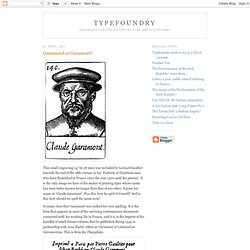
It is the only image we have of the maker of printing types whose name has been better known for longer than that of any other. It gives his name as ‘Claude Garamont’. Was this how he spelt it himself? And is this how should we spell the name now? It seems clear that ‘Garamont’ was indeed his own spelling. (Note: The combination of r and a is an awkward one for italic types of this date, where the form of a slopes up to a point and leaves a gap: it would be better if the r could be kerned to fill the space, but because, as shown here, it may need to be placed next to tall characters like i and b this cannot be done routinely.
Hear, All Ye People; Hearken, O Earth (Part One) This is the first installment in a two-part series.
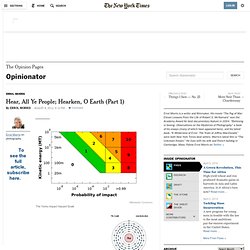
The world is full of obvious things which nobody by any chance ever observes… — Arthur Conan Doyle, “The Hound of the Baskervilles” NOTE: This is a follow-up to my quiz that ran in The Times, “Are You an Optimist or a Pessimist?” I would like you to read my essay and then take the quiz. It doesn’t matter whether you have taken it before. If you haven’t taken it before, please take it. Wikimedia CommonsThe Torino Impact Hazard Scale Here is my confession.
I picked a passage from David Deutsch’s second book, “The Beginning of Infinity” — a passage about “unprecedented safety” — and embedded it in my quiz for The Times, “Are You an Optimist or a Pessimist?” If a one-kilometer asteroid had approached the Earth on a collision course at any time in human history before the early twenty-first century, it would have killed at least a substantial proportion of all humans. But for the moment, I was interested in something somewhat less apocalyptic. Do fonts affect people's opinions? You may remember a short piece by Errol Morris in the Times a few weeks ago that was more of a quiz than a essay.
Well, the quiz turned out to be a smokescreen for how people's opinions change when the text is set in different typefaces. Each Times participant read the passage in one of six randomly assigned fonts - Baskerville, Computer Modern, Georgia, Helvetica, Comic Sans and Trebuchet. The questions, ostensibly about optimism or pessimism, provided data about the influence of fonts on our beliefs. Type Connection. Le innovazioni tecniche nella stampa tipografica. L torchio, pur non subendo modifiche tali da stravolgerne la struttura complessiva, subì nel corso degli anni numerosi perfezionamenti, volti soprattutto a semplificarne il funzionamento e ad incrementarne la produttività.
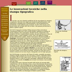
Come abbiamo già accennato, tra XV e XVI secolo si era passati dalla vite in legno alla vite in rame, e dal pianale portaforma in pietra a quello in ghisa. Nel 1620 il tipografo olandese Willem Janszoon Blaeu introdusse l'automazione della leva e del carrello mobile, mediante un sistema di tiranti collegati a dei contrappesi.
Nel XVII secolo comparvero vari modelli di torchio completamente metallici, di certo più precisi e veloci di quelli in legno, e meno soggetti a usura. Nel 1795 apparve il primo torchio interamente in ghisa, mentre il più famoso di questi modelli, lo Stanhope, (che prende il nome dal suo perfezionatore, Lord Charles Stanhope) fu introdotto nel 1798. La Linotype è una macchina per la composizione meccanica delle pagine di stampa. Type at work in the real world. Typeface classification. The classification of typefaces is one of those topics which proves enduringly attractive in typographic debate.
Yet, beyond such abstract discussions, the issue of how we might order type has very real implications on the way we write about and teach typographic history. It was this very practical aspect of classification which prompted my involvement in the field as I sought to address the particular problem of how to make accessible to students some understanding of the great diversity of typeforms now available to them. My purpose here is to share the results of my experiences in developing a new description framework for typeforms - and here I should say Latin typeforms - with a view to prompting feed-back and a future pooling of knowledge, so that these ideas can be refined still further.
Typeform description in the twentieth century First, the reliance of the British Standard upon a ‘top down’ approach to categorisation. Then there followed the scholarly surveys.