
The Python Graph Gallery – Visualizing data – with Python. A 5-step guide to data visualization. Data has been described as the new raw material for business and the "oil of the 21st century.

" The volume of data used in business, research and technological development is massive and continues to grow. For instance at Elsevier, there are about 700 million articles per year downloaded from ScienceDirect, 80,000 institution profiles on Scopus, 13 million researcher profiles on Scopus and 3 million researcher profiles on Mendeley. The 14 Best Data Visualization Tools. Nishith Sharma is the co-founder of frrole, a social intelligence startup.
Raw data is boring and it’s difficult to make sense of it in its natural form. Add visualization to it and you get something that everybody can easily digest. Not only you can make sense of it faster, but you can also observe interesting patterns that wouldn’t be apparent from looking only at stats. All Killer, No Filler This one’s different, trust us. To make the tedious task of making beautiful charts and maps easier, I’ve made the list of best data visualization tools available for the job. The New Mediators (subtitulado en Español) Capture your world in 3D.
Graphics Processors Speed Up Twitter Visualizations. New software can use the graphics processors found on everyday computers to process torrents of data more quickly than is normally possible, opening up new ways to visually explore everything from Twitter posts to political donations.

Known as MapD, or massively parallel database, the new technology achieves big speed gains by storing the data in the onboard memory of graphics processing units (GPUs) instead of in central processing units (CPUs), as is conventional. Using a single high-performance GPU card can make data processing up to 70 times faster. Making sense of too much data. Periscopic: Do good with data.
Infographics from KISSmetrics. Infographics & Data Visualization. Information aesthetics - Data Visualization & Information Design. 10 Tools for Creating Infographics and Visualizations. 9 Powerful Free Infographic Tools To Create Your Own Infographics - DATA VISUALIZATION. 46 Tools To Make Infographics In The Classroom. Infographics are interesting–a mash of (hopefully) easily-consumed visuals (so, symbols, shapes, and images) and added relevant character-based data (so, numbers, words, and brief sentences).
The learning application for them is clear, with many academic standards–including the Common Core standards–requiring teachers to use a variety of media forms, charts, and other data for both information reading as well as general fluency. It’s curious they haven’t really “caught on” in schools considering how well they bridge both the old-form textbook habit of cramming tons of information into a small space, while also neatly overlapping with the dynamic and digital world. So if you want to try to make infographics–or better yet have students make them–where do you start? The 46 tools below, curated by Faisal Khan, are a good place to start. Piktochart: Infographic and Graphic Design for Non-Designers.
Create and share visual ideas online. Gephi, an open source graph visualization and manipulation software. Microsoft SketchInsight lets you build a story with interactive sketches. Microsoft is putting its SketchInsight interactive whiteboard system on display at the company's TechFest event this week.

Designed as a system for storytelling, SketchInsight is a prototype project straight out of Microsoft's research labs. SketchInsight simply lets you tell a story using interactive sketches on a whiteboard. In Microsoft's demonstration the company shows how you could use this to present a story by drawing sketches that turn into animations. Datavisualization.ch Selected Tools.
A Periodic Table of Visualization Methods. Spherical Voronoi Diagram. Welcome // Chart and image gallery: 30+ free tools for data visualization and analysis. November 7, 2013 03:21 PM ET The chart below originally accompanied our story 22 free tools for data visualization and analysis (April 20, 2011).
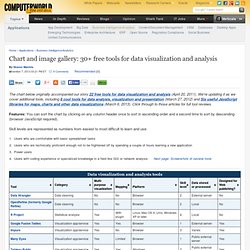
We're updating it as we cover additional tools, including 8 cool tools for data analysis, visualization and presentation (March 27, 2012) and Six useful JavaScript libraries for maps, charts and other data visualizations (March 6, 2013). Click through to those articles for full tool reviews. Features: You can sort the chart by clicking on any column header once to sort in ascending order and a second time to sort by descending (browser JavaScript required). Skill levels are represented as numbers from easiest to most difficult to learn and use: Users who are comfortable with basic spreadsheet tasks Users who are technically proficient enough not to be frightened off by spending a couple of hours learning a new applicationPower usersUsers with coding experience or specialized knowledge in a field like GIS or network analysis. Visual information resources. The Best Infographics of the Year: Nate Silver on the 3 Keys to Great Information Design and the Line Between Editing and Censorship.
By Maria Popova “More isn’t always better: no more in information design than in poetry…” Once again this year, I was delighted to serve on the “Brain Trust” for an annual project by Pulitzer-Prize-winning journalist, New Yorker writer, and Scientific American neuroscience blog editor Gareth Cook, who culls the best, most thoughtful and illuminating infographics published each year, online and off, and invites the bearer of a sharp mind to contextualize both the individual selections and the premise of the project.

Alongside the inaugural crop of infographic exemplars was David Byrne’s excellent essay on cultivating the ability to experience the “geeky rapture” of metaphorical thinking and pattern recognition. Silver, the author of The Signal and the Noise, considers the two factors that make an infographic compelling — providing a window into its creator’s mind and telling a story that “couldn’t be told in any other way.” He writes: Who We Are Lost Cat Writers, Sleep, and Productivity.