
Functionnal design. Reflection en cours. Why you Should Bury your Sign Up Button « « Bokardo Bokardo. A lesson I learned while trying to make a button so hot you would want to lick the screen.
A short while ago I was involved in a project redesigning a home page of a website. I dutifully designed the page in the common fashion, using a bold headline, some bullet points, and a juicy call-to-action button. It was very similar to many of the startup home pages that you might run across every day. The goal of the redesign was to increase conversion on the primary call to action of sign-up. We wanted to double or triple (or more) the number of people who were signing up and trying out the product. I knew the redesign was a vast improvement over the existing one, merely because the page better communicated what was going on. So we launched, and then we looked at the data. What was wrong? Why then, were people not clicking the sexy button? Bokardo. UX Design: What are the reasons that Quora, Facebook, and Twitter have unused space on the right and left.
12 Popular Wireframe UI Stencils for Quick Prototyping - UI. Prototyping is a proven technique to generate ideas and discover requirement of a project.
It’s a very effective method to show clients the visual and UI of a project. Not only that, it enhances the communication between, designers, developers and product managers as well. Many people like to use pencil and paper, but if you’re one of those who love to use photoshop or other image editing tools to do a quick mockup, these resources would be treasures for you. Listed are 12 wireframe UI stencils for popular social websites (facebook, Google+, youTube…) and mobile platform (Android, iOS, Windows…). Call to Action Buttons: A Survey of Best Practices. Call-to-Action buttons play a pivotal role in soliciting action from the user. To garner the requested action, buttons are placed on the website that allow the user to perform an action, such as buying something, or leading to another page for more information.
Careful planning is necessary in the creation of your call to action, and in this article I will explain the best practices for creating effective call to action buttons. I will also present you with examples in action to give you a better understanding of what works. In order for your Call-to-Actions to work successfully, you must first determine how they’ll fit into the overall scheme of your site. By laying the groundwork, or information architecture, you’ll begin to discover how the buttons work within the web interface. Factors to Consider Size In web design, historically the larger the element, the more important it is. ScrapBlog Mozilla Firefox Color. The Ins and Outs of Dynamic Navigation Menus. All web designers go through phases struggling with creative ideas.
It’s a natural part of the creation cycle, but it can become frustrating as you’re stuck on a website project for more than a few days. There isn’t any one-size-fits-all solution. But we can take a moment to analyze the design process for better solutions. The main goal of any website is to lead visitors through your pages. This is accomplished via a navigation of some type, most commonly links. Follow us in the guide below as we look through common trends in web navigation menu design.
What Makes Someone Leave A Website? The Infographic. 50 Useful and Free Web UI, Mobile UI and Wireframe Kits. Here we are featuring 50 useful, free and spanking new Web UI and wireframes resources that you will definitely love.
Web designers always require some fundamental user interface elements to produce a model of user interface either of a website or software. For that, they require wireframing and UI design kits which help them to replicate the user interface. In this round-up, we have collected some web and mobile user interface kits which are practical in creating low-fidelity illustrations for your projects.
We hope you will like this compilation. Enjoy! Free Web UI and Wireframe Kits Black UI Kit A free PSD UI kit designed by Alex Patrascu. Lion UI Kit Lion UI Kit is a handy PSD mockup tool with fully layered and editable elements from the latest OS X operating system. UX as an effective marketing tool. Progress Trackers in Web Design: Examples and Best Practices.
Advertisement When designing a large website, especially one that contains a store, you may be required to design a system for ordering online, or a multi-step process of another sort.
Walking users through this process by making it easy and intuitive is key to helping increase conversion rates. Any frustration along the way may cause them to leave and pursue other options. Progress trackers are designed to help users through a multi-step process and it is vital that such trackers be well designed in order to keep users informed about what section they are currently on, what section they have completed, and what tasks remain. In this article we will look at various uses of progress trackers and see how they’ve been implemented, what they are doing well, and what they are not doing well.
What are Progress Trackers? You may not be familiar with the term ‘progress tracker’, also called a ‘progress indicator’ — but chances are good that you have encountered one at one time or another. 1. 2. 10 Crimes A Web Designer Can Do For Call-to-Action Pages. Call-to-action pages are dedicated to prompt visitors to take a desired action, whether an opt-in, a sale or any type of click that brings a user one step closer to a company’s goal.
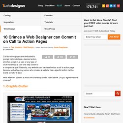
Basically, any website can be classified as a call to action page because virtually every person who creates a website has a specific action he/she wants a visitor to take. Most websites commit at least one of the top crimes listed below. Do you agree with the choices? 1. Graphic Clutter It’s obvious this website’s purpose was show as much information to visitors as possible above the fold. Ash Conway.