
The World Bank - Statistik. World Development Indicators 2016 World Development Indicators (WDI) publication is a collection of time-series data for 214 economies, with many indicators going back more than 50 years.
WDI provides cross-country comparable statistics about development and people’s lives around the globe. It is divided into six sections – World View, People, Environment, Economy, States and Markets, and Global Links. New online tables, previously published in the book, are now available from wdi.worldbank.org/tables and they provide data from the most up-to-date database. Learn more. Text analysis, wordcount, keyword density analyzer, prominence analysis. By Region - Statistics Resources - LibGuides at US Army War College Library. Real-time local Twitter trends - Trendsmap. Databases.
Indexes. Indicators. National institutes of statistics. World. Cool Infographics - Blog. Faith on the Move: The Religious Affiliation of International Migrants - Pew Forum on Religion & Public Life. Faith on the Move An Interactive Feature GRAPHIC • March 8, 2012 The figures in this interactive feature refer to the total number (or cumulative “stocks”) of migrants living around the world as of 2010 rather than to the annual rate of migration (or current “flows”). Since migrants have both an origin and a destination, international migrants can be viewed from two directions – as an emigrant (leaving an origin country) or as an immigrant (entering a destination country).
The interactive map focuses on the top origin and destination countries for each religious group. Large numbers are rounded to the nearest 10,000. According to the United Nations Population Division, an international migrant is someone who has been living for one year or longer in a country other than the one in which he or she was born. For a complete analysis, read the full report. The Pew Research Center's Religion and Public Life Project Copyright 2013 The Pew Research Center. Pew Research Center. AidFlows. Africa Statistics Wealth. WallStats - The Art of Information. Infographics. Daily News, Polls, Public Opinion on Government, Politics, Economics, Management. What really caused the eurozone crisis? Data Visualization: 20+ Useful Tools and Resources. There are plenty of cool technologies available to collect and examine data.
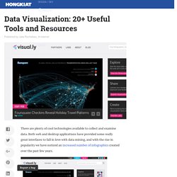
Both web and desktop applications have provided some really great interfaces to fall in love with data mining, and with the rise in popularity we have noticed an increased number of infographics created over the past few years. Today we’ll be looking into some really cool and popular online resources for data visualization. You can see all kinds of data like human population, world condition and even human emotion presented via the visualization. While some of the visualization might be experimental, all of them have one similarity: they help you understand the data better, and this is exactly what visualization is for.
If you’ve designed your own infographic or visualization tool we’d love to check it out. Recommended Reading: More Infographic related posts. Better World Flux Now this is one beautiful visualization tool! The refined condition of BWF’s design comes as no surprise. Visual.ly We Feel Fine RSS Voyage. The largest Free Internet Database about Cost of Living, Housing Indicators and many other informations about cities and countries! Numbeo is the world’s largest database of user contributed data about cities and countries worldwide.
Numbeo provides current and timely information on world living conditions including cost of living, housing indicators, health care, traffic, crime and pollution. Numbeo is a collection of Web pages containing numerical and other itemizable data about cities and countries, designed to enable anyone to contribute or modify content. Numbeo uses the wisdom of the crowd to obtain the most reliable information possible. Numbeo then provides you with a statistical analysis of the data collected. Transparent Africa. Dubai Student Designs Mobile Prenatal Care Device - Education - GOOD. It’s not hard to guess from his technology competition name—The Hex Pistols—that 20-year-old Shawn Frank is a fan of music.

He's also a strong advocate of ensuring that women in developing nations have access to quality prenatal care. Six months ago, while walking to an internship, Frank came up with the idea for momEcare, a mobile device that helps provide medical assistance to pregnant women who can't get to a hospital. Now Frank, who just graduated from the computer science program at the University of Wollongong in Dubai, is headed to Microsoft's Imagine Cup, a technology competition for socially conscious high school and college students happening next week in New York City (we've covered the other young finalists here, here and here). I caught up with him to find out what first sparked his interest in technology and learn more about how momEcare works. GOOD: When you were a kid, what first inspired you to become involved in science and technology?
IBM Research - Many Eyes. United Nations Statistics Division - Commodity Trade Statistics Database (COMTRADE) Arab spring: an interactive timeline of Middle East protests. StatWorld - Interactive Maps of Open Data. Find Market Research Companies, Facilities, Jobs, Articles, More. Statistical Visualization. For his book The Visual Miscellaneum, David McCandless, along with Lee Byron, had a look at breakups on Facebook, according to status updates.
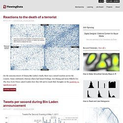
They looked for the phrase "we broke up because" in status updates, and then graphed the frequencies over time. Why they couldn't just look at updates to relationship status, I'm not sure. Notice the peak leading up to the holiday season and spring cleaning. Infografiche. 3008121e.pdf (application/pdf Object) Gates Foundations - Infographics. United Nations Statistics Division. ChartsBin.com - maps for sharing. Data and Statistics. Google Zeitgeist - data on Internet usage. Data. Bureau of Statistics, work unit of the Policy Integration Department. Google Zeitgeist 2011 - Data on people searching the Internet.
StatSpotting! Interesting Statistics, EveryDay. National Opinion Research Center - USA Univ. Chicago. Qualitative Measures. « PreviousHomeNext » Qualitative research is a vast and complex area of methodology that can easily take up whole textbooks on its own. The purpose of this section is to introduce you to the idea of qualitative research (and how it is related to quantitative research) and give you some orientation to the major types of qualitative research data, approaches and methods. There are a number of important questions you should consider before undertaking qualitative research: Do you want to generate new theories or hypotheses?
One of the major reasons for doing qualitative research is to become more experienced with the phenomenon you're interested in. Do you need to achieve a deep understanding of the issues? I believe that qualitative research has special value for investigating complex and sensitive issues. Are you willing to trade detail for generalizability? Qualitative research certainly excels at generating information that is very detailed. Empirical Scholarship Workshops,Faculty & Research: Northwestern University Law School. SPSS, Data Mining, Statistical Analysis Software, Predictive Analysis, Predictive Analytics, Decision Support Systems. YouTube Statistics. World Internet Usage Statistics News and World Population Stats. OECD Better Life Initiative. Top 5 Browsers from Apr 2011 to Apr 2012.
Gapminder: Unveiling the beauty of statistics for a fact based world view. Data Visualisation References « CrisisMaven's Blog. Demos Italia. Comparing Chinese provinces with countries: All the parities in China. Comparing US states with countries: US equivalents. Which countries match the GDP and population of America's states? IT HAS long been true that California on its own would rank as one of the biggest economies of the world. Marketing Power. 30+ WordPress Plugins for Statistics. To grow your blog, you need to know something about who's visiting, why they're at your site, where they came from, and where they're going.

This list mixes info for your eyes only with a few you can share with visitors and potential advertisers. It's part of an ongoing series on Wordpress tips. AWStats Xtended Info - Requires AWStats and adds things such as screen size, Flash, PDF, and Java support. Backlinks inbound links counter - Uses MSN to track all your incoming links to your site, not just from blogs. Data Visualization. Analyse et Stats. Visual Thinking.