
Cain Project: A Guide to Presenting a Poster. A Guide to Presenting a Poster Preparing to Present Making the physical poster is only part of preparing for a poster session.
You MUST practice also. Interacting with the audience demands thinking on your feet, applying your social skills, and drawing on short, concise explanations without fumbling or mumbling. Practice 2, 5, and 10-minute versions of your poster presentation. Risk Science Center Creating Poster Presentations that Tell Stories - Risk Science Center. This Friday my class of second year Environmental Health Science Master of Public Health students are going to get my admittedly quirky annual lecture on crating poster presentations.
Quirky, because I’m a little obsessive about the importance of story telling in posters, whether you are presenting research data or describing what you did last summer. Soup to Nuts Poster Creation in Two and a Half Minutes I’ve been using a rather old (and not very interesting) poster to teach this for the past couple of years, and so this year I thought I’d generate some new material. And just for kicks, I decided to try and capture the whole messy process of creating a poster, from start to finish. This is what it looks like, compressed into two and a half minutes! Story Telling As with other forms of communication, I try and tell stories through posters – whether they are reporting on scientific research, presenting the results of a project or capturing an experience.
Creative processes are messy. Poster Perfect. Design pointers from the pros Shorten your text lines Long lines of text are more difficult to read, which is why magazines and newspapers always break up their text into narrower columns. If your poster has a landscape orientation, consider breaking your text into four columns. Justify the right way: to the left While justifying text on both the right and left (i.e., full justification) makes for very neat-looking columns, designers are beginning to move away from the practice, says Nichole Jonas, a graphics specialist at the Eunice Kennedy Shriver National Institute of Child Health and Human Development.
Consider your font You don’t have to stick with just one. Don’t put conclusions on the floor Even though it’s the most important part of the poster, the conclusion is often placed “at the bottom, [where] it’s at people’s feet,” says Graves. Bigger is better “People have this weird love of small font,” says Purrington. Dump PowerPoint’s color palette Sundries.
Poster: Predicting genotype from phenotype · Bioinformatics Zen. Poster: Predicting genotype from phenotype · Posted: Jul 15, 2012 I presented the below poster at the 2012 American Society of Microbiology Meeting.
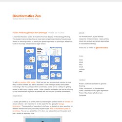
This research demonstrates how we have been comparing and testing Pseudomonas strains for twitching motility to identify the genes responsible for phenotypic differences. Click on the image below to see a larger version. As with my previous ASM poster, I think less text and a more visual overview is more likely to attract interest and start a discussion. Designing conference posters - Colin Purrington. A large-format poster is a big piece of paper or wall-mounted monitor featuring a short title, an introduction to your burning question, an overview of your novel experimental approach, your amazing results in graphical form, some insightful discussion of aforementioned results, a listing of previously published articles that are important to your research, and some brief acknowledgement of the tremendous assistance and financial support conned from others — if all text is kept to a minimum (less than a 1000 words), a person could fully read your poster in 5-10 minutes.

Section content • DOs and DON’Ts • Adding pieces of flair • Presenting • Motivational advice • Software • Templates • Printing • Useful literature • Organizing a poster session What to put in each section Below, I’ve provided rough tips on how many words each of these sections might have, but those guesses are assuming you have a horizontal poster that is approximately 3×4′. Adjust accordingly. DOs and DON’Ts 1. 2. Créer votre affiche avec Indesign. 44 brilliant InDesign tutorials. Adobe Creative Cloud's digital publishing platform InDesign has a ton of features which makes it essential for everything from brochure design to eye-catching posters; newsprint publications to screen printing.
Here we've rounded up the best InDesign tutorials on the web which walk you through a variety of design projects. You're sure to find something here to stretch your skills, either by jumping directly to a section using the menu below, or just by browsing all 47. Enjoy! Getting started with InDesign. Le pool Pimp My Poster. Designing conference posters - Colin Purrington.
Draw Freely. Te Ropu Awhina – Inkscape Tutorial. Here’s an example of just some of what Inkscape is capable of Tutorial Provided by: Miles Benton, from Te Ropu Awhina Whanau This tutorial will take you through some of the basics of Inkscape and introduce you to several tools which will be useful when creating not only posters, but figures as well.
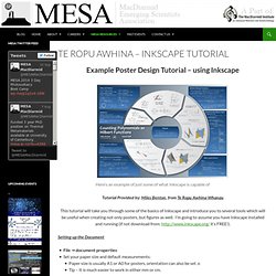
I’m going to assume you have Inkscape installed and running (if not download from: it’s FREE!). F. Duprat: Conseils pour Faire un Bon Poster. Color Scheme Designer 3. Get ready for university study. Posters are often used as part of student assessments.
How might you plan and design an academic poster? How do you produce it effectively? What is an academic poster? Poster sessions. Poster Perfect. Whitespace - Nichole Jonas - Science @ NICHD. Whitespace, also known as negative space, refers to the space between objects (such as graphics or blocks of text) on a page.
Text margins are perhaps the most common utilizaton of whitespace. Adding more whitespace to your layout prevents it from looking crowded, and increases readability. In addition, text that is broken into shorter paragraphs encourages reading, whereas long blocks of text do precisely the opposite.3 Eyetracking studies conducted by the Poynter Institute demonstrated that short paragraphs receive twice as much attention from readers than long paragraphs.4 Example 1 Example 2. VischeckURL. ScientificPosters.pdf (Objet application/pdf) Better Posters.