
2012's most common CSS Resets to copy/paste, with documentation / tutorials. Css-only Lavalamp-like Fancy Menu Effect. This time let’s get inspired by the sliding menu effect, also known as the Lavalamp effect (ex. here).
We’ll recreate it with pure css – using css3 transitions and the general sibling combinator selector. Below we’ll discuss three simple examples (make sure to see the demo first). Step 1 – Prerequisites We use a Unica One google web font. In the “heart & arrow” example we use three images combined into a sprite image as below : Step 2 – HTML For each of the three examples the html is the same. Liffect - effect for lists. A supersonic bunch of smart LESS mixins.
Creative Web Typography Styles. 20 outils et générateurs pour le CSS et CSS 3 en ligne - css3-ressources. CSS3 Generator. Animatable: One property, two values, endless possiblities. Learning LESS: Mixins. We continue on our journey of Learning LESS today as we dig into an extremely powerful component of LESS: Mixins.

If you haven’t read our first two posts on the topic, check out Learning LESS: An Introduction and Learning LESS: Variables. Blog Series Roadmap An IntroductionUsing VariablesUsing MixinsUsing Nested RulesUsing FunctionsDivide and ConquerPut It Into Action So let’s introduce LESS Mixins, and showcase some of what you can do with them. What is a Mixin? Les 30 sélecteurs CSS à connaître absolument. Tomsyweb.com Buy this domain The owner of tomsyweb.com is offering it for sale for an asking price of 345 GBP!

Related Searches This page provided to the domain owner free by Sedo's Domain Parking. HTML5 Please - Use the new and shiny responsibly. Stroll.js - CSS3 Scroll Effects. The Toolbox: a directory of useful single-page sites and apps. Instant CSS Documentation Search. Learn CSS Selectors interactively. Sprite Cow - Generate CSS for sprite sheets. CSS Hat translates layer styles to CSS3 code.
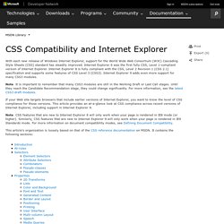
CSS3 support in Internet Explorer 6, 7, and 8. What is it?
IE-CSS3 is a script to provide Internet Explorer support for some new styles available in the upcoming CSS3 standard. How it works If you're viewing this page in Internet Explorer, some of the elements have been rebuilt by the script in Vector Markup Language (VML), an IE-specific vector drawing language. VML supports things that are missing from IE's CSS implementation like rounded corners and blur effects. How to use it Just add CSS styles as you normally would, but include one new line: Issues and Workarounds You would expect URLs in behavior: url(...) to be relative to the current directory as they are in a background-image: url(...) style for example, but instead Microsoft decided to ignore standards here and make them relative to the docroot instead. Shadow Filter (A, ABBR, ACRONYM, ...) Cross Browser CSS Transforms – even in IE.
Updates: (March 7, 2013) The examples on this page were missing due to a migration issue when upgrading my blogging software.

Thanks to James Wages for pointing this out. (August 11, 2012) The skew() transform no longer works in Firefox, due to not being in the CSS3 specification anymore. Developers must use the skewX() and skewY() functions instead. The examples in cssSandaper, as well as this documentation, have been updated to reflect this change in the spec. An example of a page using the CSS Transform property and cssSandpaper.
The CSS transform property allows developers to rotate, scale, and skew blocks of HTML via CSS. When I first saw sites using transform, I looked at the underlying code and tried to produce pages using transform in all browsers. Before I start talking about the details of my solution, let’s take a look at a few examples of it in action. CssSandpaper to the Rescue I then, to steal a phrase from Russel Peters, started to Hurt Real Bad: Browser Differences. Progressive And Responsive Navigation. Advertisement Developing for the Web can be a difficult yet rewarding job.

Given the number of browsers across the number of platforms, it can sometimes be a bit overwhelming. But if we start coding with a little forethought and apply the principles of progressive enhancement from the beginning and apply some responsive practices at the end, we can easily accommodate for less-capable browsers and reward those with modern browsers in both desktop and mobile environments. A Common Structure Below is the HTML structure of a navigation menu created by WordPress. CSS3 Generator - By Peter Funk & Eric Hoffman.
CSS Compatibility and Internet Explorer. The document is archived and information here might be outdated With each new release of Windows Internet Explorer, support for the World Wide Web Consortium (W3C) Cascading Style Sheets (CSS) standard has steadily improved.
Zoom sur l'effet parallaxe. Après avoir abordé les arrière-plans extensibles (full background) nous allons continuer avec l'effet parallaxe.
Cet effet graphique étant facile à comprendre et à mettre en place, vous allez pouvoir créer rapidement un site original. The Brand New CSS4 Selectors Specification. Yeah, the CSS4 specification is already in the early stages of being written (for selectors, anyway).

I must stress just how work in progress this is, in the sense that some of this stuff might not make the final cut, while more stuff may be added. It will however give you an idea of what you can expect some of this to turn up in the real CSS4 specification. Most of these ideas are probably the basis of what the W3C is aiming for in the CSS4 Selectors Specification. These are perhaps my two favourite additions. You may have already heard of the :not() selector, something that turned up in the CSS3 specification. Ultimate CSS Gradient Generator - ColorZilla.com. CSS3 Gradient Generator. CSS3.0 Generator.