
Encourage Design System Buy-in Through Component Scorecards. In our 2019 Design Systems Survey, we asked respondents from both in-house teams and external agencies to report their organization’s biggest concerns as they considered implementing a design system.
In-house teams reported two concerns that topped the list: Adoption and acceptance of the system Buy-in from the team. The People Part of Design Systems – Related Works. Over the years, the rotation gained more structure, with each rotation focused on a specific theme, component, or product area thanks to the hard work of Cambria Kline.
We leveraged the rotations as a power boost to the Design Systems team, helping us get through any work that included cleaning up some related design debt. Beyond speeding up our work, rotations often freed up the Systems team to innovate and think at a higher level. For example, we were working on a huge push to update our color usage everywhere to be more brand-aligned. It was during one of these rotations that Katie Sylor-Miller, an engineer on the Systems team, realized we needed a more efficient and future-proof way to make these types of sweeping, global changes.
As a result, she was able to advocate for the creation of design tokens. Lastly, these rotations created an easy way contribute without a considerable time commitment. New Hire Boot Camp. Untitled. Nettoyer les erreurs de design d'un site. 7 Principles of Icon Design - Helena Zhang - Medium. When most successful, icons are not only easy to understand for one group of people but are universal across cultures, ages, and backgrounds.
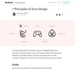
Consider your audience and use metaphors and colors that resonate with them. Keep in mind that a standalone icon may not be the clearest solution, if the idea being represented is too abstract. In this case, pair the icon with a text label or find an alternative. Once you have an understandable symbol, make sure it’s readable. It’s hard to make out the Amtrak app’s Station icon above (first row) because the details are too fine. The Transit app has a similar issue. A slight adjustment makes a big improvement: When working with multiple shapes, leave enough space between them. Google Maps does an excellent job with their transit icons—very readable at a very small size: To make sure each icon feels balanced, align its elements optically. How to Design Better Web Forms and Decrease Form Abandonment. A web form is any area on the site where you enter information.
That is, when you sign-in or sign-up, make an order, enter payment data, leave feedback, get in contact, etc. Oh, and when you Google something, you use a web form as well. The better your web form design is the more effective your website will be. Forms basically connect potential customers with your business. 5 Steps to Effective Dashboard Design - VMware Design - Medium. More often than not, you’re answering multiple questions using multiple displays, so how should they be laid out on the dashboard?
Returning to the questions you identified, they can often form a hierarchy. Imagine you’re designing a dashboard for personal trainers to track their client’s progress. The first question might be to understand if the client has reached their monthly goal. If the answer is ‘no’, then the trainer would want to know whether this was a steady progression in the wrong direction or a ‘blip’ in the trend reflecting the client’s “cheat day”.
Create an Adaptive Sketch Symbol for Material Design’s Outlined Text Field. Step 1: Getting set up Create an a symbol with the dimensions 328x56Give it a meaningful label, like Outline Text Field Active Step 2: Create the border The border is not a closed shape.
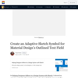
To accomplish this, we will be subtracting a shape from this one in a future step. So, the standard border option won’t work here. Material Design uses 4px border radius for input fields and a 2px border for the active state. Add the outer rectangle. Create an Adaptive Sketch Symbol for Material Design’s Outlined Text Field. 9 Tips For Designing Faster and More Efficiently So You Don’t Go Insane. Sketch Tutorials Author Note and Shameless Plug: These are techniques I picked up while building UX Power Tools design system.
I am an active designer and I use this system for 10 hours a day, along with every technique mentioned in this article. If I didn’t believe in it, I wouldn’t be writing about it 😌 1. Use Styles It pains me how often this needs to be said, but I’ll keep saying it until you start doing it 😉 Fundamental changes are coming to Sketch very soon that will make your lives SO MUCH EASIER if you just buckle down and start using styles. The Pocket Guide to Creativity. Ever been labelled as the ‘creative’ person in the room, but found yourself falling dismally short of anything that feels like an original idea?
Preach. When you work as a designer (or any other creative) people assume you’re the go–to for all exciting new ideas and inputs. Unfortunately, that’s a stigma that’s not going to change any time soon. Even if we educate people otherwise, establishing a mindful realisation around what creativity actually is, will only makes you look even more like a creative genius with all the answers. Photoshop Etiquette: A Guide to Discernible Web Design. Méthode de feedback (Plus/Delta)