
Les mauvaises données des marchés. Le portail français d'ouverture des données publiques, data.gouv.fr publie sur son site des données truffées d'erreurs, donc inutilisables.
Scribd. Regards Citoyens. Données de l'ONU et de ses émanations. Données sur 12 millions d'entreprises mondiales. Les dépenses publiques du monde entier. Open Data Center Alliance - Home. Data Science Toolkit. Usage Command Line on OS X and Linux Download python_tools.zip, extract into a new folder, cd into it and run .
/install This will create a set of scripts you can run directly from the command line, like this: html2text | text2people The command above fetches the New York Times front page, extracts a plain text version, and then pulls out likely names. File2text -h ~/scanned_documents/*.jpg > scanned_text.txt This will run OCR on all the JPEG images in that folder (the same command also works on PDF, DOC and XLS files). Commands that take in inputs that aren't natural-language text or html treat their arguments as the strings to process, rather than file names. Statistical Data. Open Data Grand Toulouse - data.grandtoulouse.fr.
OneBusAway. Un 1er hackathon couronné de succès. Le 12 novembre se déroulait le premier hackathon organisé par Capitale ouverte, en partenariat avec la Ville de Québec. Ce fut une journée très animée où on a pu voir à l’oeuvre des équipes de programmeurs et de créateurs qui s’étaient donné rendez-vous chez l’espace Abri.co pour améliorer la vie numérique des citoyens de Québec. L’événement a réuni 40 individus très créatifs pour faire avancer la cause des données ouvertes dans la Capitale Nationale. Une vidéo produite par Patrick Parent de E-Gouv Québec montre bien l’ambiance lors de l’événement : Nous remercions chaleureusement Philippe-Antoine Lehoux et Greg Sadetsky de nous avoir prêté les locaux d’Abri.co pour l’occasion.
Les participants ont apprécié l’accueil et l’environnement. Famous Perl One-Liners Explained, Part I: File Spacing. Hi all!

I am starting yet another article series here. Remember my two articles on Awk One-Liners Explained and Sed One-Liners Explained? They have received more than 150,000 views total now and they attract several thousand new visitors every week. Inspired by their success, I am going to create my own perl1line.txt file and explain every single oneliner in it. New University of Utah center offers some serious computing muscle to handle 'extreme data' SALT LAKE CITY — A picture may be worth a thousand words, but in the fields of science, they can be worth billions and billions of bytes of information.

A few years ago, then Hewlett-Packard CEO Mark Hurd said "more data will be created in the next four years than in the history of the planet. " Hurd's prediction was understated. Studies have showed that humanity has created more computer data than all documents in the entire past 40,000 years — and that was in 2007. Software Testing Automation Framework (STAF) Welcome. Style space: How to compare image sets and follow their evolution (part 4) This is part 4 of a four part article. Part 1, Part 2, Part 3. Text: Lev Manovich. All visualizations are created with free open-source ImagePlot software developed by Software Studies Initiative. The distribution also includes a set of 776 images of van Gogh paintings, and the tools that were used to measure their image properties. Home: Yet Another Multicolumn Layout.
Google Maps: 100+ Best Tools and Mashups. Most people think of Google Maps in terms of finding a place or business, or getting directions from one point to another.
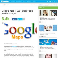
Others use the satellite images and terrain mapping features. But there are tons of other uses out there for Google maps. From mapping the weather and news to mapping things that aren't maps at all, like paintings or magazines, Google Maps has a lot to offer. And there are free tools available out there for those who want to use the Google Maps API without doing a bunch of coding. MyData : renverser la relation consommateur, concrètement. The Visible Universe, Then and Now. Before the telescope was invented in 1608, our picture of the universe consisted of six planets, our moon, the sun and any stars we could see in the Milky Way galaxy.
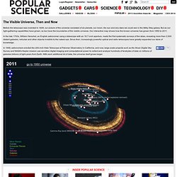
But as our light-gathering capabilities have grown, so too have the boundaries of the visible universe. Our interactive map shows how the known universe has grown from 1950 to 2011. In the late 1700s, William Herschel, an English astronomer using a telescope with an 18.7-inch aperture, made the first systematic surveys of the skies, revealing more than 2,000 distant galaxies, nebulae and other objects invisible to the naked eye.
Since then, increasingly powerful optical and radio telescopes have greatly expanded our store of knowledge. Presse - Article - Les journalistes français sur Twitter vus comme un graphe. Chris Harrison. #OpenData conversational graph. An Annual Report on One Man's Life. Nick Bilton/The New York TimesNicholas Felton and his 2008 annual report.

At the end of 2005, Nicholas Felton decided to publish a report that would chronicle his life over the previous year. He looked through his music archives to see how many songs he had listened to. He checked his airline ticket stubs to see how many miles he had flown. He aggregated the number of books read and photos taken. Actuvisu Blog. Tracking change and innovation in the enterprise software development community. Data Platform. Architecting the future of big data.
Welcome to Apache™ Hadoop™! Latest. As I mentioned in my previous post, our collaboration with the Sabeti Lab is aimed at creating new visual exploration tools to help researchers, doctors, and clinicians discover patterns and associations in large health and epidemiological datasets.
These tools will be the first step in a hypothesis-generation process, combining intuition from expert users with visualization techniques and automated algorithms, allowing users to quickly test hypothesis that are “suggested” by the data itself. Researchers and doctors have a deep familiarity with their data and often can tell immediately when a new pattern is potentially interesting or simply the result of noise. Visualization techniques will help articulate their knowledge to a wider audience. This time around I will describe a quantitative measure of statistical independence called mutual information, which is used to rank associations in the data. -log 1/1000 = log 1000 = 6.9. About - Company, Products & Services, Contacts. Infographic Of The Day: Bloomberg And Frog Turn Raw Data Into Branding. Bloomberg is a sprawling, multi billion-dollar enterprise, which creates a distinct problem if you’re trying to explain what the company actually does.

They do lots of things, ranging from law research to sports research for team managers to, of course, stock-market data crunching. "Many people have a single association with Bloomberg, as a wire service or a market-data provider," says Jen Walsh, Bloomberg’s head of digital marketing. "We wanted our website to shine a light on other aspects of the business. " Walsh sounds like she’s describing a typical corporate homepage, but she tapped frog to create something altogether different: A vast, infinitely scrolling wall of real-time data. The idea is that Bloomberg, in all of its businesses, provides data and information.
Walker Art Center - Directions. Visualizations – Our Most Popular Creations. The World Bank - Mapping for Results. Transparent Africa. Map « Open Government Data. Un état des lieux de l’Open Data. Desktop. How many pupils from your school go to Oxbridge? Four schools and one sixth-form college sent more pupils to Oxford and Cambridge between them over three years than 2,000 schools and colleges across the UK, according to a new study that analyses university admissions by individual schools.

Westminster, Eton, St Pauls, St Pauls Girls School and Hills Road sixth form college, a state school, produced 946 Oxbridge entrants from 2007-09. In the same period, 2,000 schools and colleges sent 927 pupils to Oxbridge. The difference in these schools' success rates is driven mainly by gaps in achievement at A-level, but some schools do better at gaining entry to university than others with similar exam results.
At a comprehensive and a private school in Cornwall, with near identical results, one sent 17% to selective universities and the other 66%. There are striking differences even between schools of the same type. Data summary. The Guardian Open Platform. The Open Government Playbook / FrontPage. Infochimps. APIs & Developer Resources. Infochimps. Ideas, issues, knowledge, data - visualized! Cool Infographics - Cool Posters. A collection of great infographic posters from around the world. Click the image to be taken to the poster site to view details and order yourself a copy.
Byjess.net. Column Five Media. Infochimps Data Marketplace + Commons: Download Sell or Share Databases, statistics, datasets for free. Www.the-breaks.com, AKA The (Rap) Sample FAQ. Royal Society journal archive made permanently free to access. 26 October 2011 Around 60,000 historical scientific papers are accessible via a fully searchable online archive, with papers published more than 70 years ago now becoming freely available. The Royal Society is the world’s oldest scientific publisher, with the first edition of Philosophical Transactions of the Royal Society appearing in 1665. Henry Oldenburg – Secretary of the Royal Society and first Editor of the publication – ensured that it was “licensed by the council of the society, being first reviewed by some of the members of the same”, thus making it the first ever peer-reviewed journal.
Philosophical Transactions had to overcome early setbacks including plague, the Great Fire of London and even the imprisonment of Oldenburg, but against the odds the publication survived to the present day. Bank for International Settlements. BuzzData. Data journalism and data visualization. préserver son anonymat sur Internet. Licence ouverte / Open licence - ETALAB. Dans le cadre de la politique du Gouvernement en faveur de l’ouverture des données publiques (« Open Data »), Etalab a conçu la « Licence Ouverte / Open Licence ». Free Geolocation Database. New Database Format Available: This page is for our legacy databases. For our latest database format, please see our GeoLite2 Databases. Databases IP Geolocation The GeoLite databases are our free IP geolocation databases. Galerie de Eric Fischer. Vis4.net. Fortune 500.
Data Pointed. Looking 4 data visualization. Public Data Explorer. Indicateurs de développement humain Rapport sur le développement humain 2013, Programme des Nations Unies pour le développement. SPARQL Query Language for RDF. W3C Recommendation 15 January 2008 New Version Available: SPARQL 1.1 (Document Status Update, 26 March 2013) The SPARQL Working Group has produced a W3C Recommendation for a new version of SPARQL which adds features to this 2008 version.
API Docs. Goddard Scientific Visualization Studio. Tactical Technology Collective. Welcome — LOD2 – Creating Knowledge out of Interlinked Data. Planet LOD2. RDFLib LOD Server. Jena Semantic Web Framework. Welcome. Developers. Tim Van Damme. Defining the Open in Open Data, Open Content and Open Services. Gromgull. How British do you feel? Visualised. Le blog de Réutilisation des données publiques: Montpellier.OpenData.org.
Portail:Cartes ouvertes. Accueil. All Statistics. Organisation de Coopération et de Développement Economiques. World Map of Open Government Data Initiatives. International Open Government Data Camp looks to build community.