
Creativity. Infochimps Data Marketplace + Commons: Download Sell or Share Databases, statistics, datasets for free. Image gallery: 22 free tools for data visualization and analysis. November 7, 2013 03:21 PM ET The chart below originally accompanied our story 22 free tools for data visualization and analysis (April 20, 2011).
We're updating it as we cover additional tools, including 8 cool tools for data analysis, visualization and presentation (March 27, 2012) and Six useful JavaScript libraries for maps, charts and other data visualizations (March 6, 2013). Click through to those articles for full tool reviews. Features: You can sort the chart by clicking on any column header once to sort in ascending order and a second time to sort by descending (browser JavaScript required). Digital Dashboards and Data Visualization by ComponentArt. Google+ launches ‘Ripples’ visualisation. After what appears to be have been a rapid and widespread take-up of its Google+ social media service, Google has now launched details of its ‘Ripples’ feature.
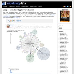
Significantly, news of the release was made by Fernanda Viegas, one of the most prominent names in the field and co-leader, with Martin Wattenberg, of Google’s “Big Picture” data visualization group. (Update: the Ripples development team also included Jack Hebert). The visualisation plots a network diagram to display how a post spreads as users re-share it on Google+. The direction of the sharing activity is indicated through arrows. Visualizing Yahoo! Mail. d3.js.
Fast Analytics and Rapid-fire Business Intelligence from Tableau Software. Social Media Monitoring and Analysis Made Easy.