
Analyse-Audit-SiteWeb-Blog-Ecommerce.pdf (application/pdf Object) A Guide To Heuristic Website Reviews - Smashing UX Design. Advertisement In this article, we’ll explore a scoring system for rating and comparing websites, we’ll visualize those ratings using infographics, and we’ll see what data and structure this method provides for reviewing websites.

How To Tell Whether A Website Is Junk We are all reviewers. We review many websites every day without even realizing it. In fact, many of us are experts at it. That’s how it is. Consultancy Reviews For many years, the agency I work for1 has conducted detailed reviews of its clients’ websites. Snap judgments may be useful and unavoidable, but when it comes to reviewing websites professionally, we need to be more organized and thorough, and we do this by using a review methodology. To make this easier, we use a set of heuristics to score websites, along with a simple method to quickly visualize any weaknesses. Heuristics 3(Image: Rick S.4) All That Glitters Is Not Gold We might be swayed by something that looks good, but we all know that beauty is only skin deep.
Depth. Navigation usability guidelines. List of navigation and IA usability guidelines Download an Excel workbook containing all 247 web usability guidelines You can also download translated versions of this checklist.

How to use these guidelines Work through each of the items in the list and mark your site as either conforming or not conforming to the guideline. Remember that all guidelines are context specific. These guidelines are purposefully expressed as positive statements, so that when you feed the results back to the design team you can identify some strengths of the design before you launch into the problems. About the author. Livre_Blanc_LudoTIC_Dia-Logos_10_sites.pdf (application/pdf Object) L’évaluation heuristique « Dia-Logos. Fréquemment utilisée en ergonomie des interfaces, l’évaluation heuristique est une des rares techniques ergonomiques qui permet d’établir, sans impliquer directement des utilisateurs, un bilan des problèmes ergonomiques dits “de surface” d’un logiciel, site web, Intranet, jeu vidéo… Cependant l’évaluation heuristique ne peut en aucun cas se substituer aux techniques d’exploration telles que les tests utilisateurs qui permettent d’étudier de façon précise la façon dont les utilisateurs “réels” du produit peuvent interagir avec celui-ci.

Quelques repères… Définition L’évaluation heuristique consiste à inspecter une interface en évaluant le degré d’application d’une liste de lignes directrices établies de façon détecter les aspects positifs et négatifs du point de vue de l’utilisabilité et à en déduire des recommandations d’amélioration adaptées. Elle est réalisée par plusieurs évaluateurs experts. Objectif Phase du projet Conception / évaluation Problématique/Situation/ contexte Protocole. Site Usability Heuristics for the Web. This appeared in Web Review, October, 1997.

This is part 2. Part 1 is Site Usability Evaluation. Jakob Nielsen's 10 usability heuristics appear below, with his description in bold and my Web-specific comment following. The overriding theme for applying these heuristics to the Web is to use links effectively. 1. The system should always keep users informed about what is going on, through appropriate feedback within reasonable time. Probably the two most important things that users need to know at your site are "Where am I? " Make sure each page is branded and that you indicate which section it belongs to. My Site Stress Test is an evaluation focused on this heuristic because it is so important on the Web. Heuristic Evaluation, A System Checklist. By Deniese Pierotti, Xerox Corporation Heuristic Evaluation - A System Checklist 1.
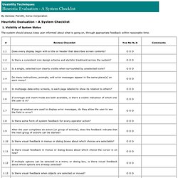
Visibility of System Status The system should always keep user informed about what is going on, through appropriate feedback within reasonable time. 2. The system should speak the user’s language, with words, phrases and concepts familiar to the user, rather than system-oriented terms. 3. Users should be free to select and sequence tasks (when appropriate), rather than having the system do this for them. 4. Users should not have to wonder whether different words, situations, or actions mean the same thing. 5. Error messages should be expressed in plain language (NO CODES).