

Infographie : le marché européen du micropaiement. Les Chiffres du m-commerce en 2012 - Infographie. Des chiffres, des chiffres… toujours plus de chiffres.
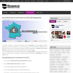
Ceux du m-commerce sont encourageants et parfois surprenants. Les ventes de smartphones n’y sont bien sûr pas pour rien mais les entreprises s’adaptent aussi en s’efforçant de plus en plus à proposer une navigation simplifiée et agréable afin d’améliorer leurs taux de conversion. Aujourd’hui, aucun canal mobile ni support (device) ne doit être négligé.
Avec cette infographie, Edatis nous apprend notamment que le panier moyen des achats sur tablette est 20% supérieur à celui des achats via ordinateur et 54% plus élevé que celui des achats via Smartphones. [Infographie] 5 étapes clefs pour optimiser sa stratégie de marketing digital. [Infographie] Publicité online : Facebook vs Google, le match ! Réalisée par WordStream et relayée sur Mashable, l’infographie suivante présente l’éternel combat que se livrent Google et Facebook dans le domaine de la publicité online.
![[Infographie] Publicité online : Facebook vs Google, le match !](http://cdn.pearltrees.com/s/pic/th/infographie-publicite-40355932)
Une réalisation qui s’inscrit donc clairement dans l’actualité au vu de l’annonce faite par General Motors. En effet, le troisième plus gros annonceur des Etats-Unis a déclaré ce matin qu’il allait retirer son budget publicité de Facebook, expliquant que celle-ci était inefficace. Portée de la publicité, revenus générés, coûts, ou encore performance et formats déployés… L’infographie s’est attachée à évaluer les deux géants du web sur 5 segments différents. Pour rappel, au 1er trimestre 2012, le coût par mille (CPM) des publicités sur Facebook aurait augmenté de 41% par rapport au 1er trimestre 2011, tandis que le taux de clic, aurait quant à lui baissé de 6% sur les 5 marchés étudiés (Etats-Unis, Canada, Royaume-Uni, France, Allemagne) en l’espace d’un an.
Groupon: Sound Investment or Risky Business? [INFOGRAPHIC] Groupon's financial history hasn't always been this precarious, but lately, the daily deal site seems to be teetering on a stock market tightrope.
![Groupon: Sound Investment or Risky Business? [INFOGRAPHIC]](http://cdn.pearltrees.com/s/pic/th/investment-infographic-29259005)
In April, the company's stock price plummeted on news that the SEC planned to investigate Groupon's Q4 earnings restatement. Why Most People Say They're Addicted to the Internet [INFOGRAPHIC] Are you addicted to the Internet?
![Why Most People Say They're Addicted to the Internet [INFOGRAPHIC]](http://cdn.pearltrees.com/s/pic/th/addicted-internet-infographic-23755938)
If so, you're not alone. Some 61% of people feel addicted to the Internet and are unable to quit browsing, according to an informal survey. Opinion pollster SodaHead surveyed 602 visitors to its site Feb. 16. about whether they experience Internet addiction, and found that many people are self-diagnosed addicts. Women experience addiction more than men, with 64% of women compared with 55% of men reporting the symptoms of addiction. Interestingly, respondents addicted to other behaviors were less likely to be addicted to the Internet. Etsy: infographic « ellipticalpointofview. Etsy: infographic Posted by natacha suttor on July 25, 2011 · 4 Comments I’ve gone through available compete data and etsy weather reports to summarise some of the key points you need to know about etsy.
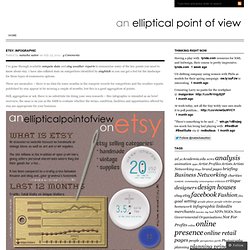
I have also collated stats on competitors identified by etsybitch so you can get a feel for the landscape for these types of ecommerce options. The History of Email [INFOGRAPHIC] Email, you've come a long way, baby.
![The History of Email [INFOGRAPHIC]](http://cdn.pearltrees.com/s/pic/th/the-history-email-infographic-50900125)
In its 40-year tenure as a form of communication, email has run its course from the domain of über nerdy computer scientists to one of the most common ways to keep in touch, both personally and professionally. Although email as a mode of communication was around for ten years before the term "email" was actually coined, we now count on it in our daily lives. In fact, the use of email has become so pervasive that the Oxford English Dictionary recently added a slew of email acronyms to its official canon. And finally, just this year, the AP Stylebook, a.k.a. the holy book of all (or most) journalists, amended the spelling of e-mail to email, allowing articles such as this one to save bigtime on hyphens. Website-flowchart.jpg (JPEG Image, 2653x1378 pixels) - Scaled (37. What Your Web Design Says About You (Infographic)
Font and color choices in a website say certain things about the owner of the site.

Though colors and symbols may have different meanings in other cultures, this only reaffirms the notion that design choices do affect the perception of the user, which in turn affects the message attempting to be conveyed. Here is an infographic that delves into the meanings of fonts and colors in the context of web design. Click to enlarge. Related Content About the Author. Free Drupal Infographics PDF + t-shirt. Find out all you ever wanted to know about Drupal, but were afraid to ask.
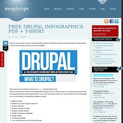
Take a look at this fast overview of basic facts about Drupal, print out a card and use it as a handy resource to promote the awesome features of this powerful CMS. You can even download a version for t-shirt and become the coolest geek on your next meetup or Drupalcamp. Questions covered: The Anatomy of a Perfect Website. The Anatomy of a Perfect Website from R.O.I Media does a really good job of looking at the primary components of a good website design.
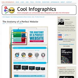
There are many decisions that need to be made by website owners and designers in each of the different sections, and of course data should be driving those decisions. Websites need a formula – a vivid blueprint that painstakingly weaves technicality, design and detail into something iconic and memorable.