
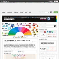
[Infographie] Top 100 des marques les plus valorisées au monde. Le cabinet d’études Millward Brown a publié hier son palmares annuel du top 100 des marques les plus valorisées à travers le monde.
![[Infographie] Top 100 des marques les plus valorisées au monde](http://cdn.pearltrees.com/s/pic/th/infographie-valorisees-40461817)
Pour la deuxième année consécutive, Apple se place sur la première marche du podium avec une valorisation de 182,951 milliards $, en hausse de 19% par rapport au classement BrandZ de l’année précédente. Autre enseignement marquant de l’étude : sur les 10 premières places, sept sont occupées par les marques high-tech. On retrouve ainsi IBM en seconde position, suivi de Google qui arrive sur la 3ème marche. Viennent ensuite Microsoft (5), AT&T (8). Verizon et China mobile occupent respectivement les 9ème et 10ème rang du classement.
Top 10, nouveaux entrants, plus fortes progressions, évolution spar catégories… L’infographie suivante récapitule les principales tendances et chiffres mis en avant par l’étude. The Most Powerful Colors in the World by COLOURlovers. When we released our report on the colors of the social web, based on data analyzed by our Twitter theme tool, we were surprised that blue was such a dominant color in people's profile designs.
Was Twitter's default color influencing their design decisions? Or is blue really THE most popular and dominant color online? ...We decided to look at the colors in the brands from the top 100 sites in the world to see if we could paint a more colorful picture. [click to view in full size] Turns out the blue-berry doesn't fall far from the bush. While the initial reasoning for the colors chosen may be trivial, the impact that these dominant players now have in the web world will surely influence the smaller startups that want to share in the positive color associations created by their bigger siblings... Would A Corporation By Any Other Color, Still Profit As Well? Color is an important part of any brand, but along with the actual name of a company...
The Colors of 1 Million Brand Icons Uh-oh! Team. [Infographie] Anatomie des nouvelles startups. Ikea versus Apple. Ford et les réseaux sociaux. Honda et les réseaux sociaux. Charting The Life And Death Of Our Greatest Companies. I’ve said it many times and I’ll say it forever: A great data visualization has the power to illuminate the world in ways that would otherwise be impossible.
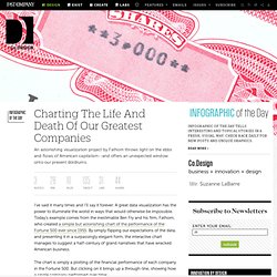
Today’s example comes from the inestimable Ben Fry and his firm, Fathom, who created a simple but astonishing chart of the performance of the Fortune 500 ever since 1955. By simply flipping our expectations of the data, and presenting it in a surpassingly elegant form, the interactive chart manages to suggest a half-century of grand narratives that have wracked American business. The chart is simply a plotting of the financial performance of each company in the Fortune 500. But clicking on it brings up a through-line, showing how a single company performed over time: Thus, amidst all the wash of data, you can pick out individual stories, and you can choose to view them through the lens of ranking, revenues, and profits. But compare that to a company such as BF Goodrich, the tire company. Now they look pretty healthy.