
Before LinkedIn, How Exactly Did Our Ancestors Find Jobs? Didn’t you always wonder how folks found jobs back in the day?

I mean the day before LinkedIn. Were there neolithic recruiters? Were headhunters literally that? We will never know. What we do know is that there were jobs then that have somehow vanished. Fuller, arming squire, leech collector, barber-surgeon, stone worker, lime burner, treadmill worker, lance maker, chain-mail maker, royal falconer, purple maker, and shepherd. Titles like these surely stir up your interest in the job market of yesteryear? Jörgen Sundberg The original Undercover Recruiter, after 7 years in tech recruiting Jorgen now runs Link Humans, a social media agency in London.
Why Retraining Current Employees Is Cheaper than Hiring New Ones. Infographic about infographics. 10 Free Tools To Create Visually Appealing Infographics. By Akhter on June 12, 2012 10 Free Tools To Create Visually Appealing Infographics Don't Forget to participate in a contest where you can win an amazing e-Commerce template from TemplateMonster.

Infographics is the graphical representation of information or data. The information presented through Infographics is visually appealing and can be scanned easily. Furthermore, you can effectively represent relatively large amount of data in a very small space. In this round up, we are presenting some free tools that you can use to create visually appealing and effective Infographics. Visual.ly Visual.ly Create is the fastest, smartest and most beautiful approach to data visualization yet. Stat Planet Create fully customizable interactive and animated bar charts, time series and scatter plots. Inkscape It is a free vector graphic tool. with this tool you can create your overall infographic free.
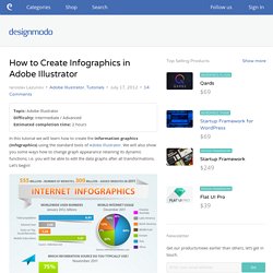
ChartBin With this tool you can create your own interactive map. Creately Wordle ManyEyes Google Public Data. How to Create Infographics in Adobe Illustrator. Topic: Adobe IllustratorDifficulty: Intermediate / AdvancedEstimated completion time: 2 hours In this tutorial we will learn how to create the information graphics (Infographics) using the standard tools of Adobe Illustrator.

We will also show you some ways how to change graph appearance retaining its dynamic functions; i.e. you will be able to edit the data graphs after all transformations. Let’s begin! Step 1 The work with infographics always involves information search and data processing in the first phase of your project. All information should be entered in the Entry text box. Step 2 Our created object is a dynamic object, i.e. we can always change the name, data sequence and the number of categories and/or data. The graph design will change only after you click on OK in the dialog box. Infographics. How Movie Posters Have Changed In The Last 98 Years [Infographic] It seems silly when Pantone announces the new color of the year, but their basic premise is correct: Our tastes in colors change over time.
![How Movie Posters Have Changed In The Last 98 Years [Infographic]](http://cdn.pearltrees.com/s/pic/th/posters-infographic-business-33003942)
Consider the green refrigerators and yellow countertops of the 1970s vs the stainless steel appliances of today. Be it in paints, inks, fabrics or linoleums, color sink into our collective consciousness. Vijay Pandurangan was interested to see how colors played out in one of society’s most time-honored advertising traditions, the movie poster. So through some clever code, he snagged 37,000 posters from an online image database, sorted them by year (1914-2012), counted the color pixels in each poster and then mapped each color’s frequency in a simple horizontal strip. Click to enlarge. What he generated was a fascinating timeline, a way to quickly scan the trends of Hollywood marketing in terms of nothing but color.
If you like the infographic, be sure to check out the interactive version on Pandurangan’s page. See it here. [Hat tip: boingboing] The Infographics Gallery. Data Visualization, Information Design and Infographics. Geny-in-the-workplace-infographic-mba-at-unc.jpg (JPEG Image, 650x3708 pixels) - Scaled (17%)