
How Amazon Saves a Ton of Money [INFOGRAPHIC] With $48.1 billion in net sales last year, Amazon is certainly the leading Internet retailer.
![How Amazon Saves a Ton of Money [INFOGRAPHIC]](http://cdn.pearltrees.com/s/pic/th/amazon-saves-money-infographic-31631346)
But how does the company fare in other areas, such as employee satisfaction and corporate social responsibility? Not so well, according to an infographic from MBAOnline, a website that curates business information from the top minds in the blogosphere. In fact, Amazon seems to put saving money ahead of many other priorities. For example, on a 102-degree day in June 2011, 15 workers in an Amazon warehouse collapsed from the lack of air conditioning, six of whom needed to be rushed to the emergency room. And despite a $5 billion cash reserve, Amazon donates nothing to charities — if an employee wants to deduct a donation from his or her paycheck, he or she has to pay an additional fee.
SEE ALSO: Do E-Reader Owners Read More Books? History of Windows Infographic. Sizing up Google vs Baidu in China. 23 February '12, 02:45am Follow We’ve written considerable amounts about Google’s approach to China, which the company says it is still focused on despite the fact that it relocated its search engine to Hong Kong in 2010. Of all of the challenges that Google faces there, the fierce competition provided by Chinese rival Baidu is one of the biggest. Baiduis simply killing Google in its core market, search. Yet outside of China little is known of the company, which s very much like Google but with key differences. Were you aware, for example, that Baidu has more than 50 communities and services online, including maps, an encyclopedia, a mobile OS and more?
We’re usually skeptical on infographics but these stats, and more, are brought to us in a neat visual comparison from Digimind, which asks: ‘Is the battle already lost for Google?’ Looking at their prime focus, Baidu is streets ahead of Google in search, controlling 83.6 percent of all searches in China against Google’s 11.1 percent. How Google Affects Memory and Learning [Infographic] Online colleges put together this nifty infographic that shows us how Google helps us find information on the Internet, so we can keep our minds clear and fresh.
![How Google Affects Memory and Learning [Infographic]](http://cdn.pearltrees.com/s/pic/th/infographic-socialtimes-16267672)
But, perhaps we rely too much on Google. The information is insightful because it illustrates how Google helps us keep our daily lives organized and coherent. When only a few years ago, half of what Google offers now wasn’t even available then. Google is a service that we take for granted — just think where we’d be without it. If I didn’t have Google, I’d own an updated encyclopedia set and several reference books. Research and Design by: Online Colleges Site. Infographie : les 10 sites les plus populaires. The Six Biggest Websites On The Internet Compared [Infographic] Startup_Toolkit_Info.png (PNG Image, 1200x6400 pixels) - Scaled (10.
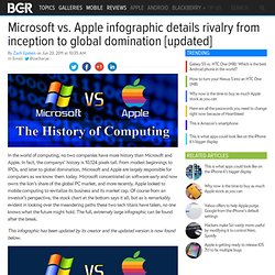
Blekko Gets An Infographic. Cloud Computing. Microsoft vs. Apple infographic details rivalry from inception to global domination. In the world of computing, no two companies have more history than Microsoft and Apple.

In fact, the companys’ history is 10,124 pixels tall. From modest beginnings to IPOs, and later to global domination, Microsoft and Apple are largely responsible for computers as we know them today. Microsoft concentrated on software early and now owns the lion’s share of the global PC market, and more recently, Apple looked to mobile computing to revitalize its business and its market cap. Of course from an investor’s perspective, the stock chart at the bottom says it all, but as is remarkably evident in looking over the meandering paths these two tech titans have taken, no one knows what the future might hold. The full, extremely large infographic can be found after the break.