
How to Properly Use Sunscreen. How Mobile Technology is Changing World Travel. Do you use your smartphone to help make traveling easier?
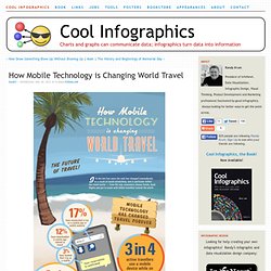
If you do, then your part of a huge growing trend. The How Mobile Technology is Changing World Travel infographic from MyDestination.com shares some interesting statistics when it comes to traveling. Back in 1903 when the Wright Brothers first took flight in their first fixed winged aircraft, little could anyone have imagined what travel would become. Fast forward to 2012 and the internet has revolutionised travel – along with communication – with the birth of the smartphone. From Parchment to Data Lockers: History of the Password [INFOGRAPHIC]
Trying to protect sensitive personal information from prying eyes is not something particular to the digital age — it's just human nature.
![From Parchment to Data Lockers: History of the Password [INFOGRAPHIC]](http://cdn.pearltrees.com/s/pic/th/parchment-password-infographic-28783705)
Before digital encryption and data lockers — and before the concept of identity theft even existed — passwords and their kin guarded secrets and kept conversations A-to-B. The first computer password was developed in 1961 at the Massachusetts Institute of Technology, when most people had never even seen a computer. Decades earlier, Nazis used "Enigma machines" to guard evil secrets.
And way back in the Bronze Age, the Spartan military used carefully matched sticks and leather to transmit messages. Typographical Infographics That'll Make You Go "Wow!" Apr 11 2012 Words are a really powerful tool to express what you think, but an even more powerful weapon to visualize your main thoughts and concept are graphics. To be more specific a rich combination of beautiful typographical signs, letters and symbols.
Australian Tourism Infographic. Who doesn’t dream about going to the land down under?

So if your curious about who is coming or going in Australia, planning a mini-vacation, or perhaps a permanent vacation, the Australian Tourism infographic from WeWish has the information for you! The only thing we like more than being on holiday is planning a holiday! Find out where everyone is heading this year. [Infographie exclusive] Le baromètre digital des écoles de commerce. Depuis quelques années, les écoles de commerce se sont peu à peu appropriées le web et les réseaux sociaux comme véritables outils de communication.
![[Infographie exclusive] Le baromètre digital des écoles de commerce](http://cdn.pearltrees.com/s/pic/th/infographie-exclusive-41136988)
Si certaines s’en servent comme simple dispsitif pour réunir et suivre leurs anciens étudiants, d’autres, en revanche, voient le digital comme un réel levier marketing d’acquisition de nouveaux étudiants. Partant de ce constat, le site MédiaEtudiant.fr s’est penché sur la stratégie digitale des écoles autour de 3 grandes thématiques : le social, le web et le mobile. Dans cette optique et en partenariat avec l’agence Kreactive, Media Etudiant a élaboré un premier baromètre mensuel de visibilité 2.0 des écoles de commerce. 15 Grammar Goofs That Make You Look Silly. Everyone makes mistakes, but that notion seems to go out the window anytime syntax is misused.

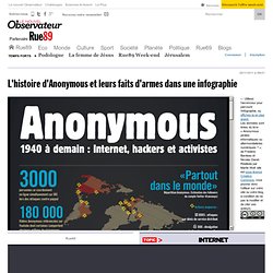
If the wrong there, their, or they’re is used at the wrong time on the internet, prepare for every web user to attack your intelligence and attempt to obliterate your self-esteem. Amanda Cox Talks about Developing Infographics at the New York Times. Tech Creeps Into Top Toy Trends of Last 30 Years. When it comes to the most-wanted toys of the holiday season over the past 30 years, one thing is clear: The toy market has become way more tech-centric. Between 1981-1990, Donkey Kong, Lazer Tag and Nintendo's Game Boy stood out as the lone tech toys desired by kids. In the following decade, the same number of tech toys were coveted, including Tickle Me Elmo, Tamagotchi and Furby. L'histoire d'Anonymous et leurs faits d'armes dans une infographie. « Nous sommes les Anonymous.
Nous sommes légion. Nous ne pardonnons pas. Nous n’oublions pas. Vous allez nous voir. » Cette devise martiale est celle d’un groupe d’activistes organisé et agissant sur Internet, les Anonymous. [Infographie] En ligne, les enfants seraient majeurs dès 11 ans. La société AVG, spécialisée dans la sécurité online, vient de publier une étude baptisée « Digital Diaries ».
![[Infographie] En ligne, les enfants seraient majeurs dès 11 ans](http://cdn.pearltrees.com/s/pic/th/infographie-seraient-frenchweb-36736646)
A chart of almost all the money. La mort en infographie. Le symbolisme de la mort et des lieux de recueillement est riche en signes, en messages et en imaginaire, du plus particulier aux symboles utilisés sur les pierres tombales dans le monde entier.
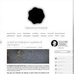
Parce que quiconque nait, mourra un jour, c’est une condition qui rassemble tous les humains (et toute la vie en générale), et donc le centre de nombreuses traditions, de nombreuses cultures, coutumes, symboles… Quelques données sur les profondeurs marines. Addicted to Angry Birds? Here's Help [INFOGRAPHIC] As we continue to work through our Angry Birds addiction, this playful infographic offers some consolation.
![Addicted to Angry Birds? Here's Help [INFOGRAPHIC]](http://cdn.pearltrees.com/s/pic/th/addicted-angry-infographic-15791746)
We're not alone in our attraction to flinging the flying fowl, but would like some answers, and this infographic is happy to oblige with lots of solid research. A Digital Day In the Life of a Student [Infographic] L’infographie des animaux domestiques. Pets on Pillows [INFOGRAPHIC] Animal facts weird. Kidfographics. L’agence Dare Vancouver a pensé la campagne vidéo « Receiss » pour B2ten, et Canadian Sport for Life.

Voulant communiquer et encourager le sport chez les enfants, cette vidéo utilise ces derniers pour créer des infographies. Un rendu intéressant à découvrir dans la suite en vidéo. How Do Architects Use Twitter? [INFOGRAPHIC] Italia-infographic-map. Bible-marriage. NFL. What's happening in the world of social media? That's not a simple question to answer, as this space is quickly becoming one of the busiest, most interesting aspects of our digital lives. However, if we had to choose the best way to present the wealth of recent information on social media — how companies are using it to improve their business, how individuals are interacting with its many facets and how it's affecting our lives — the simplest way would probably be to showcase the best social media infographics from the last few months, and that's exactly what we did.
Infographic Of The Day: The Fantasy Sports Economy Is Rip-Roaring. I’ll admit that I don’t understand a lick about fantasy sports: So you get together with your friends and invent make-believe teams? Then you trade your players in such a way that you effectively rip off your buddies? And you have to pay money for the privilege? What’s the difference between that and, say, playing Barbies? I mean, on the one hand, you have a pastime in which lonely children make playthings of little plastic human simulacra.
On the other, you have something that doesn’t involve Derek Jeter. 4thof July facts. How Dad's Music Indicates What You Listen To Today [INFOGRAPHIC] Do dads really have an influence on the musical tastes of their offspring? This amusing flowchart, created for Father's Day in honor of dads who rock, predicts the kind of music you prefer by the tunes your father listened to when you were growing up. However, as a parent, I realize that many times my influence on my teenager has an opposite effect. America According to Twitter: U.S. Cities Remixed [INFOGRAPHIC] Paradise or Peril Infographic.
Les réseaux terroristes islamistes dans le monde. Identity Theft Facts and Figures. Filed under: People Infographics | 2 Comments » This gorgeous graphic, provided by blog.kgbpeople.com should give you a reason to be worried about identity theft if you weren’t already. If you thought that the advent of services like Lifelock have reduced identity theft in the U.S. over the past several years, I advise you to think again. According to this eye-opening graphic, identity theft has been on the rise since 2003. In 2003, a “mere” 10.1 million people found themselves the victims of identity theft. Les Français et ... les files d’attente. Journey of a Successful blog post. Royal Wedding : the infographic.