background preloader

How to CRO

Facebook Twitter

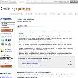
Powerful Value Propositions. Topic: Powerful Value Propositions: How to Optimize this Critical Marketing Element – and Lift Your Results Do you think your value proposition is powerful? Would your prospects agree? Most of the time, when we ask companies about their value proposition, we hear a description of their business model. But that’s not what most customers care about. Customers not only want to know “What’s in it for me?” But “Why buy from you?” This is an area that even seasoned marketers have trouble with, because there is so much confusion about what makes a value proposition effective - including how to find one in the first place. Because value propositions are so important to conversion, making a few small but crucial changes can have a big impact across all of your marketing efforts. Value Proposition Problems That Hold Marketers Back: Value propositions can be intimidating because they strive to combine small size — often 10 words or less — with a lot of substance.
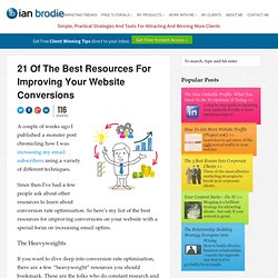
What exactly is your value proposition? Landing Page Checklist - Peter Sandeen. 21 Of The Best Resources For Improving Your Website Conversions. 116 Shares Twitter 57 Facebook 31 Google+ 10 LinkedIn 18 116 Shares × A couple of weeks ago I published a monster post chronicling how I was increasing my email subscribers using a variety of different techniques. Since then I’ve had a few people ask about other resources to learn about conversion rate optimisation. So here’s my list of the best resources for improving conversions on your website with a special focus on increasing email optins. The Heavyweights If you want to dive deep into conversion rate optimisation, there are a few “heavyweight” resources you should bookmark. Your first port of call should be MarketingExperiments. A great place to get started is their primer on Building To The Ultimate Yes.
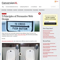
Online marketing veteran Bryan Eisenberg has a great series of Conversion 101 blog posts that cover everything from landing pages, webinar invites, sales videos, etc. Practical Hints and Tips Blogs and resources with regular articles on improving conversion rates and email optins. 5 Principles of Persuasive Web Design. What’s the best way to persuade somebody when talking to them? You have to be confident, talk fast and swear a little, among other things. But what about persuading somebody without words – possible? You bet. Researchers installed a ‘fly’ onto urinals across different airports around the world: The presence of a fly in a urinal literally changes human behavior. This is a clear case of getting people to do what you want without using words.
Are people in Denmark selfish? This graph represents the number of people who’re registered organ donors, divided by countries: So only 4.25% of Denmark, but over 99% of Austrians – what’s going on here? People go with whatever is the default. Do people change software settings? Here’s another tidbit. If you’d like more people to take action, make the preferred actions ‘default’. That being said, there are lots of opportunities with designing for default. We spend very little time on deliberate thought Our decisions change depending on how we think 1. 2. 3.

How to Write Web Copy that Converts - 8 Simple Techniques Based on 4 Years of Research - ContentVerve.com. “How do I write web copy that converts?” If you find yourself asking that question a lot, you’re in luck! In this post I’ll give you 8 simple techniques that will help you get it right every time. These techniques are based on what I’ve learned from 4 years of research and 300 copy-related A/B tests. 1.

If you want results, you need to start by setting goals. I think we can all subscribe to the logic behind this statement. If you want to achieve results with your website copy, you need to start by defining the goal of the individual piece of copy. If you’re writing copy for a sign-up form, you need to focus on the conversion goal of the form and the purpose of the copy: to get as many qualified leads as possible to fill out the form and sign up. Therefore, it’s important that you can leave the ”artist” on the shelf for a while in favor of a more analytical/scientific approach that will help you focus on giving your potential customers what they need in order or make the right decision. 2.

How to Write Web Copy that Converts - 8 Simple Techniques Based on 4 Years of Research - ContentVerve.com. 4 ways to optimize your web pages to increase conversions. At BoostSuite, I help passionate small business owners and web marketers like you with your digital marketing strategies every day. I’ve seen it all. I’m no stranger to the good, the bad, and the ugly. First off, what is a conversion? A conversion is the most important factor to the success of your online marketing strategy and goals. Second, what is a conversion funnel? It’s the process of getting visitors to your site and then using various marketing techniques to convert them into leads and/or customers.

Here’s a nice graphic from HubSpot: Whenever I first talk to any of our new users and try to get them on the path to web marketing success, I immediately take a look at their website to see if their pages have a couple of items that are crucial for increasing conversions. Immediately I check to see if they have a content management system (CMS) that allows them to add/edit content on their website. 1. Raleigh Produce Delivery Service | Company Name Produce Delivery 3) Use Calls-to-action. Do I Really Need a Call to Action at the End of My Content?

Guest post by Jeff Herring Q: Do I need a Call to Action at the end of my article content? A: I must admit, I was a little surprised by this question. It came from someone who had purchased an entry level resource from me, and the purchase came with a bonus strategy session. In the book “Made to Stick” authors Chip and Dan Heath talk about the “curse of knowledge” – thinking that just because you know something means every one else knows it too. So this question was another gentle reminder to always carry somewhere within you a “beginner’s mind” so you can make the most difference with your students. On to the answer So the answer is absolutely yes, you always want to have a call to action at the end of your article content. 1) Even if you are creating content and/or articles just to see your name in print, you are doing your readers a disservice by not showing them a way to get more from you. Why? And you don’t really want to do that, do you?
11 Ways to Optimize Thank You Pages. Post-conversion Thank You pages present a great opportunity for further conversion — not just for another sale, but also microconversions. Here are ten-plus-one ways to squeeze the most of your confirmation pages and email. Create an account Offering guest checkout with option to create an account after successful conversion is a win-win, but don’t forget to romance why the customer should bother creating one. Action Envelope makes this a simple 3-field process, but the call-to-action does compete with several other page elements. Image credit: PitStop Media Keep shopping Are you thinking “why would someone who just finished shopping want to start again?” Sometimes cross-selling and upselling is ignored or worse — causes abandonment — during the buying process, so post-purchase merchandising gives you a second chance to get the buyer’s attention.
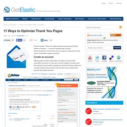
Suggest, suggest, suggest Image credit: SearchEngineLand via @SandraNiehaus <-- follow her! Let’s make a deal Image credit: Listrak Smart cross-sell. Don’t Use Automatic Image Sliders or Carousels, Ignore the Fad. 553inShareinShare I’m sure you’ve come across dozens, if not hundreds of image sliders or carousels (also called ‘rotating offers’). You might even like them. But the truth is that they’re conversion killers. So if they’re not effective, why do people use them? 2 reasons: Some people think they’re cool. What the tests say I’m not alone. We have tested rotating offers many times and have found it to be a poor way of presenting home page content. Chris Goward, Wider Funnel Rotating banners are absolutely evil and should be removed immediately.
Tim Ash, Site Tuners Jakob Nielsen (yes, the usability guru) confirms this in tests. Notre Dame university tested it too. Product design guru Luke Wroblweski summed it up like this: . There’s a discussion about automatic sliders on StackExchange UX. Here are some of the things different people who tested them said: Almost all of the testing I’ve managed has proven content delivered via carousels to be missed by users. Adam Fellows Here’s another one: Lee Duddell. Auto-Forwarding Carousels and Accordions Annoy Users and Reduce Visibility. Google Tag Manager: New Google Product. Today Google announced a new product to the world: Google Tag Manager.
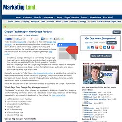
It is an extremely important addition to marketers, as it allows them to add or remove tags used for marketing and measurement without the need to ask from webmasters to change the website code. According to the Google Tag Manager help center: Google Tag Manager allows you to conveniently manage tags (such as tracking and marketing optimization tags) on your site.

You can add and update AdWords, Google Analytics, Floodlight and non-Google tags from the Google Tag Manager user interface instead of editing site code. This reduces errors, frees you from having to involve a webmaster, and allows you to quickly deploy tags on your site. Basically, according to Phillip Klien, a tag management system is a solution that controls the deployment of externally hosted JavaScript “page tags”, very similar to what a Content Management System does for content. Which Tags Does Google Tag Manager Support? Conversion for e-commerce: Two winning tests for a multilingual online florist. In this article, we’ll show you how to increase your win rate by doing some diligent research. Plus, we’ll show you the results of two interesting tests. daFlores delivers flowers to over 30 countries. Overview e-commerce sites have a particular challenge when it comes to conversion rate optimization: Implementation can require significant technical resources.
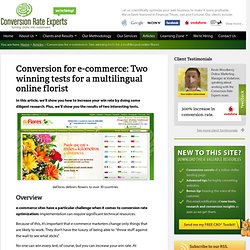
Because of this, it’s important that e-commerce marketers change only things that are likely to work. No one can win every test, of course, but you can increase your win rate. This article describes the work we’ve been doing with Latin America’s largest network of florists. daFlores was the first to offer online flower delivery to South America, and now it delivers flowers worldwide. On this page, we reveal how we did it, so you can apply the same techniques to your business. We started—as we always do—with objection collection As you can imagine, daFlores’ visitors had a wide range of objections. 1. The control. 2. How-to guides. How we doubled the sales of a web app. PhotoShelter is a web app that lets photographers easily create highly effective websites, allowing them to sell, market, and store their photography online.
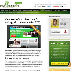
By applying our CRE Methodology™ to PhotoShelter’s website, we have helped it to double its annual sales. This is money that will continue to accrue every year. How we got those improvements When we started working with PhotoShelter, the company was already well beyond the stage of obtaining product/market fit; it was a successful business operating in a market that was relatively mature (at least in web terms) and competitive. (Side note: If your company, product, service, web app, or whatever is still in its embryonic stages, we highly recommend you read these resources from four very intelligent guys: this article by Paul Buchheit, who created Gmail; this one by venture capitalist Paul Graham; this slide deck by Dave McClure; and these videos by retired entrepreneur Steve Blank.)

We have run many projects with PhotoShelter. 1. 2. What Eyebrows and Websites Have in Common. Have you ever wondered why you have a small patch of thick, delicate hair above each of your eyes? What purpose does it serve? Some could argue it fearlessly defends your eyes from the hostile invasion of forehead sweat, or that it was a way for ancient cavemen to defend a saber-tooth kill with one threatening scowl (oh, the power of nonverbal communication). Whatever the actual purpose, one thing is clear: This comparatively small facial feature is very significant to our daily lives, even if we don’t consciously think about it.

And, there can be dramatic ramifications if removed. Have you ever visualized someone you know without eyebrows? Anne Hathaway with eyebrows: Anne Hathaway without eyebrows: Wow, what a difference. Take our Director of Editorial Content, Daniel Burstein. Daniel with eyebrows: Daniel without eyebrows: At this point, if you are still reading, you are probably wondering, “Why am I reading about eyebrows on an Internet marketing blog?” Before: After: Control: Treatment: Conversion rate optimization tips from top 10 online retailers. By Alaister Low on July 2nd, 2012 Here is an interesting study conducted by The Nielsen Company in March 2010. They analyzed the top online retailers and calculated their conversion rates, which was the percentage of unique vistiors that made an online purchase on the given site.

The top e-commerce sites ranked by conversions showed huge, almost unheard of conversion rates. Here are the top 10 online retailers ranked by conversion rate with number one having a massive 40.6% conversion rate: There are a lot of conversion rate optimization lessons we can learn from these top online retailers. Great photos and product descriptions It’s very important to have great product photos and product descriptions. Don’t waste your time with stock standard photos. Here’s an example of great product photos. Woman Within – Great product photos Ask customers to leave reviews and feedback A lot of the ecommerce sites in the top 10 converting list allow customers who have bought a product to leave a review. HOW TO: Keep Your CTA Above the Fold on a Lead Gen Landing Page. A fundamental rule of landing page design is to try and keep your Call To Action (CTA) above the fold. This enables your visitors to quickly see where they need to interact with your page to be successful.

This is easy with a standard “Click-Through” style landing page that just offers a big shiny button for the user to click. You simply ensure that you place it in the top portion of the page. On a lead gen form, the CTA is at the bottom of the form (the submission button). So it’s quite common (especially if you have a relatively long form) to have the CTA fall below the fold. The solution to this problem is to implement 2 design rules that focus user attention on the lead capture form area. Step 1 – Give the Form Area a Big Bold Header Your form button may be below the fold, but the top of it shouldn’t be. Step 2 – Use a Directional Cue to Let Visitors Know where the CTA is Now that you’ve got their attention, you want to direct them downward. Click on the thumbnail for a full-size view. Increasing Lead Capture by 27% – A Conversion Optimization Case Study. Today’s guest post is a conversion optimization case study by Kevin Kaiser from Surety Bonds. In my last post I referenced their lead capture form as a good example of how to keep your CTA above the fold on a lead gen landing page.

Kevin discusses how he optimized a primary conversion goal – to have more customers complete a lead capture form to receive a quote. Over to you Kevin. Many people approach their web marketing strategy mainly as getting people to their site. Unfortunately, this is rarely the case. A Little Background The site performs well drawing in visitors. Location, Location, Location: Where to put the form?

When people are searching for a product, they have an idea in mind of what they are looking for. Note the form placement on the right-hand side of the homepage. From a link to a button Initially, we only had a link to the form in the side column on our homepage which did nothing to stand out from with the other links on the page. Adding the form to the homepage Ask Nicely. The 5 Critical Components of Fantastic Lead-Capture Forms.

5 Things about Lead Capture Forms That Rub Your Visitors the Wrong Way. 5 Ways to Improve Your Contact Form Conversion Rate. How and why to keep away the dreaded Google bounce. Design Compelling Call To Action Buttons | A How-To Guide. 20 Variables Every Marketer Should Be Testing. A/B EcommerceTest: Which Benefits Below the Photo Got 18.7% More Purchases? How To Increase Website Conversions - 21 Must-Follow Tips - SES SF.