
Should You Watermark Your Art? In Today's article we look at watermarking your artwork.
Creating a Graphic Design Resume. Freelancer.com. Design guide for print. I’ve learned that by streamlining the prepress process I am able to pass significant savings onto my clients.
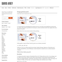
My prepress guidelines let me bypass common mistakes made when digital artwork is prepared for print. Here I show how you can save money when printing. With quality in mind, all files I send for print are in industry standard: Guide to International Paper Sizes. To ensure accurate, economical printing when publications designed or typeset in one country are printed in a second country, it is necessary to know the standard paper sizes used in the second country.

Because designers and publishers often do not have ready access to this information, EDS Inc., Editorial & Design Services, has published this concise guide, consisting of the four tables listed below. For additional sizes and complete inch-metric equivalents, see Expanded Tables of North American and UK/EU Paper Sizes and Japanese Papers for Printing. For office and business papers, see Desktop/Office Printer, Business & Imposetter/Large-Format Papers. See International Paper Sizes for additional information of interest to transnational publishers. ISO Paper sizes. In the ISO paper size system, the height-to-width ratio of all pages is the square root of two (1.4142 : 1).
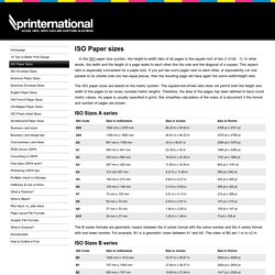
In other words, the width and the height of a page relate to each other like the side and the diagonal of a square. This aspect ratio is especially convenient for a paper size. ISO Envelope sizes. Information about graphic and print design. Tips on Pre-flight before sending to the printers. 10 Tips to better print design. With these tips I hope to help novice designers on their way to better print design.
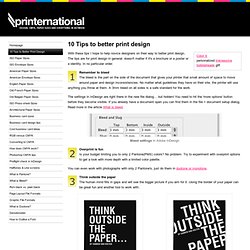
The tips are for print design in general: doesn't matter if it's a brochure or a poster or a identity. In no particular order. Remember to bleed The bleed is the part on the side of the document that gives your printer that small amount of space to move around paper and design inconsistencies. Acrobat, Reader. To view/add comments, you must enable JavaScript in your browser.
Puzzled? Wondering why this page appeared? You probably clicked a button when trying to print. If you aren't looking for printing tips, simply close this window and return to printing. Need help printing? Click the picture below to open instructions for that task. Solving printing problems Quick fix If you are having problems printing, try this quick fix first.
Acrobat 9.4.2. RGB versus CMYK. Computer monitors emit color as RGB (red, green, blue) light.
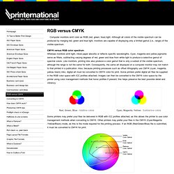
Although all colors of the visible spectrum can be produced by merging red, green and blue light, monitors are capable of displaying only a limited gamut (i.e., range) of the visible spectrum. CMYK versus RGB color spectrum Whereas monitors emit light, inked paper absorbs or reflects specific wavelengths. Cyan, magenta and yellow pigments serve as filters, subtracting varying degrees of red, green and blue from white light to produce a selective gamut of spectral colors. Like monitors, printing inks also produce a color gamut that is only a subset of the visible spectrum, although the range is not the same for both. Red, Green, Blue - Additive colors Cyan, Magenta, Yellow - Subtractive colors. What is duotone? Duotone is the generic name for multitone printing, which can be done with two, three or four inks.
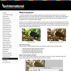
This process requires that the press be set up with special inks, usually PANTONE-designated colors, instead of the standard CMYK inks used for process color printing. Usually the images are printed with a dark base color and a lighter second color, overprinted to fill in, tint and tone the photo or graphic. Duotone color mode in Photoshop supports between one to four colors of ink. Because home inkjet printers are far better at printing full-color images than black and white, many photographers and designers use Photoshop Duotone processing to improve their artwork/prints. Photoshop's Duotone mode is also commonly used for creating sepia toned prints, using black and yellow inks, sometimes with a third color. Full color original. Tips for Working in CMYK for Print – Computer Arts. I started reading computer arts magazine and i noticed they had an article that they interview Ed Templeton from Red Design, I immediately thought that i should share this interview from the magazine as I thought it could benefit others and get some quick tips about print design.
Print design isn’t talked about enough in the web design community and id like to learn more about it as I’m from an intense web based background and hopefully others do too, this should be a nice start to a series of posts about print design in the coming weeks if you’d like to contribute a post feel free to contact me. The Interview from Computer Arts magazine Make a plan At an early stage, decide what paper stock you’re printing on and what finish will be applied: matt, gloss, varnish, laminate and so on.
Welcome to Digital Output Magazine. DTP Tools. Photoshop >> Photoshop and Your Monitor. Adobe InDesign CS4 * Understanding spot and process colors. Factors to Consider when Choosing a Small Photo-Quality Inkjet Printer. Part I: Small Printers | Part II: Large Printers Throughout the history of photography, countless advancements have made it easier for people to create photographic images. One of the most important advancements has been the advent of affordable, photo-quality inkjet printers. They have brought the color and black and white darkroom “out of the dark” and into just about any room in an office, home or school. What to Ask a Client Before You Start Their Project.
We all know the importance of fact-finding before starting any web design project.

7 Essential Red Flags to Watch Out for in New Clients. Working with clients is one of the most difficult parts of being a web designer.
It’s a challenge which we face each and every day, regardless of whether we work in-house, as freelancers, or as agency owners. Some clients are great, while others leave us tearing our hair our and wondering why we felt the need to subject ourselves to this line of work. While some problems with clients can be put down to poor communication by both parties, many times we can identify clients which are going to be difficult before we even start working with them. Today we’ll take a look at seven ways to make sure you don’t end up as a regular contributor to ClientsFromHell.net. 1. This is probably the most common of all red flags.