background preloader

Graphics

Facebook Twitter

Soyouneedatypeface.jpg (JPEG Image, 1983x1402 pixels) - Scaled (45%) 83 Crazy/Beautiful Letterhead and Logo Designs. Inspiration December 22, 2009 Whap! Like a flash of satori, your company letterhead should be a slap in the face of consciousness. The whole point is to grab your readers’ attention by the throat on first contact, then make them beg for more in the long run. Considering the chronic short-attention span of a generation raised on cable TV and the internet, this is saying a lot. I’ve gathered 83 of the most eye-popping letterhead designs so far to illustrate my meaning. Creating your own letterhead design? Author: Cadence Wu Cadence is You The Designer's senior blogger, and the most jack-of-all-trades of the staff.

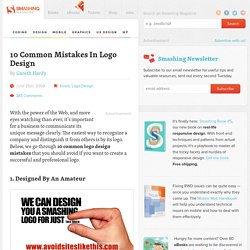
10 Common Mistakes In Logo Design - Smashing Magazine. With the power of the Web, and more eyes watching than ever, it’s important for a business to communicate its unique message clearly. The easiest way to recognize a company and distinguish it from others is by its logo. Below, we go through 10 common logo design mistakes that you should avoid if you want to create a successful and professional logo. 1. Designed By An Amateur Avoid websites that promote ridiculously cheap logo packages. You get what you pay for. A professional business should look professional. Here are the most common reasons why many logos look amateurish: The business owner wanted to save money by designing the logo quickly themselves.A friend or relative who claims to know a little about graphic design does it as a favor.The wrong people are commissioned.
All of the above can result in disastrous outcomes. Here are the advantages of hiring an established and professional logo designer: 2. Focusing on current logo trends is like putting a sell-by date on a logo. 3. 4. 5. A look at some car companies logos design evolution. The evolution of big companies logos is always interesting, and I found car companies logo designs to be among the most interesting to inspect.

One of my favorite aspect of these is to see how logos are handled when two or more brands are merging (see Audi, Mercedes-Benz or Mitsubishi). Renault Audi Volkswagen Mercedes-Benz I also can’t resist to share this fabulous vintage ad. Ford Alfa Romeo Mitsubishi. 50 Insanely Weird but Awesome Photoshop Brushes.