

Breaking Dev: Responsible & Responsive. Responsive web design. As the number and variety of devices from which we access the internet increases, new web design challenges present themselves.
It’s no longer simply enough to have a mobile version and a browser version. Now, we have to consider whether the person visiting our site is visiting from a tablet, a smartphone (and whether that smartphone has a high-res screen or not), a netbook, a desktop computer or full-size laptop (and whether it’s one with a high-res or low-res screen), or some other device entirely. And optimizing the experience for all of those different possibilities is becoming more expected among savvy internet users. A few years ago, a designer would have looked at the list of devices they had to design for and then set about creating individual website designs for each device. But as the number and variety of devices increases, that becomes an impractical, time-consuming proposition. A lot of screens keep getting bigger But then there are mobile devices. The New Front End Design Stack - The Role of Responsive Web Design. Ethan Marcotte established the idea of responsive web design in his 2010 A List Apart article of the same title.

The ultimate responsive web design roundup. Responsive design is the new darling of the web design world.
It seems that not a week goes by that there aren’t new resources for doing it, opinions about how to do it or even whether to do it at all, and new sites that make beautiful use of it. It can quickly get overwhelming trying to keep up with it all. Here we’ve compiled a list of more than seventy resources for creating responsive designs. Included are articles discussing responsive design and related theories, frameworks and boilerplates for responsive layouts, tools for testing your responsive designs, techniques for resizable images, and a whole lot more.
Then, to top it all off, we’ve collected a hundred of the best responsive designs out there right now to inspire you and give you some real-world ideas. Beginner’s Guide to Responsive Web Design. Whether you’re a beginner or a seasoned web professional, creating responsive designs can be confusing at first, mostly because of the radical change in thinking that’s required.
As time goes on, responsive web design is drifting away from the pool of passing fads and rapidly entering the realm of standard practice. In fact, the magnitude of this paradigm shift feels as fundamental as the transition from table based layouts to CSS. Simply put, this is a very different way of designing websites and it represents the future. Free trial on Treehouse: Do you want to learn more about responsive web design? Try a free trial on Treehouse. Over the past year, responsive design has become quite the hot topic in the web design community. Responsive Web Design Guidelines and Tutorials - Smashing Magazine. In this overview you will find the most useful and popular articles we have published on Smashing Magazine on Responsive Web Design.

Quick Overview Design Process In The Responsive Age11 You cannot plan for and design a responsive12, content-focused13, mobile-first14 1 website the same way you’ve been creating websites for years—you just can’t. If your goal is to produce something that is not fixed-width and serves smaller devices just the styles they require, why would you use a dated process that contradicts those goals? I’d like to walk you through some problems caused by using old processes with responsive design. Read more…17.
Tools. Processus. Mobile First. Graceful Degradation vs Progressive Enhancement. Fondations. Intro. Responsive. Responsive Design. Responsive Web Design, A Book Apart. Foreword by Jeremy Keith From mobile browsers to netbooks and tablets, users are visiting your sites from an increasing array of devices and browsers.
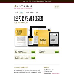
Are your designs ready? Learn how to think beyond the desktop and craft beautiful designs that anticipate and respond to your users’ needs. Ethan Marcotte will explore CSS techniques and design principles, including fluid grids, flexible images, and media queries, demonstrating how you can deliver a quality experience to your users no matter how large (or small) their display. Contents Our Responsive WebThe Flexible GridFlexible Images (Read this chapter online)Media QueriesBecoming Responsive. Responsive Web Design.
The English architect Christopher Wren once quipped that his chosen field “aims for Eternity,” and there’s something appealing about that formula: Unlike the web, which often feels like aiming for next week, architecture is a discipline very much defined by its permanence.
Article Continues Below A building’s foundation defines its footprint, which defines its frame, which shapes the facade. Each phase of the architectural process is more immutable, more unchanging than the last. Creative decisions quite literally shape a physical space, defining the way in which people move through its confines for decades or even centuries. Working on the web, however, is a wholly different matter. But the landscape is shifting, perhaps more quickly than we might like. In recent years, I’ve been meeting with more companies that request “an iPhone website” as part of their project.