
Kandinsky Font. TURQUIE – Une expérimentation signée Sinan Buyukbas des couleurs et des formes géométriques de Kandinsky adaptées sur une Font imaginaire. « I started with thinking each letter as a 3d canvas to play around with color and form, but also together they would form a type experimentation on Kandinsky. I presented each letter as a color and form composition and tried to relate them with the space as they are intended to be perceived in 3d dimension. »
Upside Down, Left To Right: A Letterpress Film. Classification. Garamond_fi-ligature.jpg (Image JPEG, 500x612 pixels) Ressources typo. The Logodesign Portal! - Typography in a Nutshell. ✿ Our favorite set — CopyPasteCharacter.com. De la Naissance de l'Écriture à la Typographie Numérisée.
Afin de pouvoir créer une nouvelle petite rubrique récurante sur ce blog, je vais avancer un tout petit peu dans ma chronologie rapide de l’écriture… Vous comprendrez par la suite où je veux en venir… Donc si vous vous souvenez bien, dans le précédant billet, je m’étais arrêté sur les Alphabets complets, dits consonantiques… J’avais ensuite précisé l’ordre du billet suivant (celui-ci), c’est à dire, les voyelles Grecques… Mais avant d’aborder ce « chapitre », je vais apporter quelques précisions nécessaires sur la signification des signes de l’alphabet Hiéroglyphique.
Représentation des sons : Comment les Égyptiens ont-ils élaborés cette écriture appelée Hiéroglyphes? Tout simplement en essayant de représenter les sons. Heureusement pour nous, les peuples Sémitiques, et plus particulièrement les Phéniciens, eux, y ont pensé! Je m’explique! Les Grecs ajoutent les voyelles : Pour des raison pratiques et évidentes, (Le bœuf ne se disait pas Aleph, ni la maison Beth, en Grec!) Le saviez-vous? LetterMpress for Mac. The Movie title stills collection. Build, Share, Download Fonts.
Blogs typo. Histoire typo. Règles typo. Calligraphie. Calligraphie.pdf (Objet application/pdf) Typo1_structure_couleur.pdf (Objet application/pdf) Typo animées. Télécharger typo. A Typographic Anatomy Lesson : un album. Typefruitography. Design made black and white. LetterCult — Custom Letter Culture. Les meilleures compositions typo 2010. Todd Klein comic book logos top. The concept of a magazine logo is certainly nothing new, they've needed them since magazines began.
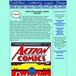
Comic strips also had colorful logos, often in a separate box featuring some of the characters. The purpose of a comics logo, like that of any magazine logo, is to attract the reader and help sell the magazine. Since comics were traditionally sold in racks on newsstands and in stores where often only the top half of the comic was visible, the logo traditionally filled the top third or quarter of the cover with large, bold, colorful open letters designed to appeal to kids and other readers. Red, orange, yellow or white letters with thick black outlines were the most common. As comics developed, some companies tried to keep their logos in a similar style, to help promote their line of comics.
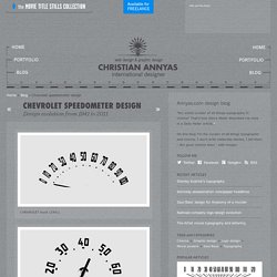
©DC Comics, Inc. Many of the logos from the Golden Age and Silver Age comics published by DC had Ira's classic logos, still associated with the characters today, despite many later designs. Typographie. Chevrolet speedometer design. CHEVROLET Apache truck (1959) CHEVROLET Viking truck (1960) CHEVROLET Chevy Nova (1966) CHEVROLET Corvette (1968) CHEVROLET Chevy Nova (1970)
Typographie. Presents Helvetica vs. Arial. The software that prints green fonts with holes. Ecofont softwarefor Word and Outlook More info Home 1 Lifetime licenseWindows XP, Vista, 7, 8, 10Arial, Verdana, Calibri, Times New Roman, Trebuchet MS. only $ 19.95Buy now 3-Pack Lifetime licenseWindows XP, Vista, 7, 8, 10Arial, Verdana, Calibri, Times New Roman, Trebuchet MS. only $ 42.95Buy now Medium Business & Enterprise From 30 workstations Network installationCustom fonts Request quotationQuotation Bulk data printing and offset printing solution For application printing, newspapers, magazines...
Start saving printer ink today! Watch our videos Our green clients Award winning solution. TYPOGRAPHIE NUMÉRIQUE. House Industries. Typographica. Type Reviews, Books, Commentary. Espace Pédagogique - typographie expressive. Type Furniture. You can order your own words or letters.
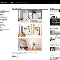
Customize as you wish! They come with shelves and everything! Check them out here.