
The map of Twitter names of London. Collusion for Chrome maps how sites are tracking you, courtesy of the Disconnect team. Intel Creates Infographic Generator That's All About You. Intel, which has catered to Facebook and Twitter users' inherent narcissism before, is giving you a new tool for digital navel-gazing: an infographic that's all about you.
The chipmaker's new "What About Me? " app culls info from your Facebook, Twitter and YouTube profiles to crank out a data visualization of your composite social media profile. How Much Do Your Friends' Facebook Apps Know About You? Even if you never connect your Facebook account to a single app, dozens of them may still have access to your profile information via your Facebook friends.
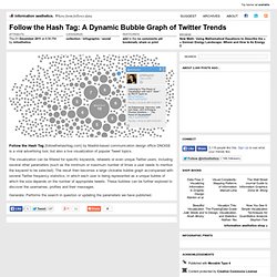
When your Facebook friends connect new apps, the list of permissions they approve can include access to not just their own information, but also specific information from your profile — including your birthday, status updates, photos, hometown, current city and app activity. Facebook won't share information with your friends' apps that you haven't shared with your friends, and you can control which information friends' apps can access through a privacy settings page. But some Facebook users don't realize they're sharing information with app developers this way, or that they can control it. Follow the Hash Tag: A Dynamic Bubble Graph of Twitter Trends.
Follow the Hash Tag [followthehashtag.com] by Madrid-based communication design office DNOiSE is a viral advertising tool, but also a live visualization of popular Tweet topics.
Want to Print Facebook? Better Get 11.5 Billion Sheets of Paper [INFOGRAPHIC] Printing a year's worth of Facebook statuses would be equivalent to printing more than 500,000 Oxford English Dictionaries, a new survey found.
![Want to Print Facebook? Better Get 11.5 Billion Sheets of Paper [INFOGRAPHIC]](http://cdn.pearltrees.com/s/pic/th/facebook-billion-infographic-22438660)
Sure, it would be a waste of paper, but a UK online cartridge retailer thought it would be interesting to find out how much paper would be needed to print a year's worth of Facebook statuses if the website's 800 million users updated once per day. The answer — 11.5 billion sheets. Of course, there are a few stipulations for cramming the statuses onto paper — each of the estimated 292 billion status updates would be an average of two lines, which is equivalent to 584 billion total lines; the statuses would be printed on 8.3-by-11.7 inch paper in size 11 point Arial font. The print job would be expensive — the ink alone would cost about $194.5 million or 147.2 million euros. To compare, England could build two more of the London Eye with that amount of money. Map of 10,000 Tweets Shows New York City at Work. What does where we tweet say about how we live and work?
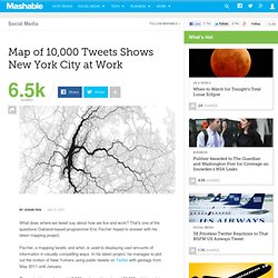
That's one of the questions Oakland-based programmer Eric Fischer hoped to answer with his latest mapping project. Fischer, a mapping fanatic and artist, is used to displaying vast amounts of information in visually compelling ways. In his latest project, he manages to plot out the motion of New Yorkers using public tweets on Twitter with geotags from May 2011 until January. The project lays out around 10,000 geotagged tweets and 30,000 point-to-point trips in cities like New York City to plot the flow of people in terms of favored paths.
In his map of NYC, seen above, there is a huge ink blot lining Broadway; as we've long suspected, it looks like the busy avenue is the backbone of the city. Using a base map from OpenStreetMap, he drew out transit paths using Tweets. The-types-of-facebook-friends.jpg (600×2543) Gridplane. Emotional cartography. Bio Mapping / Emotion Mapping by Christian Nold. Positive Facebook Updates Get More Likes, Negative Get More Comments [INFOGRAPHIC] Here's How Twitter Got Big. Mapping The World's Tweet Networks. This is a picture of the world, as connected by Twitter, created by Eric Fischer.
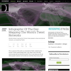
It shows where people travel--and, what’s more, who they communicate with all around the world. Thus, in one map, you can see where people’s physical communities are, and their virtual ones as well. [Click to enlarge.] How British do you feel? Visualised. Visualising data online and in a newspaper is like the difference between speaking Spanish and conversing in French; there have the same roots and are ostensibly similar - but in practice are completely different.
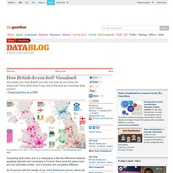
So it's proven with the results of our online Britishness survey, where we asked readers to rate how they felt about their nationality. The results provide a fascinating insight into how different parts of the UK really feel about the nation as a whole. Online, it works just like a Google map - where you can zoom in and see how people feel in each place, ranked by the maps of each country. It works using the Google Maps API, feeding from a spreadsheet form that readers are essentially filling in.
Britishness interactive Photograph: Guardian. Vizualize.me Beta: Turning Your LinkedIn Resume in Infographics. There seems to be a commercial market emerging around the idea of automizing the creation of infographics.
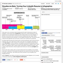
Toronto based start-up vizualize.me [vizualize.me] is currently developing an online application that can automatically translate any online LinkedIn profile into an online infographic. In particular, the new service aims to overcome the issue of reading overly long or highly complex resumes by showing the same information in a more readable and attractive way. The start-up has been coding the online application only since the last 2 months, and is currently still in private beta.
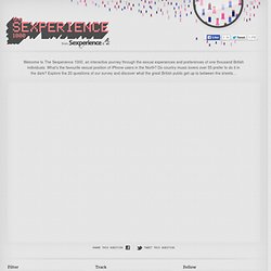
What does Twitter think of Gaddafi's death? Inside the Mind of a Community Manager. Taking on Facebook, Google’s Social Network Allows Data Exporting. The Sexperience 1000. Welcome to The Sexperience 1000, an interactive journey through the sexual experiences and preferences of one thousand British individuals.
What’s the favourite sexual position of iPhone users in the North? Do country music lovers over 55 prefer to do it in the dark? Explore the 20 questions of our survey and discover what the great British public get up to between the sheets… Filter Filter by region, age, etc. and compare to yourself. Track.