
A Visualization Of World War II Like You've Never Seen Before. La réserve parlementaire décryptée. Explorez les 668 commissions ministérielles... et leurs budgets. Indice de gouvernance départemental. A Campaign Map, Morphed By Money : It's All Politics. Explore political ad spending through creative cartography.
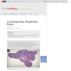
This animated map shows where superPACs and other outside groups spent their money — over a six-month period during the general election — to air political ads aimed at influencing the presidential race. Campaign reporters spend a lot of time pointing at color-coded electoral maps like the one below, showing which states voted for Republican John McCain (in red) and Democrat Barack Obama (in blue) in 2008.
AllYears.gif (Image GIF, 722x542 pixels) 21 Charts That Explain American Values Today - Bob Cohn. Americans say they are more tolerant and open-minded than their parents.
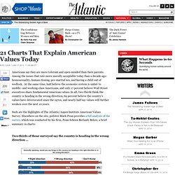
Among the issues that rate more morally acceptable today than a decade ago: homosexuality, human cloning, pre-marital sex, and having a child out of wedlock. At the same time, half believe the economic system is unfair to middle- and working-class Americans, and only 17 percent believe Wall Street executives share fundamental American values. The e-diplomacy Hub, A real-time window onto digital diplomacy in action. World: Corruption Perceptions Index 2011. 2011 – a crisis in governance: Protests that marked 2011 show anger at corruption in politics and public sector Berlin, 1 December 2011 – Corruption continues to plague too many countries around the world, according to Transparency International’s 2011 Corruption Perceptions Index released today.
It shows some governments failing to protect citizens from corruption, be it abuse of public resources, bribery or secretive decision-making. Socialbakers-infographic-Dec01-Dec31.jpg (520×2275) Which Politician is Most Popular, Engaging on Social Media Sites? President Barack Obama may be down in the ratings, but he still has a steady hold on social media popularity.
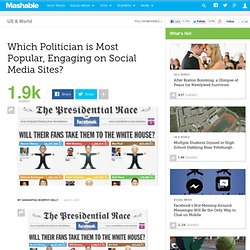
In December, Socialbakers – a social media analytics firm – tracked Facebook-page interactions of the eight key candidates from the Republican and Democratic parties to gauge changes in popularity and monitor fan engagement. Obama led the pack with the most overall interactions on the site, including comments, fan engagement and viral reach. President Barack Obama also has the most Facebook fans – a whopping 24 million, far more than the Republican candidates — but many were collected during the 2008 election period. The Euro Crisis Is Less Complicated Than It Appears. A few days ago I received an email from Thomas Watkins, who is an avid reader of this blog and a past participant in one of my Visual Business Intelligence Workshops.
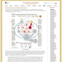
He asked my opinion of this infographic, which recently appeared in the . Eurozone in crisis in graphics: Deficit. Continue reading the main story EU rules say that countries using the euro are not allowed to have an annual deficit of more than 3% of GDP, but several countries have failed to keep to that rule in recent years.
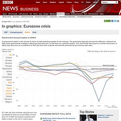
Note that Germany, Italy and France were all among the first countries to break the Maastricht rule during the last decade, while Spain and the Republic of Ireland ran surpluses before the 2008 crisis. Since 2008, peripheral economies such as Spain, Greece and Portugal have run big deficits, because their economies have slumped, generating less tax revenues and requiring more unemployment benefit payments. Ireland experienced an exceptionally enormous deficit of 31% of its GDP in 2010, largely due to the cost of rescuing its banks.
What really caused the eurozone crisis? [DATA] Budget 2012 : 366 milliards, mais pour financer quoi ? (french) Discours d’investiture de la cinquième : essai de text mining. Les six discours d'investiture des Présidents de la République sont passés à la moulinette: quels présidents étaient les plus bavards?

Quels mots revenaient le plus dans leurs discours? Lequel parle le plus souvent de lui? Billet initialement publié sur le datablog d’OWNI Pour ce test, j’ai choisi les discours prononcés par les présidents de la Vème République lors de leur (première) investiture afin de pouvoir comparer des textes énoncés dans un même contexte. Ils sont tous accessibles et exportables en PDF (faut pas trop en demander non plus…) sur le site de l’Elysée. Premier élément à comparer : la longueur des discours, dont la différence saute aux yeux une fois le nombre de mots extrait grâce au logiciel de traitement de texte. Outliers in the European Parliament. Public spending by UK gov. Boundary changes: Labour and Lib Dems set for losses.
The Conservatives could have been within striking distance of an overall majority had the 2010 general election been held under England's new boundaries, early Guardian analysis suggests.
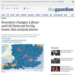
The Labour party could have netted 14 fewer seats, the Liberal Democrats 10 fewer, while the Conservatives, who dominate England, might have lost just six seats. The UK's only Green MP, Caroline Lucas, would not have been able to win her seat, according to the preliminary figures. England riots: suspects mapped and poverty mapped. Hierarchical Data with Bubble Tree. Sep 29, 2011.

Ontologies for e-Gov. Apps for America. GovStats.org. Money Chart. Death & Taxes 2012. Voting and Registration. The Power of Maps. Lobbyists and Politicians: Connections. Politics is as much about who you know as what you know.

That's why the website First Street wants to help us learn more about the who of politics — and how they're all connected. The site details the allegiances of political officials and lobbyists — for a price. It already has content deals with the New York Times, the Associated Press and the Washington Post. Social Media Users on U.S. Politics. Two-thirds (67%) of adult social media users in the U.S. voted for Barack Obama in the 2008 presidential race, although only half (51%) would vote the same way if they knew what they know now. Market researcher Lab42 polled 500 social media users on all things politics. The findings, presented in the infographic below, reveal top issues, candidates and news sources for social media users. So Clever: Ron Paul Campaign Vid Uses Obama's Typeface Against Him.
First Street Research Group. Behind SOPA: What It Means for Business and Innovation [INFOGRAPHIC] The Stop Online Piracy Act (SOPA) is stirring up a lot of controversy in the tech world. Companies that rely heavily on copyright protection call the bill piracy protection; those that rely on user-generated content call it censorship. The bill strengthens the U.S. SOPA+Internet.png (972×5500) OECD Better Life Initiative. Infographie : 4 ans d'action pour la France et les Français. Infographic: Which dictator killed the most people? Clip de campagne de François Hollande - une vidéo Actu et Politique. Les temps de parole des candidats à la présidentielle. Diminishing Voters' Rights. Periscopic (@Periscopic) sur Twitter.