
Infographics & Data Visualization. 20 Great Infographics of 2012. 2012 has certainly been an eventful year, with everything from elections, to olympics, to scientific breakthroughs, to major weather events.

To help review some of the things that happened, here are 20 of the best static infographics from the year. 1. There were several space related events this year. NASA’s Curiosity rover landed on mars, and successfully began collecting data. Data Visualization: Modern Approaches. About The Author Vitaly Friedman loves beautiful content and doesn’t like to give in easily. When he is not writing or speaking at a conference, he’s most probably running … More about Vitaly Friedman … Data presentation can be beautiful, elegant and descriptive. There is a variety of conventional ways to visualize data - tables, histograms, pie charts and bar graphs are being used every day, in every project and on every possible occasion. However, to convey a message to your readers effectively, sometimes you need more than just a simple pie chart of your results. M.A. Thesis. Visual tools for the socio–semantic web This thesis contributes to a new discipline of science: web science, as introduced by Tim Berners-Lee and others in 2006.
Designers, computer scientists, sociologists, cognitive scientists, psychologists etc. have individual perspectives on the complex and rapidly evolving interplay of technological and social infrastructure and human society. However, a well-defined discipline — unifying the scientific analysis of social and human factors to understand, but also to shape and steer web developments by informed design and engineering —is not established yet. I hope to contribute to an interdisciplinary dialogue between science, engineering and design with this thesis. Master’s Thesis Interface Design Programme University of Applied Sciences Potsdam Moritz Stefaner, June 2007 Supervisors: Prof. Best Masters Thesis at FH Potsdam in 2007 Analysis. This is onformative a studio for generative design. Moritz.stefaner.eu - /
Cropcircleconnector.com/Millennium/kris2.gif. Phylogenetic tree. In a rooted phylogenetic tree, each node with descendants represents the inferred most recent common ancestor of the descendants, and the edge lengths in some trees may be interpreted as time estimates.
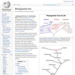
Each node is called a taxonomic unit. Internal nodes are generally called hypothetical taxonomic units, as they cannot be directly observed. Trees are useful in fields of biology such as bioinformatics, systematics, and comparative phylogenetics. Unrooted trees illustrate only the relatedness of the leaf nodes and do not require the ancestral root to be known or inferred. History[edit] Tree structure. A tree structure showing the possible hierarchical organization of an encyclopedia.
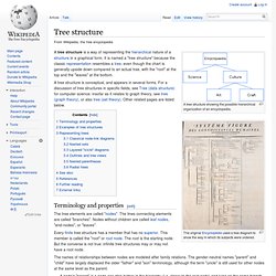
The original Encyclopédie used a tree diagram to show the way in which its subjects were ordered. A tree structure is a way of representing the hierarchical nature of a structure in a graphical form. Revised Graphic Organizers Make Mapping Out Ideas Easy—and Savable! Join us on Facebook to get the latest news and updates.
Become a Fan ReadWriteThink couldn't publish all of this great content without literacy experts to write and review for us. If you've got lessons plans, activities, or other ideas you'd like to contribute, we'd love to hear from you. More Home › About Us › News News | August 17, 2011 Recently revised, three online interactive graphic organizers help students map out their writing ideas or organize information they have learned. Try the new save capability with your students using any one of these interactive mapping tools. Students often have trouble getting started when asked to write an essay. Aim.cast.org/sites/aim.cast.org/files/NCACgo.pdf. What Are the Benefits of Graphic Organizers in Elementary Language Arts? Walrus - Graph Visualization Tool. Source Code Available The source code to Walrus is now available under the GNU GPL.

You may download the source code below. Description Walrus is a tool for interactively visualizing large directed graphs in three-dimensional space. Результат поиска Google для. Introduction to Circos, Features and Uses // CIRCOS Circular Genome Data Visualization. A visual exploration on mapping complex networks.
Spiral repesentation, polarities. Maps of War. Файл:WikiCatsRootMindMap.png. _tree_imp.jpg (изображение «JPEG», 855x436 пикселов) Infographics news. Infographics Blog: Reviews of the Best Infographic Design Ideas. KnowRob (Knowledge Processing for Robots) — Intelligent Autonomous Systems Group. From Data to Digital Art: Animating Air Traffic, Texting and Thom Yorke. David McCandless: The beauty of data visualization.
Information design. Information design is the practice of presenting information in a way that fosters efficient and effective understanding of it.
The term has come to be used specifically for graphic design for displaying information effectively, rather than just attractively or for artistic expression. Information design is closely related to the field of data visualization and is often taught as part of graphic design courses.[1] Etymology[edit] Information graphics. Information graphics or infographics are graphic visual representations of information, data or knowledge intended to present complex information quickly and clearly.[1][2] They can improve cognition by utilizing graphics to enhance the human visual system’s ability to see patterns and trends.[3][4] The process of creating infographics can be referred to as data visualization, information design, or information architecture.[2] Overview[edit] Infographics have been around for many years and recently the proliferation of a number of easy-to-use, free tools have made the creation of infographics available to a large segment of the population.

Social media sites such as Facebook and Twitter have also allowed for individual infographics to be spread among many people around the world. In newspapers, infographics are commonly used to show the weather, as well as maps, site plans, and graphs for statistical data. Is Data Visualization Useful? You’ll Have to Prove It. Great data visualization is hard to measure: you can’t prove you have a good chart.

Unless you can convince your employer to deploy at least two different formats/layouts and are able to compare results, you can say “this is a good chart” but that’s an act of faith, not an act of science. It’s True Because It Rhymes Information visualization experts like to evaluate a chart based on its compliance to some more or less accepted standards (Tufte’s data-ink ratio, for example). That’s like saying “it must be true because it rhymes”: the truth is defined by the language itself, not by the real world. RobertFuddBewusstsein17Jh.png (926×1345) Инфографика. Инфогра́фика (от лат. informatio — осведомление, разъяснение, изложение; и др.

-греч. γραφικός — письменный, от γράφω — пишу) — это графический способ подачи информации, данных и знаний, целью которого является быстро и чётко преподносить сложную информацию[1][2]. Одна из форм графического и коммуникационного дизайна. Beautiful Data: The Stories Behind ... - Google Книги.