
The Best Data Visualization Projects of 2014. It's always tough to pick my favorite visualization projects.

I mean, it's a challenge to pick and rank your favorite anything really. So much depends on what you feel like at the time, and there's a lot of good work out there. Nevertheless, I gave it a go. These are my favorites for the year, roughly in order of favorite on down and based on use of data, design, and being useful. Mostly though, my picks are based on gut. One unintentional theme: All of my picks are interactive or animated or both.
The Upshot Last year, Nate Silver took his ball to play elsewhere, so the New York Times had a data-centric hole to fill, and they came out better for it with the Upshot. If I didn't cluster the Upshot visualization projects into this one section, the individual works would dominate the list. Pisa 2012 results: which country does best at reading, maths and science? The latest Programme for International Assessment (Pisa) results are out today.

The release by the Organisation for Economic Co-operation and Development (OECD) shows that the UK has seen slight improvements in maths and reading performance but has slipped down four places in the overall ranking for science. The UK is ranked 23rd for reading, 26th for maths and 20th for science. In 2009 it was placed 25th, 28th and 16th respectively. Shanghai tops the overall ranking with Singapore and Hong Kong being placed second and third place respectively.
Sometimes Good Data is Hard to Come By. Sometimes the most challenging aspect of creating data visualizations is finding an interesting data set that tells a story.

As I’ve mentioned before, try all you want but dressing up dull data won’t disguise poor data. The truth of the matter is, if you don’t have good data even the most visually stunning infographics will still look like they’re missing something. I know that it’s a bit cliché, but when it comes to data visualizations the old adage rings true: “garbage in, garbage out”. So where are some places to look when you need some additional, reliable data to help bring out the best in your visuals? If this problem has got your stumped, then look no further. Find Data. Data science. We’ve all heard it: according to Hal Varian, statistics is the next sexy job.
Five years ago, in What is Web 2.0, Tim O’Reilly said that “data is the next Intel Inside.” But what does that statement mean? Why do we suddenly care about statistics and about data? Big Data: A New Approach to Finding Info. A breakthrough method to graphically represent knowledge enables software developers to easily build intelligent agents such as Apple's Siri and IBM Watson.
Nov 16, 2011, San Diego, CA - Artificial intelligence vendor ai-one will unveil a new approach to graphically represent knowledge at the SuperData conference in San Diego on Wednesday. The discovery, named ai-Fingerprint, is a significant breakthrough because it allows computers to understand the meaning of language much like a person. Data. Data sources. HDR: Human Dev. Reports. Online Data - ESRI. ArcGIS Online Map Services Use these map services to create web maps in ArcGIS Online, or access them directly from ArcGIS for Desktop and ArcGIS for Server.
Developers can access them through ArcGIS Web Mapping APIs to build web applications. Country Geography Data. Physical geography Variables: Latitude and longitude of each country's centroid, mean elevation, mean distance to nearest ice-free coastline, mean distance to nearest ice-free coastline or sea-navigable river, distance from a country's centroid to nearest coastline, distance from a country's centroid to nearest coastline or sea-navigable river, total population, percent of population within 100km of the coastline, percent of the population within 100km of the nearest coastline or sea-navigable river, percent of land area within 100km of the coastline, percent of land area within 100km of the nearest coastline or sea-navigable river, percent of population in the geographic tropics, percent land area in the geographic tropics, and the typical population density an average person experiences, by country. documentation.
Media Map Shows Impact of Information. (December 5, 2011) How do we know that media make a difference?
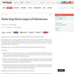
We’ve looked at the numbers. The Media Map Project, a multi-faceted research collaboration between Internews and The World Bank Institute, has made 25 data sets which collectively touch on every country in the world and up to 30 years' worth of information available to the public for download and analysis. Visualizations on the site allow viewers to interact with and test the data in different ways. Correlation between economic performance (GDP) and freedom of expression / freedom of the press For example: STATS - MDGs Indicators.
Statistical Data. Data journalism. National institutes of statistics. US: data.gov. US Gov XML. Catalog Dashboard. Govpulse. WashPost Databases. Public DBs from Washington Post. Tetherless World. RPI exports data.gov info. UK Open Data Institute (Silicon Roundabout) Posted by Information Age on 28 November 2011 Share article 0googleplus Short of time?
Print this pageEmail article The government will announce a number of open data initiatives tomorrow, including a new Open Data Institute near 'Silicon Roundabout'. The Open Data Institute will "innovate, exploit and research open data opportunities with business and academia", chancellor George Osborne will announce tomorrow. The institute will be directed by leading open data academics Professor Nigel Shadbolt and web inventor Sir Tim Berners-Lee. The scheme recalls the Institute for Web Science, an academic research centre proposed by former prime minister Gordon Brown in March 2010, which was also due to be run by Shadbolt and Berners-Lee. "We want to build on the outstanding work Sir Tim and Nigel Shadbolt have put in to 'making public data public'," said Brown at the time.
However, the current government scrapped the £30 million plan in May 2010, saying it was a "low priority". UK government announces open data initiative. Ofcom Data Downloads. UK: data.gov.uk. Census 2011: the results map of England and Wales.