
Infographic: 10 Myths About Graphic Design. Infographic, Resources October 15, 2012 Throughout the years graphic designers have tried to dispel the myths surrounding graphic design and working as a graphic designer.

While some myths are hilarious and particularly harmless, there are other myths that are annoying and generally unhelpful in the understanding of clients to graphic design and graphic designers. In our quest to demystify these myths we here at YTD made a cool infographic for you to share that will help people understand what graphic design and being a graphic designer really is. La dataviz de la dataviz : une infographie originale conçue spécialement pour Expoviz. Spécialement réalisée à l’occasion d’Expoviz par Karen et François de Wedodata, « La dataviz de la dataviz » est une infographie qui représente le processus de design d’informations et met à plat les grandes étapes de création d’une visualisation de données, depuis la collecte jusqu’au choix de la forme d’expression graphique.

Intégrée dans le parcours d’exposition, cette infographie a été conçue pour répondre et s’adapter aux contraintes spécifiques imposées par le format et les dimensions des panneaux (100x150 cm). « Travailler sur un tel format est assez rare et influe grandement sur la conception de l’image. En effet, on n’est pas dans le cas d’une dataviz qui va être vue derrière son écran d’ordinateur, sa tablette ou son magazine, à quelques centimètres. The Gamification of Education Infographic #gamification #edtech. The Digital Classroom.
16 Ways Educators Use Pinterest. Twitterestudiantes.jpg (658×4881) Onlineeducation.infographic.png (500×2595) Music-movies-programs-piracy.jpg (650×6438) NT_polylogue : Designers ! Vos problèmes... Why-is-pinterest-so-addictive_5029171a985e6.jpg (918×2889) #dalalalataviz. #ninoferrer Une #dalalalataviz de Mathieu Crocq. MUSE. Graphisme & interactivité blog par Geoffrey Dorne. Is-job-killing-you.jpg (JPEG Image, 1000x5895 pixels) - Scaled (10%)
Tresses et lacets historique. Serpentin hacking (solo) Un article de Wikipédia, l'encyclopédie libre.

Schéma d'un serpentin. Portail de la chimie. Vissage (datavis) Vissage (serpentin) Un article de Wikipédia, l'encyclopédie libre.

Tout vissage se décompose de manière unique en une telle rotation et translation ; c'est une décomposition canonique. Lorsque le vecteur de translation est nul, un vissage se réduit à une rotation. Lorsque l'angle de la rotation est nul, un vissage se réduit à une translation. Les vissages forment l'ensemble des déplacements de l'espace affine euclidien de dimension 3. Hacking rouage.
Bodycard 0010. Serpentin hacking (collectif) Décomposition (primaire) Canonique (maths) Un article de Wikipédia, l'encyclopédie libre.

Untitled. Éco-Pandémie - Épisode 1 : "Un virus nouveau ?" Interactive. Du bon usage de la datavisualisation. En juillet 2010, une petite annonce a mis en émoi la communauté émergeante des spécialistes de la datavisualisation.

General Electric, entreprise connue pour sa propension à anticiper les tendances du web – la firme reste fameuse pour avoir déposé son nom de domaine en 1986, des années avant l’explosion d’Internet – annonçait l’ouverture d’un poste de responsable de la visualisation de données à son siège de Fairfield, Connecticut. « Il est intéressant de voir ce secteur donner lieu à l’ouverture de postes au sein d’entreprises mainstream », commentait Randy Krum sur Cool Infographics, l’un des nombreux blogs consacrés au sujet. Bruno Walther, qui cherche à convaincre les entreprises de recourir à cette méthodologie à des fins de pilotage marketing, n’hésitait pas quant à lui à qualifier ce nouveau métier de « top job » de la prochaine décennie, décelant dans la dataviz « une nouvelle grammaire pour communiquer et créer une expérience de marque plus enrichissante. » Mapize.com : Data Visualization & Mapping.
L’ère de la la Dataviz commence aujourd’hui. Certes, maintenant que les datavisu et autres infographies (version abâtardies des premières) débordent de vos browers, vous trouvez banal, voir vulgaire ces représentations visuelles de données sous une forme schématique ou artistique.
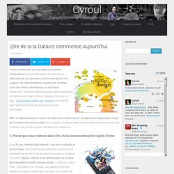
Néanmoins, la dataviz (forme jeune de datavizualisation) est devenue en moins d’un an (rappelez-vous sur ce blog : La singulière beauté des données) le moyen le plus facile et efficace de transmission d’une information. Mais la datavizualisation va bien au delà d’une mode internet. La dataviz est la prochaine étape de l’évolution de notre société. Une évolution incontournable, indispensable et fondamentale pour 3 raisons que je vous propose de découvrir ci-dessous.
Data Publica, le portail français des données publiques et de l'open data. Analyse_du_monde.jpg (Image JPEG, 866x466 pixels) GreenCodeInfo - le comparateur CO2. Les data en forme. Tour d'horizon du meilleur du web par les journalistes de données d'OWNI (des créatures innovantes, dénommées data-journalists sous d'autres cieux).

Au programme : Open Data en application, infographies épurées, et un peu d'écologie. Vous avez toujours rêvé d’entrer dans la peau d’un élu québécois. L’arrondissement du Plateau-Mont Royal de Montréal transforme ce rêve en réalité, l’accent en moins. Sur son site Internet, cet arrondissement vous propose de donner votre avis sur les priorités budgétaires, au moyen d’une application. Sauf qu’il ne suffit pas de dire “moi je ferai-ci“, “je baisserai les impôts“, “je ferai plus d’espaces verts“. Par exemple, vous trouvez qu’il faudrait maintenir une brigade de déneigement sur les trottoirs lors des grands coups de froid ?
Une fois votre budget équilibré, vous pouvez soumettre les propositions aux élus de l’arrondissement, qui s’engagent à jeter un coup d’œil à vos propositions. Untitled. Data Visualisation in Web Apps. A dashboard is a single screen showing the status of an application.
At a glance you should see what’s going well and what areas are struggling. Customer retention is down. Sales are up. Complaints are at an all time high. Creative Cartography: 7 Must-Read Books about Maps. By Maria Popova From tattoos to Thomas More’s Utopia, or what Moby Dick has to do with the nature of time.
L'évolution de l'industrie du disque en un graphique animé. L'industrie du disque est-elle en crise profonde, ou au coeur d'un énième cycle de renouvellement ? Voici un graphique qui illustre parfaitement le phénomène cyclique de l'industrie musicale, réalisé par Digital Music News. On y voit l'évolution des ventes depuis 1980, avec la répartition au fil du temps de l'importance des différents supports, du disque vinyle jusqu'au MP3. Comme un poumon, la taille du camembert qui représente le volume global des ventes tend lui aussi à diminuer puis à augmenter, selon des cycles plus longs. Or la question aujourd'hui est de savoir si l'industrie musicale se trouve en période d'inspiration, et si elle s'apprête une nouvelle fois à regonfler ses poumons grâce à la musique en ligne.
Ou si l'industrie est en fin de vie et peine à retrouver son oxygène. Portail Skoden pour la formation ouverte distance: StepMap: des cartes personnaliser. StepMap - Create your personal map for free. How Students Use Technology [INFOGRAPHIC] 60seconds.jpg (Image JPEG, 1191x842 pixels)
Books on Infographics : un album. 1992: Diagram Graphics. 1974: Graphis diagrams. A visual exploration on mapping complex networks. Quel type de graphique choisir ? Consommation d’information par jour. Visualisation graphique des Beatles. Infographie contre visualisation des données. Le site ReadWriteWeb publie un article court sur la différence entre infographie et visualisation des données en anglais.
Comme il est assez intéressant, je le résume ici : Une visualisation de données est une représentation graphique de données quantifiables au moyen d’une carte, d’un tableau ou autre diagramme. Bien qu’elle puisse être créée à la main, l’intérêt est de la générer directement par l’application. On peut mettre en oeuvre des techniques d’organisation de l’information. État des lieux et présentation du projet. Captain Dash ou la «data visualization» appliquée aux campagnes marketing. Mercredi 16 mars, Gilles Babinet, multientrepreneur (MXP4, Musiwave) et actuel PDG d'Eyeka, Bruno Walther et Yannick Ruby, tous deux anciens d'Ogilvy One, présentaient à une poignée d'agences et d'annonceurs leur nouveau service, Captain Dash. L'idée: permettre à l'annonceur de visualiser sur un tableau de bord personnalisé ses données économiques et d'autres informations chiffrées, le tout agrégé par Captain Dash.
Une nouvelle manière d'interpréter des données, grâce à la «data visualization», successeur très en vogue de l'infographie (lire l'encadré). «Nous avons récupéré et agrégé un maximum de données ouvertes [en accès libre] de bonne qualité: les statistiques de l'Insee, des données d'instituts tels que GFK, et celles recueillies via des partenariats, par exemple avec Yacast pour les chiffres d'affichage publicitaire», explique Bruno Walther, cofondateur de Captain Dash.
Créez votre propre Data Visualization. Vous connaissez mon amour pour la data visu (aussi appelée Infographics). Mais c’est souvent difficile à réaliser car il faut à la fois les compétences d’un ergonome et d’un créatif. Mais heureusement, vous allez pouvoir créer votre data visu en quelques secondes en répondant juste à des questions. En effet, l’agence Brésilienne Ionz, explorateur du digital (<autopub>un peu comme Curiouser quoi </autopub>), nous propose de créer une Datavisu de sa propre vie digitale et de l’exporter sur un superbe Wallpaper.
Data journalism. Data Visualization. Data Visualization: Modern Approaches - Smashing Magazine. About The Author Vitaly Friedman loves beautiful content and doesn’t like to give in easily. When he is not writing or speaking at a conference, he’s most probably running … More about Vitaly Friedman … Data presentation can be beautiful, elegant and descriptive. There is a variety of conventional ways to visualize data - tables, histograms, pie charts and bar graphs are being used every day, in every project and on every possible occasion. However, to convey a message to your readers effectively, sometimes you need more than just a simple pie chart of your results. Data-visualisation. Visualisation data. Lift10 : Visualiser la complexité pour mieux la comprendre - Fin. Datavisualisation de l’étude des tâches de sang sur les scènes de crime. Ecole Supérieure d'Infographie - Albert Jacquard. Répartition géographique de l'amitié sur base de Facebook - Paul Butler — Papa, papa, aujourd’hui j’ai entendu à la radio que la dette de la Belgique était de 343 920 488 903,86 EUR.
Papa, papa, c’est beaucoup, ça? — (papa, ennuyé) Oui. Non. Cela dépend, comparé à quoi? Data Visualization /Communication : un album. Les 50 meilleures infographics et data visualization. 50 Great Examples of Data Visualization. Wrapping your brain around data online can be challenging, especially when dealing with huge volumes of information. And trying to find related content can also be difficult, depending on what data you’re looking for. But data visualizations can make all of that much easier, allowing you to see the concepts that you’re learning about in a more interesting, and often more useful manner.
Below are 50 of the best data visualizations and tools for creating your own visualizations out there, covering everything from Digg activity to network connectivity to what’s currently happening on Twitter. The Lists, To-dos and Illustrated Inventories of Great Artists. By Maria Popova What a 21-point scale of self-confidence has to do with Adolf Konrad’s carry-on and Picasso’s favorite artists. A visualization of US Debt in 100 dollar bills. Data Visualization. [infographie] Ukraine : la démocratie en dictature ! L’Ukraine, un bien beau pays qui est dans l’actualité en ce moment pour de bien tristes raisons… Malgré les vaillants efforts de l’opposition en Ukraine, le Parlement ukrainien a adopté une loi brutale qui dirige le pays en plein dans la dictature. Sont interdits en vertu de la nouvelle loi (sous peine d’emprisonnement) de conduire des voitures dans des colonnes qui dépassent cinq véhicules longs, de mettre en place un système sonore (émission ou réception) non déclaré, les « perturbations de masse » sont passibles de 10 à 15 ans d’emprisonnement, des informations sont collectés sur la police ou les juges, j’en passe… (l’image en grand format) Bref, comme souvent je vous invite à rester vigilant autant que possible sur vos droits, vos libertés et à rester informés tout en informant… et à militez avec vos propres moyens, si vous le pouvez!
Galerie de jose.duarte. Découvrez le kit de visualisation de données fait-main. Galerie de mkandlez.
² bodycard 0056.