

Quartz/Chartbuilder. Datawrapper. [Boîte à outils] 5 applications pour créer sa propre infographie Esthétiques, claires, efficaces et surtout très virales, les infographies en tous genres envahissent la toile.
![[Boîte à outils] 5 applications pour créer sa propre infographie](http://cdn.pearltrees.com/s/pic/th/applications-infographie-43062586)
Timeline JS - Beautifully crafted timelines that are easy, and intuitive to use. Upload Images. Scraping for Journalists – ebook out now. 22 outils gratuits pour visualiser et analyser les données (2ème partie) La bibliothèque JavaScript InfoVis Toolkit propose des graphiques très peaufinés.

10 Awesome Free Tools To Make Infographics. Advertisement Who can resist a colourful, thoughtful venn diagram anyway?

In terms of blogging success, infographics are far more likely to be shared than your average blog post. This means more eyeballs on your important information, more people rallying for your cause, more backlinks and more visits to your blog. In short, a quality infographic done well could be what your blog needs right now. Cleaning data using Google Refine: a quick guide. I’ve been focusing so much on blogging the bells and whistles stuff that Google Refine does that I’ve never actually written about its most simple function: cleaning data.

So, here’s what it does and how to do it: Download and install Google Refine if you haven’t already done so. It’s free.Run it – it uses your default browser.In the ‘Create a new project’ window click on ‘Choose file‘ and find a spreadsheet you’re working with. Scraping for Journalism: A Guide for Collecting Data. Photo by Dan Nguyen/ProPublica Our Dollars for Docs news application lets readers search pharmaceutical company payments to doctors.
We’ve written a series of how-to guides explaining how we collected the data. Most of the techniques are within the ability of the moderately experienced programmer. La boite à outils. Tools - WikiViz. La boite à outils. [outils] Datawrapper: mettre en forme facilement des statistiques (courbes, histogrammes, camemberts) Voici un nouvel outil simple d’utilisation pour mettre en forme des données statistiques sur le web.
![[outils] Datawrapper: mettre en forme facilement des statistiques (courbes, histogrammes, camemberts)](http://cdn.pearltrees.com/s/pic/th/statistiques-histogrammes-24908548)
Il s’appelle Datawrapper et a été développé par Mirko Lorenz et Nicolas Kayser-Bril. Datawrapper a été développé pour ABZV, une organisation de formation des journalistes affiliée à BDVZ (Association des éditeurs de presse allemands). Le projet fait partie de leurs efforts pour bâtir un programme de formation complet pour les journalistes. Avec Datawrapper, l’idée est de rendre encore plus simple la mise en forme de données. Plus simple qu’avec ManyEyes ou Google Docs et très facilement « embeddable » (intégrable) sur un site web. Voici ce que ça peut donner (d’autres visualisations sont possibles: camenbert, courbes, etc) 22 outils gratuits pour visualiser et analyser les données (1ère partie) Vous avez des données à explorer ?
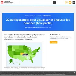
Voici quelques outils qui pourront vous être utiles pour les transformer en informations et en graphiques attrayants. Jeffrey's Exif viewer. 4 Simple Tools for Creating an Infographic Resume. This post originally appeared on the American Express OPEN Forum, where Mashable regularly contributes articles about leveraging social media and technology in small business.
As a freelancer or job seeker, it is important to have a resume that stands out among the rest — one of the more visually pleasing options on the market today is the infographic resume. An infographic resume enables a job seeker to better visualize his or her career history, education and skills. Unfortunately, not everyone is a graphic designer, and whipping up a professional-looking infographic resume can be a difficult task for the technically unskilled job seeker. Data Visualization Platform, Weave, Now Open Source.
With more and more civic data becoming available and accessible, the challenge grows for policy makers and citizens to leverage that data for better decision-making.
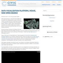
It is often difficult to understand context and perform analysis. “Weave”, however, helps. TimelineSetter: Easy Timelines From Spreadsheets, Now Open to All. Talking Points Memo used TimelineSetter to create a timeline featuring events in Wisconsin’s public-sector union struggle.
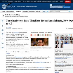
Last week we announced TimelineSetter, our new tool for creating beautiful interactive HTML timelines. Today, after a short private beta with some of our fellow news application developers, we’re opening the code to everyone. How to Install If you’ve got Ruby and Rubygems installed, you can get the package by running: sudo gem install timeline_setter You can also check out the source code from Github. Documentation. Mapize.com : Data Visualization & Mapping. Refine - Google Refine, a power tool for working with messy data (formerly Freebase Gridworks)
Orange - Data Mining Fruitful & Fun. How to: get started in data journalism using Google Fusion Tables. Merging Datasets with Common Columns in Google Refine. Blog Archive » 10 things every journalist should know about data. Every journalist needs to know about data. It is not just the preserve of the investigative journalist but can – and should – be used by reporters writing for local papers, magazines, the consumer and trade press and for online publications. Think about crime statistics, government spending, bin collections, hospital infections and missing kittens and tell me data journalism is not relevant to your title. If you think you need to be a hacker as well as a hack then you are wrong. Part 3: The essential collection of visualisation resources. This is the third part of a multi-part series designed to share with readers an inspiring collection of the most important, effective, useful and practical data visualisation resources. The series will cover visualisation tools, resources for sourcing and handling data, online learning tutorials, visualisation blogs, visualisation books and academic papers.
Your feedback is most welcome to help capture any additions or revisions so that this collection can live up to its claim as the essential list of resources. This third part presents the suite of charting and visualisation resources developed by Google, effective and accessible tools for the masses. Through the typical nature of Google developments, these are constantly evolving development platforms, occasionally mutating, sometime separating, sometime merging. It can be difficult to keep track, hopefully this will bring some clarity. How to Design Fast, Interactive Maps Without Flash.
Until recently if you wanted to create a fast interactive map to use on your website you had two main options – design it in Flash, or use Google. With the prevalence of mobile devices, for many users Flash isn’t an option, leaving Google and a few competitors (like Bing). But we are developing open source technologies in this space that provide viable alternatives for serving fast interactive maps online – ones that often give users more control over map design and the data displayed on it. [TileMill, our open source map design studio]( now provides interactivity in the [latest head version on github]( Once you design a map with TileMill, you can enable certain data in the shapefile to be interactive.
“Internet civilisé”: la timeline. Les anthologies, frises, chronologies (timeline), c'est bien. Les illustrer en utilisant les outils disponibles sur le web, c'est (encore) mieux. Public Data Explorer. Indicateurs de développement humain Rapport sur le développement humain 2013, Programme des Nations Unies pour le développement Les données utilisées pour calculer l'Indice de développement humain (IDH) et autres indices composites présentés dans le Rapport sur le développement humain ... Dipity - Find, Create, and Embed Interactive Timelines. TimelineSetter: A New Way to Display Timelines on the Web. TimelineSetter takes a spreadsheet of events -- or even many series of events -- and generates an easy-to-use timeline.
The timeline is a very useful way to visualize sequences of events, and they’re especially useful to orient readers within the complex investigative stories we do at ProPublica. But they’re not very easy to make. As far as we know, there are no good open source frameworks that web developers can use to generate timelines quickly without losing design flexibility.
So we made our own, which is debuting today. Data Visualisation Stuff. Steve Doig’s best of CAR Conference: 13 free tools to analyze, display data. By Steve Doig The San Francisco Chronicle used Exhibit to show which ZIP codes in its area had the most foreclosures. The bigger the bubble, the bigger the number. The annual Computer-Assisted Reporting Conference that concluded in Raleigh, N.C., on Sunday was extraordinarily rich in useful free tool for all sorts of data analysis and visualization, thanks to invitations accepted by computer scientists from Google, MIT, Stanford and the like. Making open data accessible for everyone. How to: get to grips with data journalism. A graph showing the number of IEDs cleared from the Afghanistan War Logs Only a couple of years ago, the idea that journalists would need to know how to use a spreadsheet would have been laughed out of the newsroom.
Now those benighted days are way behind us and extracting stories out of data is part of every journalist's toolkit of skills. Some people say the answer is to become a sort of super hacker, write code and immerse yourself in SQL. Tools to help bring data to your journalism « Michelle Minkoff. NOTE: This entry was modified on the evening of 11/9/10 to deal with typos and missing words, resulting from posting this too late the previous night. Sleep deprivation isn’t always a good thing — although it allows one to do things more fun than sleep. Like play with data. Note to self: Be more careful in the future. Many of the stories we do every day, across beats, could benefit from a data component. Make a homepage in minutes : Flavors.me. Protovis. Protovis composes custom views of data with simple marks such as bars and dots. Unlike low-level graphics libraries that quickly become tedious for visualization, Protovis defines marks through dynamic properties that encode data, allowing inheritance, scales and layouts to simplify construction.
Protovis is free and open-source, provided under the BSD License. It uses JavaScript and SVG for web-native visualizations; no plugin required (though you will need a modern web browser)! Many Eyes.