
CSS transitions, CSS transforms and CSS animation. Browser Support for CSS transitions How to use transitions If you haven't used transitions before, here's a brief introduction.
On the element you want to have animate, add the following CSS: There is a lot of duplication due to vendor prefixes - until the specification if finalised, this will persist. If this bothers you, there are various tools such as CSS Scaffold, LESS, or my preference - SASS, that allow you to define mixins to avoid repetitive code. Another approach is simply to write the CSS without the prefixes, then use Lea Verou's -prefix-free to add them in at runtime. Something you definitely shouldn't do is to only include the webkit prefix. It's worth noting as well that there isn't an -ms- prefix on these properties. The syntax is pretty straightforward, you specify the property you want to animate, all or border-radius or color or whatever, the time to run, then the transition timing function.
Whenever any property changes, then it will animate instead of changing directly. Ceaser - CSS Easing Animation Tool - Matthew Lein. Font Awesome, the iconic font and CSS toolkit.
Useful resources and inspiration for creative minds. A 3D engine built using HTML and CSS 3D transforms by Keith Clark. CSS Gradient Animator. CSS-Tricks. Box Shadow Generator. Use this CSS3 box shadow generator to quickly generate box shadow CSS for your project.
Your browser does not support the CSS3 box-shadow property. You can still use this tool to generate the CSS3 rule, but you won't be able to see the results. <div class="error_msg">Please enable Javascript to use this page. </div> Box Shadow Explained The CSS3 box-shadow property allows you to add depth to your website's design without the need for images or extra container elements. While the syntax is easy to understand, it is hard to visualise the style using just code. The box-shadow syntax works as follows: The first value defines the distance of the box shadow in the x (horizontal) direction and the second value defines the distance in the y (vertical) direction. Optionally you can include an additional parameter after the blur distance: CSS Button Generator. The Shapes of CSS. CSS3 box-shadow rolled corners.
HTML5 Pure CSS Lightbox. Image 1Image 2Image 1bImage 2b Pure CSS3, no javascript.
Webkit browsers get a little bonus animation. The :target pseudo selector is truly a powerful new feature in CSS3. MicroTut: How CSS Positioning Works. Martin Angelov Undoubtedly, the position property is one of the most useful tools that designers have in their CSS toolbox.
However, there are a few concepts about positioning that might baffle beginners. First, what is positioning? When your browser opens a webpage, it starts rendering elements (divs, paragraphs, headings etc.) in the order they appear in the HTML markup of the page. Positioning is a natural way of organizing how the elements are displayed and an easy resolution to situations like overlaps.
Elements are statically positioned by default The default positioning, which is implicitly applied to every element on the page, is static. Relative positioning. An Awesome CSS3 Lightbox Gallery With jQuery. CSS-Tricks. CSS Lifted corner Drop Shadow. CSS3 Generator. Start up page - Ultimate CSS Gradient Generator - ColorZilla.com. The Shapes of CSS. Learn Development at Frontend Masters CSS is capable of making all sorts of shapes.
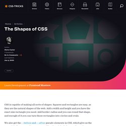
Squares and rectangles are easy, as they are the natural shapes of the web. Add a width and height and you have the exact size rectangle you need. Add border-radius and you can round that shape, and enough of it you can turn those rectangles into circles and ovals. We also get the ::before and ::after pseudo elements in CSS, which give us the potential of two more shapes we can add to the original element. Square Rectangle Circle Oval Triangle Up Triangle Down Triangle Left Triangle Right Triangle Top Left Triangle Top Right Triangle Bottom Left Triangle Bottom Right Curved Tail Arrow via Ando Razafimandimby Trapezoid Parallelogram Star (6-points) Star (5-points) via Kit MacAllister Pentagon Hexagon Octagon Heart via Nicolas Gallagher Infinity via Nicolas Gallagher Diamond Square via Joseph Silber Diamond Shield via Joseph Silber Diamond Narrow via Joseph Silber Cut Diamond via Alexander Futekov.
Creative CSS3 Animation Menus.